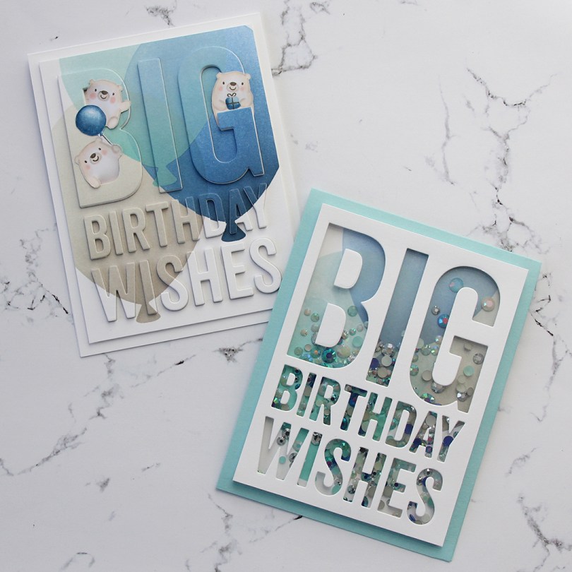
Hi, everyone! This is my second post of the day. If you came here to see my Mo Manning post, you will find that here. This one’s a bit of a twofer, focusing on the big birthday wishes die from My Favorite Things, along with the Big Balloon stencil, also from MFT.
 I have a great crafty friend who suggested I play along with the current color challenge over at MFT. The color palette for the challenge was Blueberry, Berrylicious, Grout Gray and Sweet Tooth, and it’s a palette I find very appealing! I’ve done a raised diecut inlay using the big birthday wishes die and big balloon stencil once before, but it was with warmer tones (it’s this card) and some birthday monsters.
 Starting with the raised die cut inlay card, I did some serious ink blending. I love the look of ink blending, but I have a shoulder that protests every time I do it, meaning it doesn’t happen every day. I don’t have colored inks from MFT, so I used the brands I have and made it work. I used Hero Arts Wet Cement and Papertrey Ink Soft Stone inks for the gray balloon, Papertrey Ink Hawaiian Shores and Distress Ink Speckled Egg for the teal balloon, and Altenew Dark Night, Azurite, Ultramarine and Eastern Sky for the blue balloon.
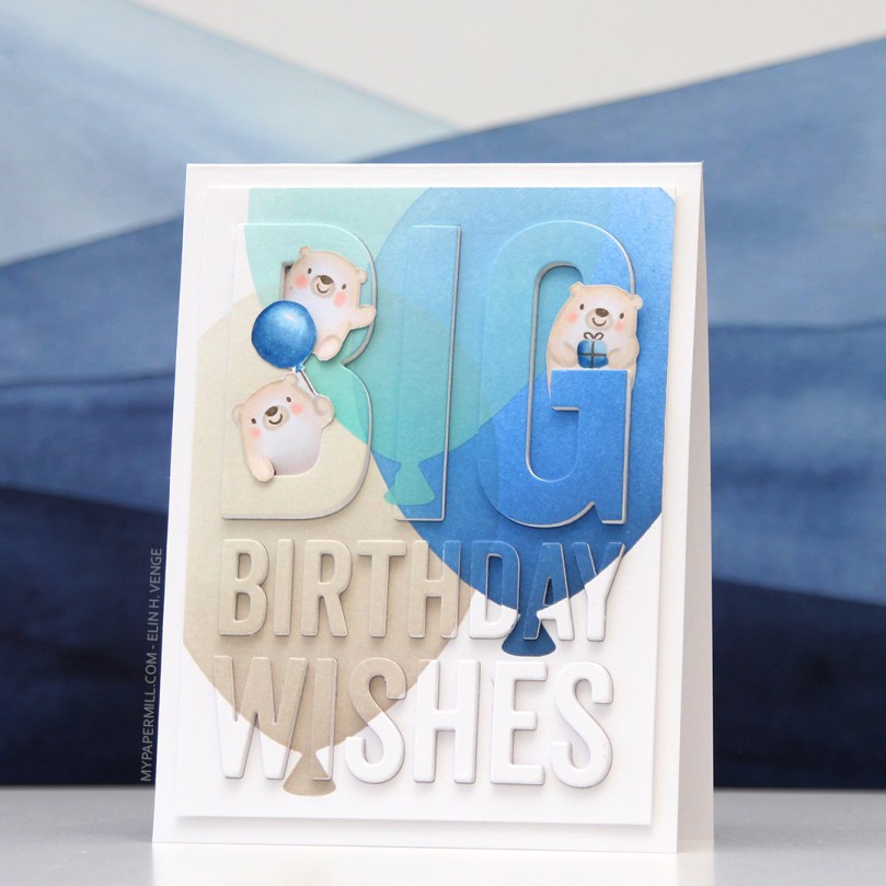 Once the panel was inked, I used the Big Birthday Wishes die to die cut the panel, making sure to keep all the little pieces for the stacked inlay technique. I die cut five more pieces from white card stock and stacked all the individual letters, putting the inked piece on top, giving me a total of six layers for each letter. I no line colored a few of the bears from the Bitty Bears stamp set to look like polar bears, and added them to the big letters at the top.
 For the second card I used the same color inks to ink blend the balloons, cut off the edges to make it a smaller panel and used the negative of a die cut for the shaker window. I built up the walls of the shaker using thin strips of white card stock. I’m not a fan of foam tape for shaker windows, I prefer to take the extra time and effort to build dimension with cardstock. It’s fiddly and time consuming, but I love it!
 I glued the negative die cut onto a piece of acetate, and filled the shaker with the Starry Sky Mix of jewels from Pretty Pink Posh before adding the piece of acetate and negative die cut on top, sealing in the jewels. The colors of the jewels are perfect for the color palette I was going for. I glued the finished shaker piece onto a top fold card base I made from Berrylicious card stock, and my card was finished.
 I had so much fun creating these two cards, but will admit that I struggled with which bears to use, I’d colored all but one bear from the stamp set. Indecisive is my middle name. So is procrastinator, perfectionist and a whole bunch of other descriptors.
 All the bears (except for the one that couldn’t fit on this panel) all colored up like polar bears. While the stamps were still in my Misti, I used a Memento Rich Cocoa dual marker on the eyes, noses and mouths and stamped them on top of the fadeout ink from Inkon3 I’d already used. This is a trick I like to use, and it saves me from having to draw eyes and mouths in after my coloring and risk ruining my images.
 Last, but not least, the colors I used. Not a lot, but enough to make these cute bears look like polar bears and for them to match the color palette for the MFT color challenge.
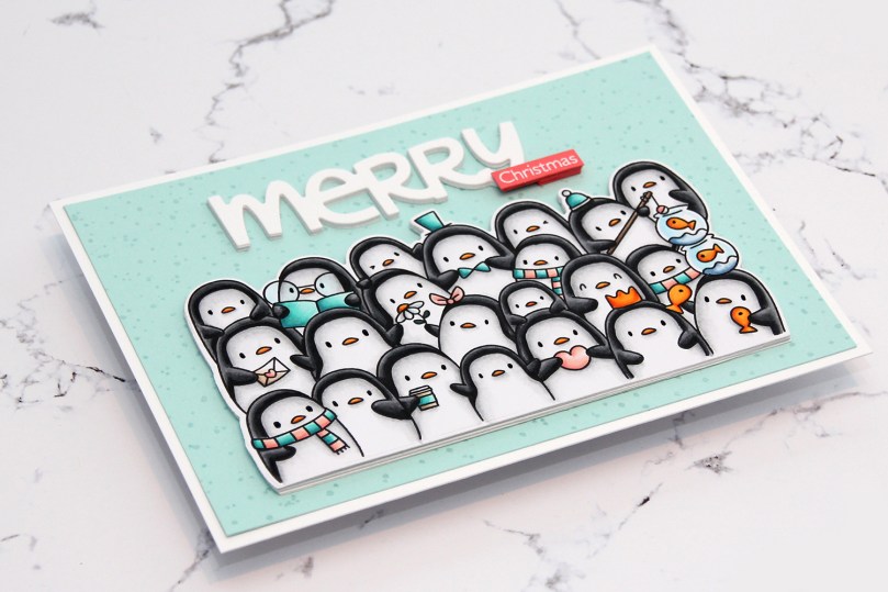 I colored the penguins with Copics and used the coordinating die to die cut this cute little waddle for the front of my card.
 The waddle of penguins actually opens up so you can write a personal message on the inside, and there’s a few more die cuts under there for dimension and a little bit of stability.
 I glued my penguins to a panel made from Aqua Mist card stock from Papertrey Ink. I used the Paint Splatter background stamp from My Favorite Things with VersaMark ink, poured White Satin Pearl embossing powder from Hero Arts on top and heat embossed it. I know the stamp is supposed to be paint splatter, but I think it looks like snow, which makes the stamp even more versatile, and it’s a great way to add some subtle interest to a background. I added the Aqua Mist panel onto a slightly larger panel of Stamper’s Select White cardstock from Papertrey Ink.
 The Penguin’s Waddle die set comes with a big word die “Oh so merry”. I die cut it several times from white cardstock, cut the “oh so” away to use just merry on my card and spritzed some sparkly sheer shimmer spray on top, which you can kind of see in this photo if you look closely. I stamped and white heat embossed the word Christmas from the Christmas Cheer stamp set from My Favorite Things onto Berry Sorbet cardstock from Papertrey Ink, then used my Cut-align ruler from Misti to make sure I’d cut the little strip straight. In this photo you can also see the shine in the penguins’ eyes. I added a little bit of black glaze pen to the eyes, and also a little bit of clear Wink of Stella to certain elements.

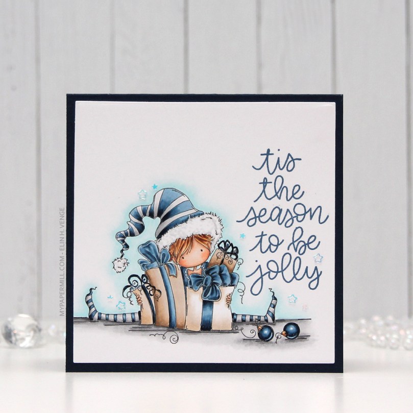 I used a square die from Lifestyle Crafts to die cut my elf down to the size I wanted, in this case 4″.
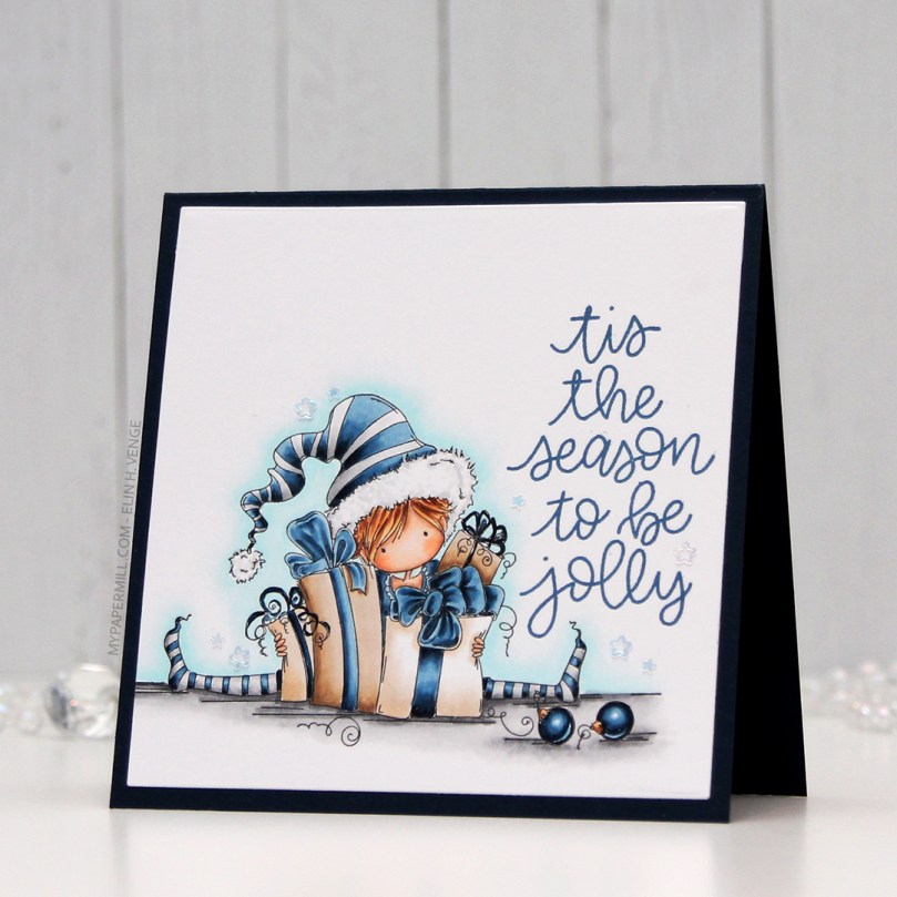 I then stamped a sentiment from the Scripty Xmas stamp set from Mama Elephant using Enchanted Evening ink from Papertrey Ink, before gluing my panel to a 4 1/4″ square card base made from Dark Indigo cardstock, also from Papertrey Ink. I finished off my card by gluing on some stars from a sequin mix from Hero Arts. They’re iridescent, which I’m normally not a big fan of, but it worked on this card.
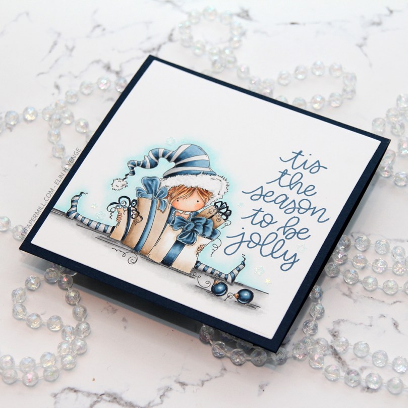 I love the ease of clear stamps, but rubber stamps like this one have much finer lines, and they stamp beautifully every single time, I love that. I also love blue for Christmas, but that’s hardly a secret 😉
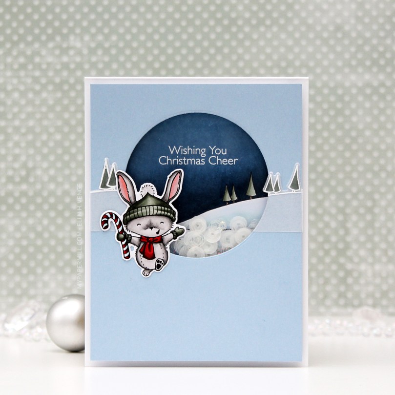
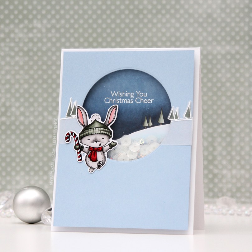 I stamped, colored and diecut the bunny a couple of days ago, so he was ready to go. I wanted the background stamp from that same stamp set to be in the shaker, and also going across. The shaker portion was stamped using Extreme Black ink, then colored with Copics, while the parts on the outside were stamped and white heat embossed on vellum and colored on the back. You don’t want to ruin the tips of your Copics by touching the embossing, so the back’s a great option when using vellum, because it still shows through.
 I like my shakers done a certain way. I use a die slightly bigger than my shaker window to die cut several times from white cardstock. I stack my negative die cuts (for this card it was 7), glue them together and glue a thin strip of cardstock to the inside of my negative diecut stack. That way, none of the sequins or other bits in the shaker get stuck anywhere, but can shake freely in their little confined space.
 I used a sequin mix from Hero Arts for the inside of the shaker. It’s a mix of matte white sequins and clear sequins, as well as iridescent star confetti. I’m not usually a fan of iridescent elements on my cards, but for a night time Christmas shaker, I don’t mind.
 Not too many Copics used for this one! And the red one that says B97 should say R27, I must have undone the correct one before I saved my graphic in Photoshop.
 This is a small, but mighty one. It may look very unassuming as a 2-3/4″ square shaker card, but there’s a secret. It opens up to be quite big in the end. The shaker itself is filled with sequins, gems and a few die cuts in colored cardstock die cut using one of the dies in the Tag Builder Blueprint 5 set. I cut them down a little with my scissors and cut the ends off so they wouldn’t get tangled inside the shaker.
 The gorilla from the Picture Perfect Party Animals stamp set covers the entire front, but there’s a magnetic flap on the back, and once you undo that, more is revealed.
 Flip the gorilla over, and you’ve got more animals ready to join the party. I used the yellow polka dot pattern from the Party Patterns paper pad for even more fun and a way to get even more happy color into my card. These three panels are flaps that open to the sides (two to the right and one to the left) to reveal even more…
 The last three (technically four, since there are two parrots in that one selfie) animals are ready to party. They’re tucked inside pockets, and I’ve stamped a couple of the sentiments that come with the stamp set onto Razzle Berry heavyweight cardstock from MFT and heat embossed them. That pink really packs a punch. I die cut my sentiments using the largest of the Fishtail Flag Frames dies, and cut down another patterned paper from the Party Patterns paper pad to strips that included the yellow, green and pink colors that I have throughout my card. I also added some die cut streamers from the Tag Builder Blueprint 5 die set using Razzle Berry, Pineapple and Limelight cardstock, all from MFT.
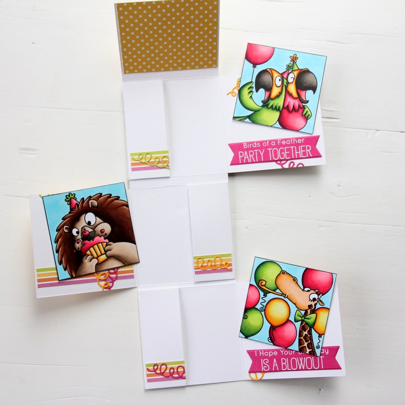 You can pull the selfies out of their pockets, and there’s room to write a personal message to the birthday boy or girl on the back of the selfies. The best thing about this card is that no specialty dies are required, this is all done with a paper trimmer, score board, bone folder, craft knife and a steel ruler. I prefer the craft knife and steel ruler over the paper trimmer, but that goes way back to my days of creating architectural models. Those knives are handy!
 There you have it, my entry for the Innovation Master category for MFT’s annual superstar contest.
 I colored up these snowmen for Kathy Racoosin’s 30 day coloring challenge in June of last year, so it felt good to finally put them to use. Another thing I put to use? Those die cut squares. They were left over from
  I had 12 snowmen, but I needed room for a sentiment, so I stamped one from Norsk Stempelblad AS onto one of the die cut white squares using Papertrey Ink Enchanted Evening ink and glued the last snowman to the inside of the card instead.
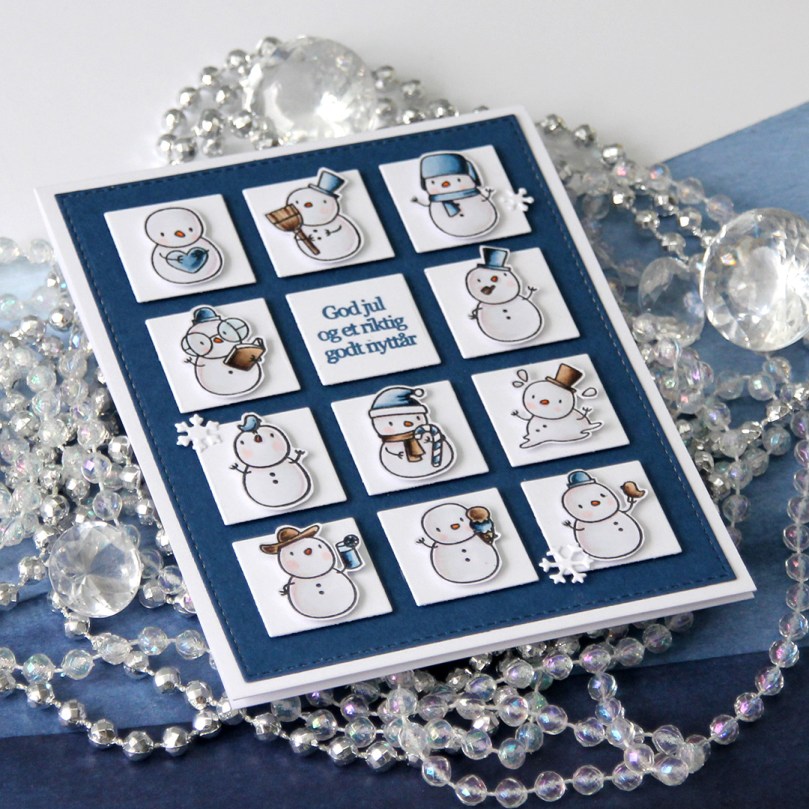 I used the largest die in the Stitched Rectangles Stax Set 1 from My Favorite Things on some Enchanted evening card stock, and glued it to my Stamper’s Select White card base before adding all the squares with 1 mm foam squares. I then used more 1 mm foam squares on the back of the snowmen. Dimension is life, as Laura Bassen says. I didn’t want this card to be too thick, though, so I stuck with the 1 mm. Added some snowflakes die cut with the Hero Arts Snowflake Confetti die, and my card was finished.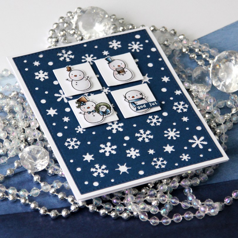
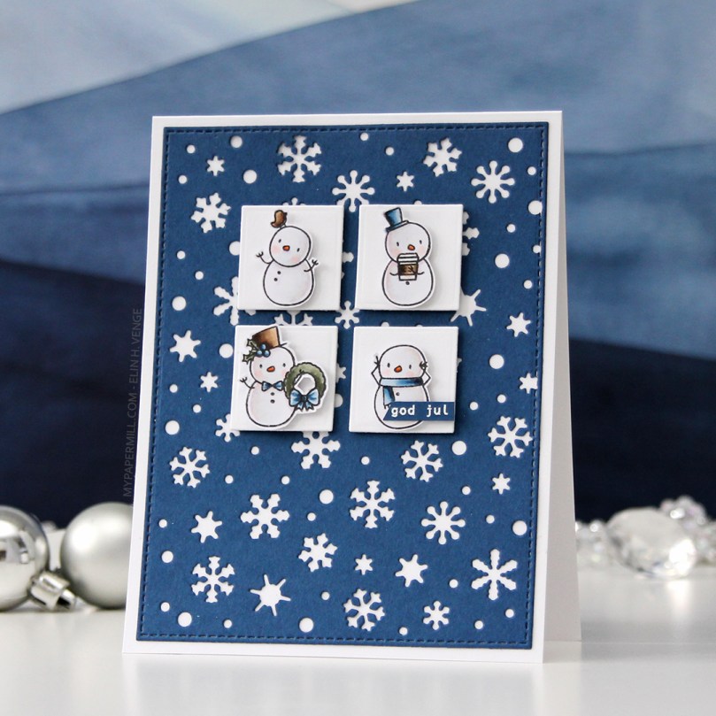
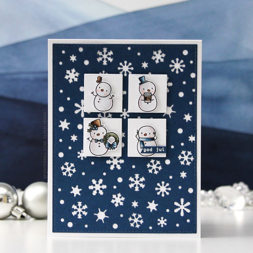 I had loads of diecut squares left over from my previous card, they were the interior pieces of the stacked frames I used. Instead of letting them go to waste, I thought I’d put them to good use. I took four squares and mounted them to my blue snowflake panel using 1 mm foam squares. Believe it or not, but this was the part that took the longest. Getting them centered perfectly near the top with equal spacing between them all and equal distances to both sides and the top of the panel took…. well, it felt like forever. With this kind of design, though, you have to get it just right, or it’ll throw off the balance of the entire card. They’re equally distanced down to 1/32″, that’s about as good as it gets.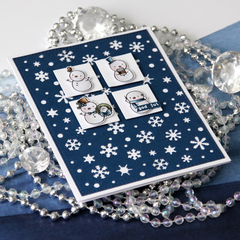
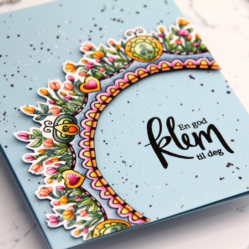
 This is a lot more artsy than what I normally do. I printed the image with an opacity setting of 25%, colored it with Copics and then used a Copic multiliner to add back in some black lines in selected areas before fussy cutting my image with a thin, white border on the outside and straight up to the black line on the inside.
 I used foam tape from Gina K to pop up my colored piece onto a cardbase I made from Spring Rain cardstock from Papertrey Ink.
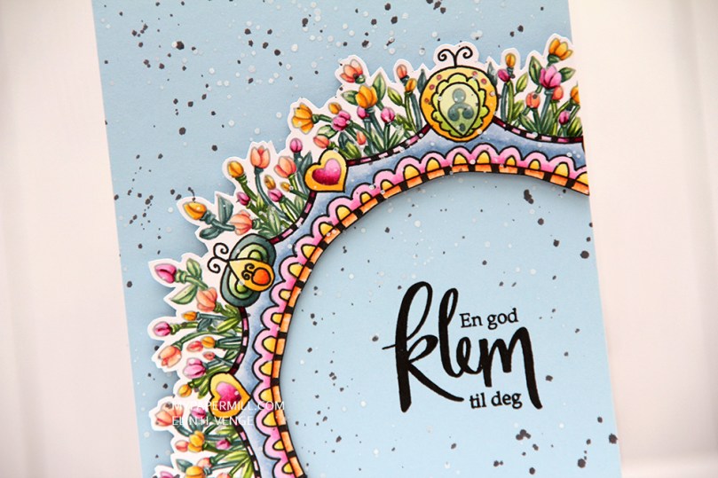 I stamped a Norsk Stempelblad AS sentiment using VersaFine Onyx Black ink, and added splatters across the entire card with white liquid watercolor from Hero Arts and a watered down black ink.
 Not exactly my usual style of card, this one. What do you think?

 I have a soft spot for Stacey Yacula’s images, and the Sweet Holiday Penguins set from My Favorite Things was perfect for a quick, simple Christmas card. I’m normally not one for scene cards, but I thought these two deserved better than to just float around, so I added a night sky and some subtle hints of snow on the ground.
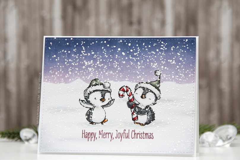 I colored my penguins during Kathy Racoosin’s 30 day challenge on Instagram, and asked my followers how to add snow. Someone suggested paint splatters and embossing powder, so that’s what I did. I used liquid watercolor from Hero Arts for the splatters, and lots and lots and lots of chunky white embossing enamel from Stampendous for the rest. It makes the card seem very wintry, and the embossing enamel adds a ton of texture to an otherwise very simple card.
 I could have made it a one layer wonder, but I like the faux stitch look you get with the stitched rectangle STAX sets from My Favorite Things, and I love the 1/16″ frame of pure white around it. I even mounted my panel on foam tape for that extra bit of dimension.
 Simple, yet dimensional from that foam tape, with lots of texture from the embossing enamel. Maybe I should start making scene cards more often?
 I can’t believe I’ve nearly used all the different gray families on one card, all I’m missing are the Ws.
 Kraft og hvitt syns jeg funker veldig bra til julekort, det gir et mye roligere utseende enn rødt. Jeg stanset ut en
  Rammen fungerer også fint som et holdepunkt for blomsten min. Jeg stemplet blomsten med kraftfarget blekk, fargela veldig enkelt med en hvit blyant, og stemplet og embosset over i hvitt. Dette gjorde jeg på flere blomster, og til slutt klippet jeg dem så jeg fikk laget en lag på lag-blomst med lave 3D-puter mellom lagene. Til slutt sprutet jeg
