Hi! Part of me is struggling to believe it’s been a week since my last post, but it totally has been. I was so good and efficient in my craft room before going on vacation, getting lots of stuff done and scheduling everything for when I was away, and let me tell you, getting back into the swing of things is not easy, I feel like I’m still in vacation mode. I’ll get there, though, it just takes a little while.
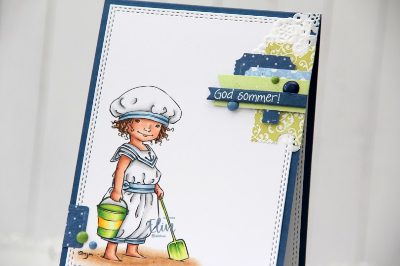
 Technically, I should have made this card at the beginning of the summer, but it’s a recent image from Mo and I couldn’t NOT make a summer card using it. The air is definitely getting cooler here, and I’m very well aware of the fact that summer officially ends in two weeks. I kind of want to go back to June and warmer temps, I don’t like the cold.
 Onto the card. I colored the image with Copics and used a double stitch rectangle die from My Favorite Things to turn it into a nice panel, before adhering it to a top fold card base I made out of Enchanted Evening cardstock from Papertrey Ink. I love their cardstocks.
 When I don’t have a clear idea for a card, I turn to embellishment clusters of patterned paper scraps. These are so easy to put together and a great way to add SOMETHING when I’m out of ideas and my mojo’s low.
 I’ve sorted my die cut patterned paper scraps by color, so I pull out colors that will match my card and just start playing. I used patterned paper from 3ndypapir, Papirdesign, Kaisercraft and Imaginisce for this card, and the dies I used to cut them out are from XCut and My Favorite Things.
 I white heat embossed a sentiment from Norsk Stempelblad AS onto a scrap piece of Enchanted Evening cardstock and used one of the Itty Bitty Strips dies from My Favorite Things to diecut it, before using 1 mm foam squares to mount it onto my cluster. I added a few enamel dots from Papirdesign to finish my card.
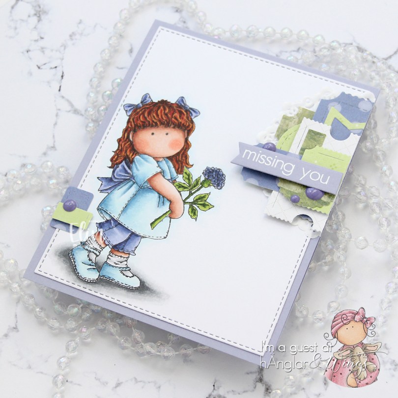
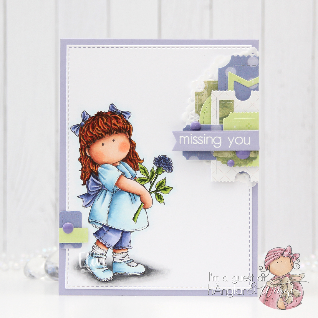
 Fairly limited color palette for this one.
 You can actually get the image I used for FREE if you spend $20 or more during Mo’s summer sale, which ends today, so you’d better be quick.


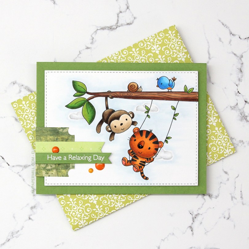
 I colored the image with Copics and die cut it using the second largest die in the A2 Stitched Rectangles STAX 2 set from My Favorite Things, before adding it to a card base made from Gumdrop Green Heavyweight card stock, also from MFT, using lots and lots of foam tape. I used a black Glaze pen to add some dimension and shine to their eyes and noses.
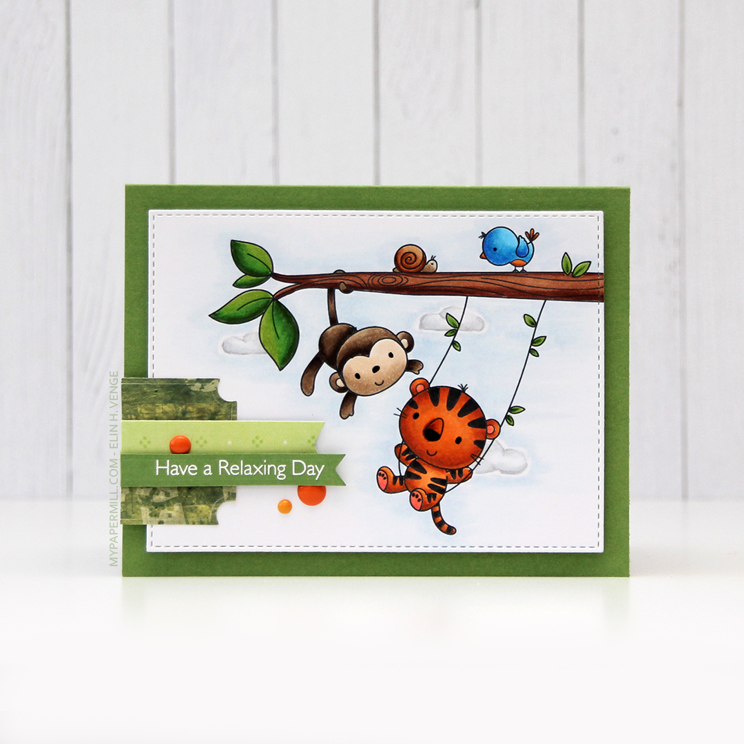 I’m one of those people that use patterned paper on my cards. I don’t use lots, and I pretty much always use them for small clusters, but my ancient stash of patterned paper is shrinking ever so slightly with each card. I have a tub of die cut patterned paper scraps on my desk, and rummage through it to find the perfect pieces for my clusters. The dark green patterned paper I used here is actually from 2005, which was years before I started making cards. I stamped one of the sentiments from the Always Bring a Smile stamp set from My Favorite Things onto a separate piece of Gumdrop Green card stock and die cut it using one of the dies in the Slimline Starter die set. I finished off my card with a few enamel dots from Papirdesign to match the tiger and the details on the bird.
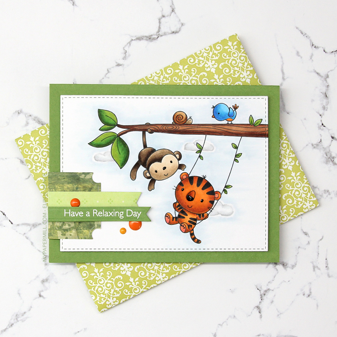 Another great use of patterned paper is envelopes. I’ve nearly run out of colored envelopes for A2 cards, and I’m definitely out of white ones, but larger scraps of patterned paper are perfect for creating one of a kind envelopes. I used the A2 V flap envelope dies from Simon Says Stamp on this piece of patterned paper from 3ndypapir. Another old one, this paper’s from 2010.
 Lots of bright colors used for this one. I also used B40, which is a color I’ve created myself.
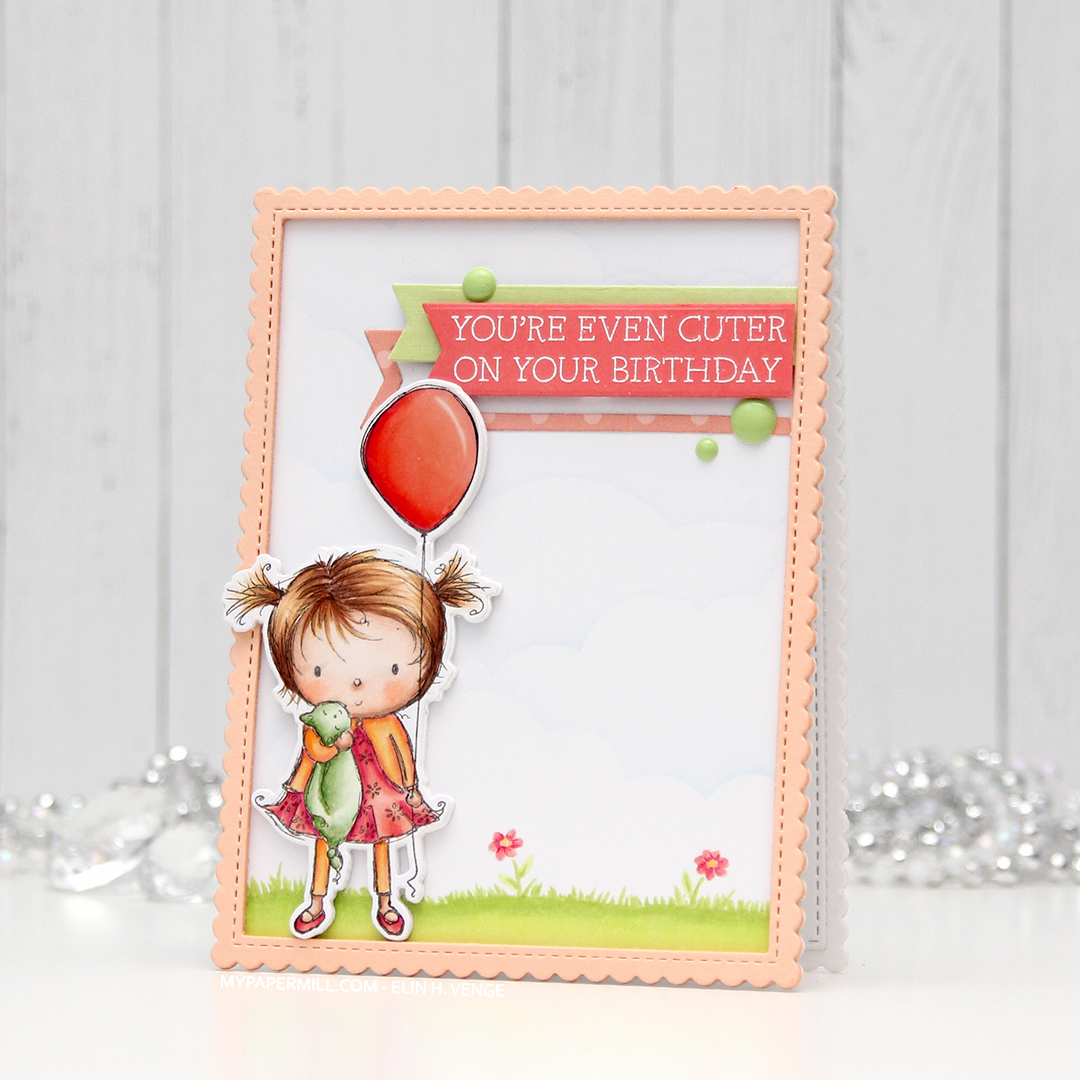 I don’t often purchase coordinating dies for stamp sets, but boy, they make it easy to add dimension. Once I’d colored up the little girl with the balloon, I die cut her and four additional pieces from white card stock to add dimension behind her. Way more sturdy than foam tape.
 I wanted to use lots of other goodies from MFT on this card, so I used the cloud stencil with a very light blue ink (Iceberg from Altenew) to create a barely there puffy cloudy sky behind her. It’s really soft, but shows up better in real life than in photos. I used a couple of elements from the Scene Builder stamp set and stamped those near the bottom using Fadeout ink from Inkon3 for a little bit of no line coloring. I die cut the largest of the Stitched Rectangle Scallop Edge Frames four times from Peach Bellini card stock and glued them together for dimension.
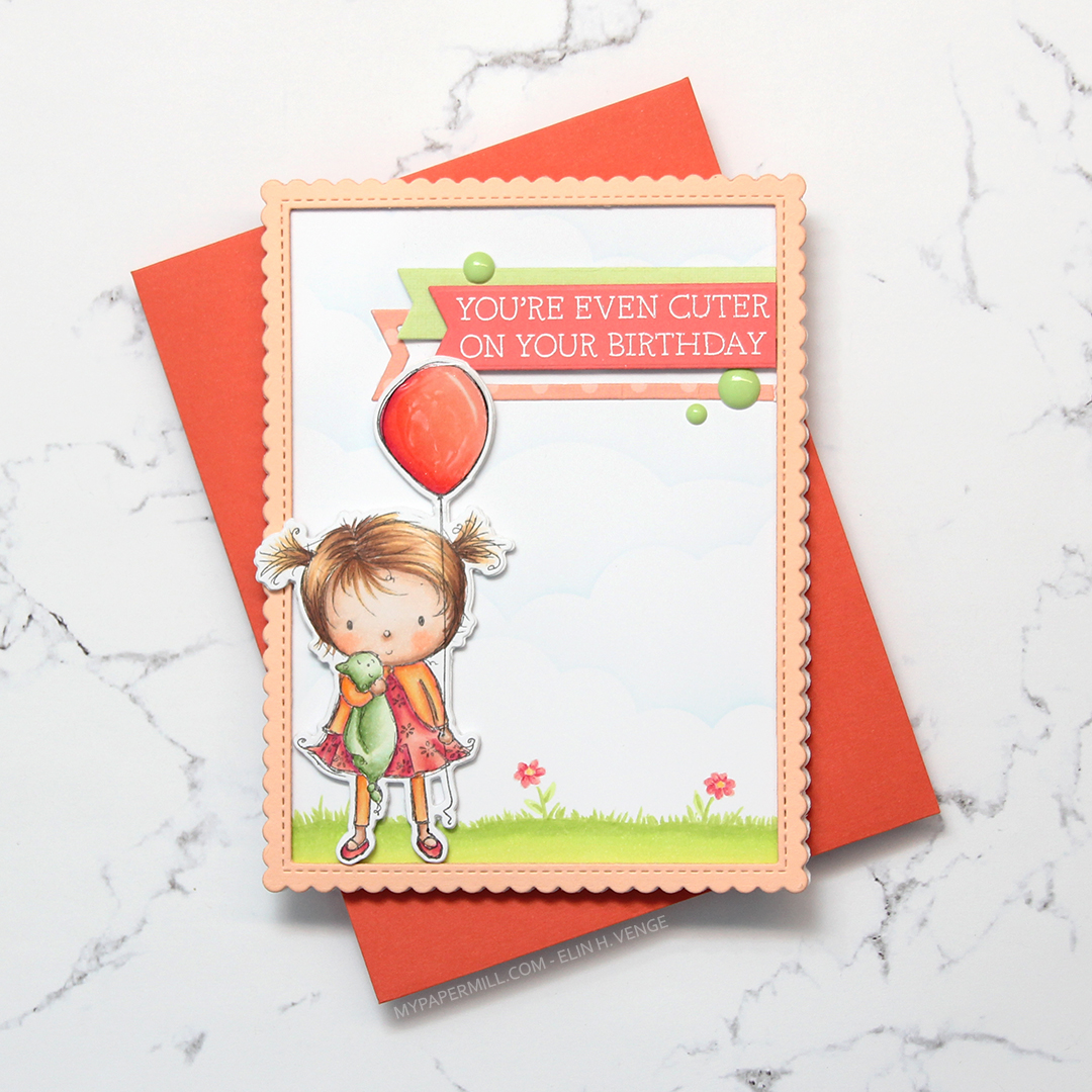 I added clear Wink of Stella glitter and a thick layer of Glossy Accents on the balloon, before stamping and white heat embossing one of the sentiments in the Birthday Cutie stamp set onto Berry Sorbet card stock from Papertrey Ink. I die cut the sentiment using one of the Fishtail Flag Frames dies from MFT, and found some scraps in my stash that I’d already die cut using dies from the same set. I use that die set a lot. I added three green enamel dots from the Tropical Forest set from Altenew and my card was finished. I paired the card with a Persimmon envelope, also from MFT. I love their envelopes!
 Lots of colors for this one! I was going for a peachy pink jacket and leggings, but it was too close to the pink I’d used for the rest of her, so I added some yellows on top. I also decided to go for a brighter green on the grass than her little stuffie.
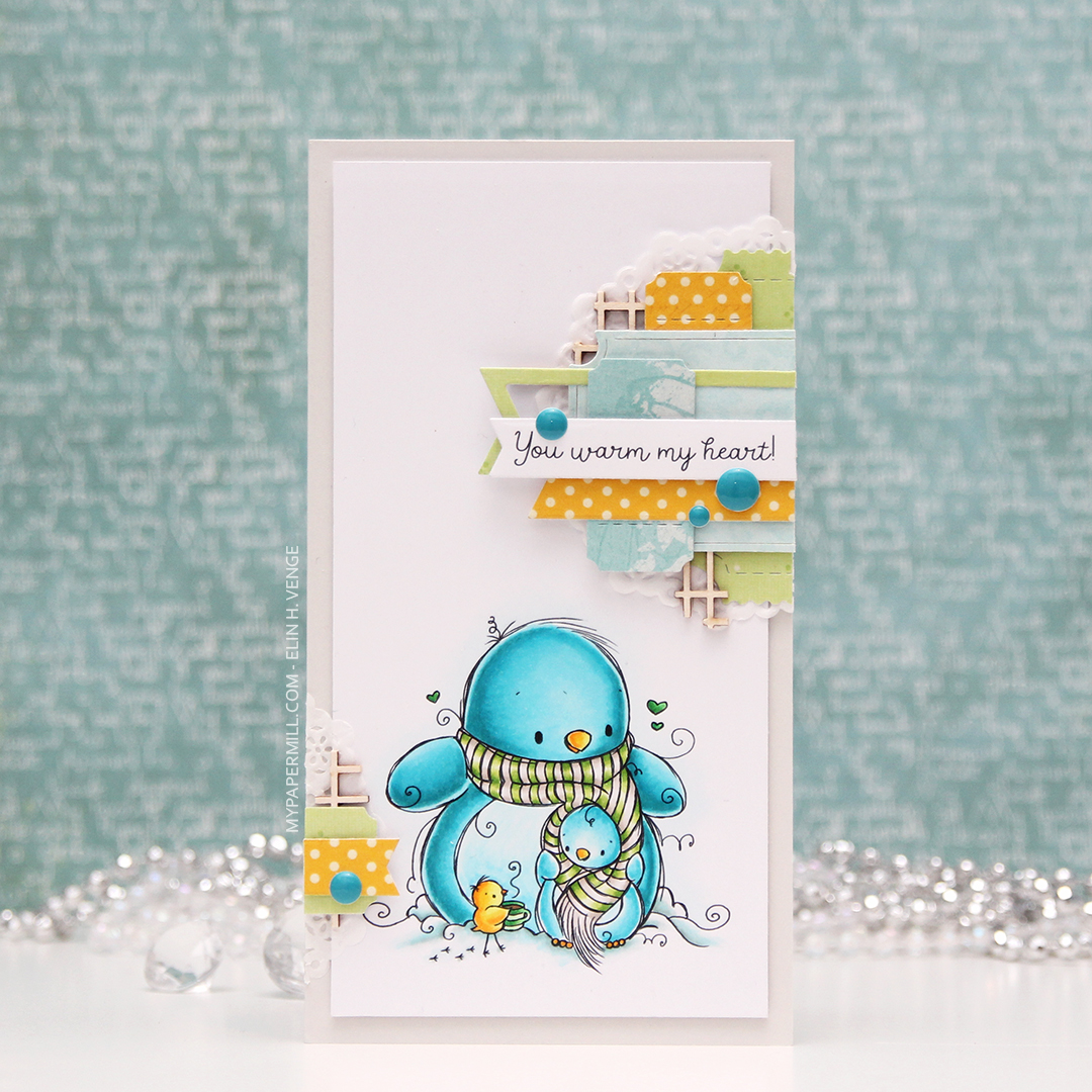 My card measures 3 1/2 x 6 1/2″. I printed the image onto X-Press It blending card and colored it with my Copics. I was planning on doing a split complementary color scheme, but went with an analogous in the end, which is never a bad idea, in my opinion. I adhered the colored panel onto a card base I made from Soft Stone card stock from Papertrey Ink, adding two layers of cardstock behind the image for added dimension.
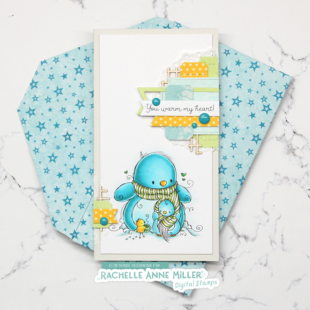 It’s no secret that I love enamel dots, and the Cool Summer Night enamel dots from Altenew were the *perfect* color to match my penguin. Since I didn’t have any envelopes in the right size for this card, I created my own using patterned paper from Papirdesign and my envelope punch board from WRMK.
 I love this color palette. In addition to these colors, I also used BG71, which is a color I’ve created myself.
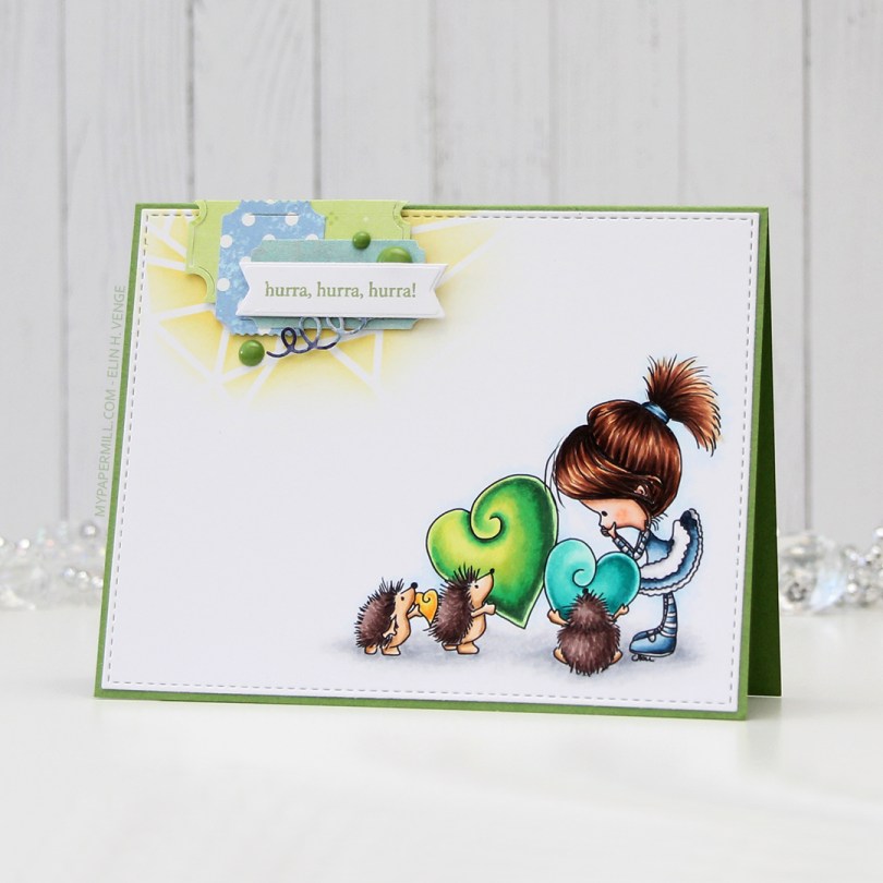


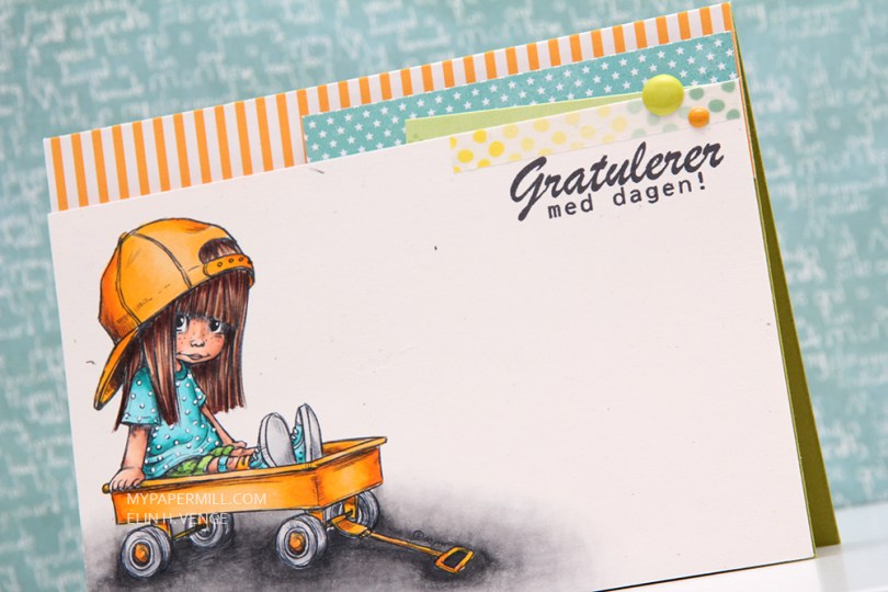
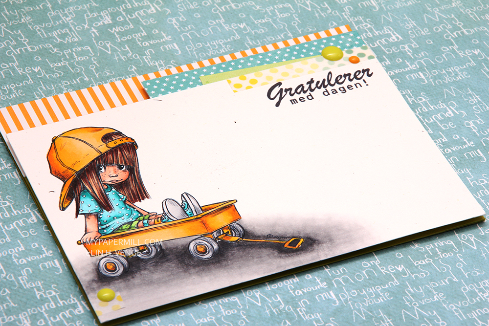 Hei og hopp! Dagens kort er publisert i aprilnummeret av Ett trykk, i Inspirert av-artikkelen som vi har begynt med i år. Jeg lot meg inspirere av
 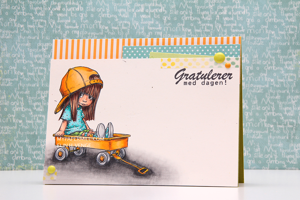 Motivet jeg har brukt er
  Jeg har satt panelet med det fargelagte motivet på 3D-teip, og pyntet bak med mønsterark. Det stripete gule er et digitalt Project Life-ark, det turkise med stjerner på er fra Papirdesign og det grønne er fra Imaginisce. Dottene jeg har satt på kommer også fra Papirdesign.
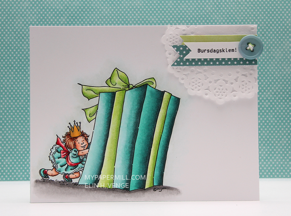 Jeg har brukt motivet
 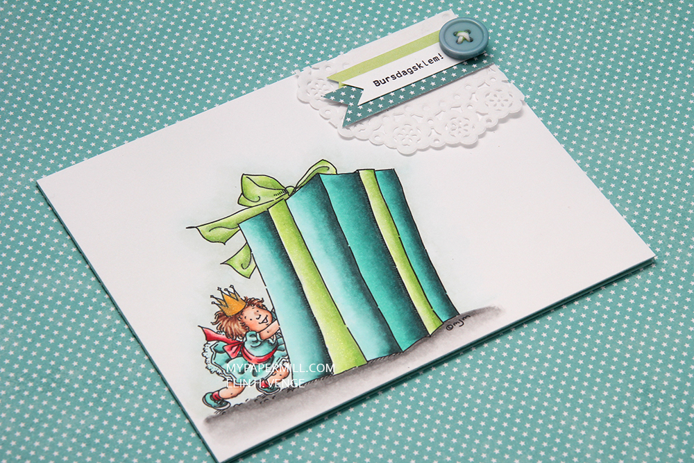 Jeg har laget en liten cluster oppe i det høyre hjørnet av en liten kakeserviett, to bittesmå vimpler laget av mønsterark og en vimpel med en stemplet tekst fra Norsk Stempelblad AS. Til slutt limte jeg på en knapp fra My Mind’s Eye med litt twine tredd gjennom.