
Hi! I have a 50th birthday card to share today, featuring the Teeing Off image from Lili of the Valley that was released a few weeks ago.
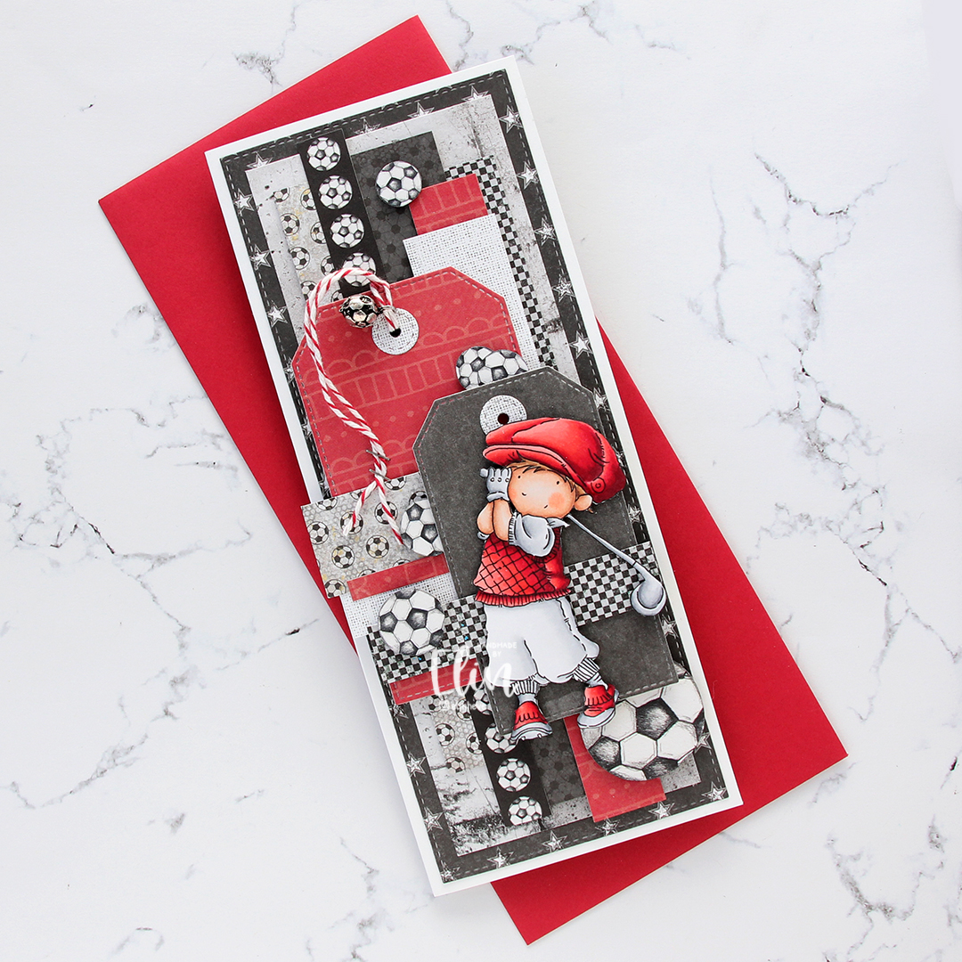
The card was made on order for a golf-playing tinsmith whose favorite football team (European football) is Liverpool. I wanted to include as many of the elements as possible, and made a slimline card with patterned paper from Papirdesign, P13 and 7 Dots Studio.
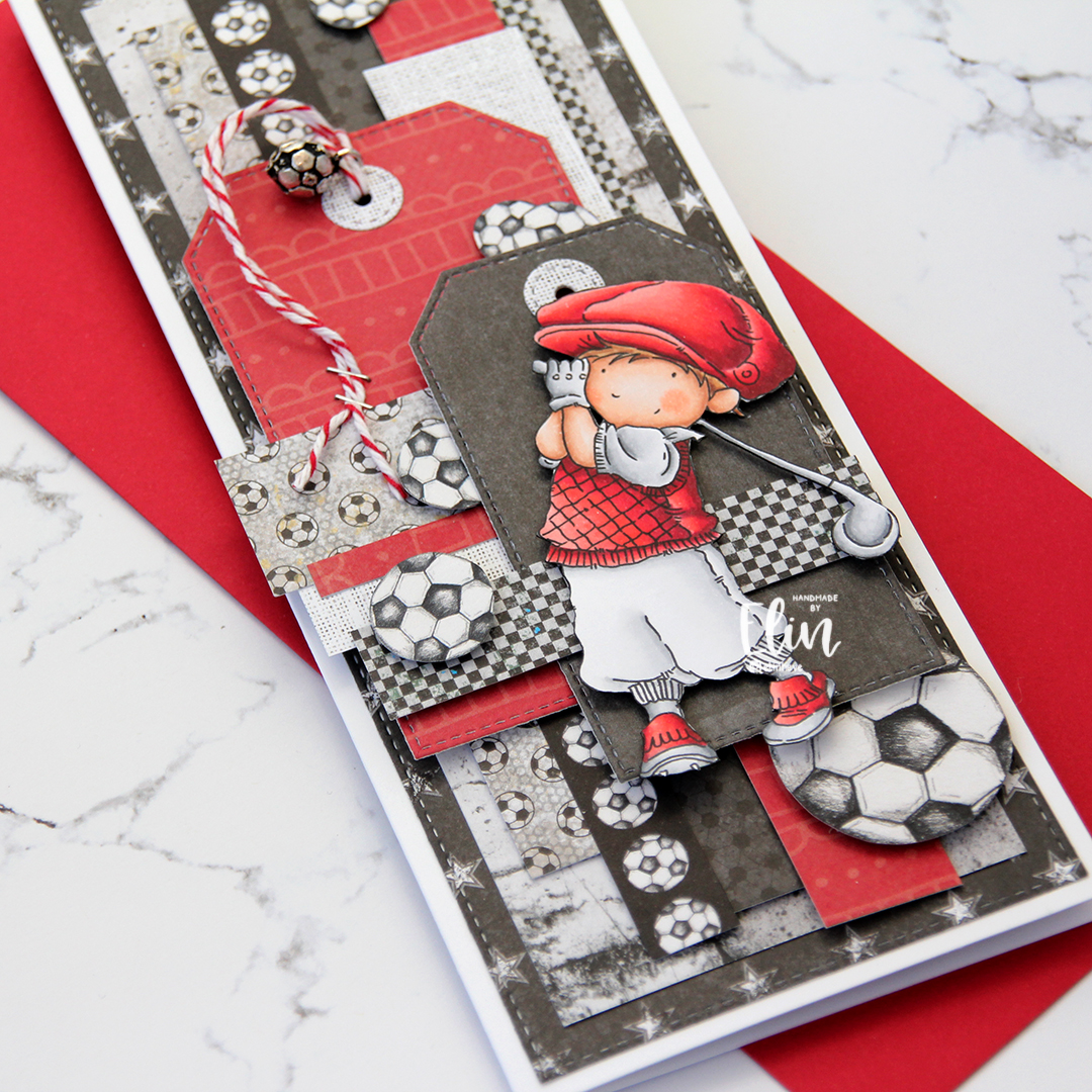
I used lots of foam tape for dimension, and varying widths of the patterned paper layered and criss-crossed across the card. I used the Slimline Starter die set from My Favorite Things and also the Stitched Trad. Tag STAX dies to create the tags. The reinforcers are made with the Tag Builder Blueprints 6 die set, also from MFT.

Through one of the reinforced holes, I pulled a piece of Cherry twine from Whisker Graphics and dug through my stash to find a ball charm, perfect for a football fan. I wanted to include a little bit of metal because of his profession, and started by stapling the twine to the tag. I also fussy cut a few footballs from patterned paper from Papirdesign that I scattered across the front.

I fussy cut my golfer and added him to the front of the card using foam tape.
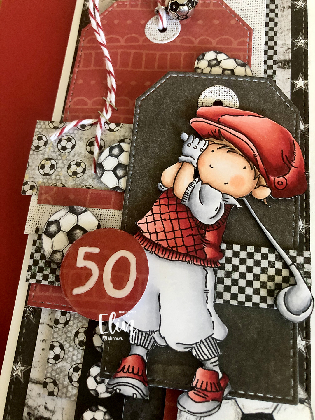
I created a circle with the recipient’s age and covered it with a thick layer of Glossy Accents. Glossy Accents takes a long time to dry, so I made this little piece before starting on the rest of the card and put it somewhere safe to dry for a few hours. Once it was time to put the card together, I’d completely forgotten about this little 1″ circle, and only found it after I’d handed the card over to the woman who ordered it. Thankfully, I was able to meet up with her the following day to add it to the card, but of course, all my photos were already taken, so I snapped this super quickly with my phone just to show what the card should have looked like all along.
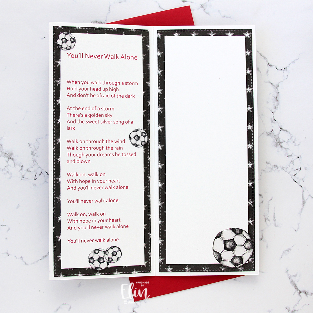
I was asked to try to put the Liverpool team song somewhere on the card, and I figured that one of the insides had just enough space. The other inside has plenty of room for a personal message to the recipient.
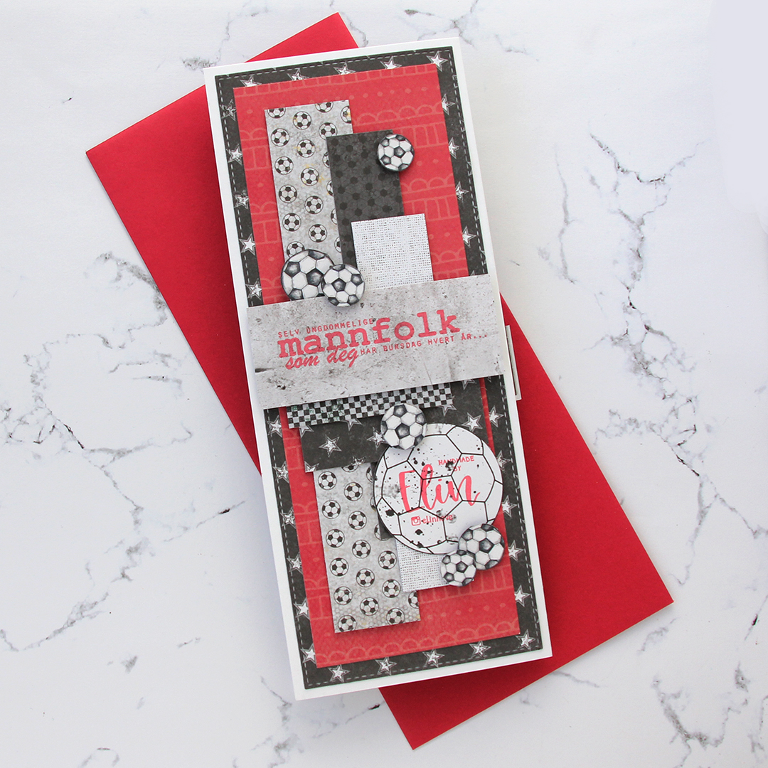
On the back of the card I used more patterned paper, more fussy cut footballs and also a sentiment from Norsk Stempelblad AS stamped in Memento Ladybug ink.
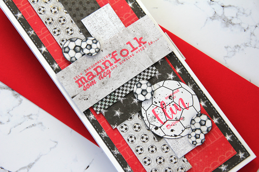
I also added my personal stamp to the back of the card, on a white football with splatters. Back in February, Create a Smile had a two week collaboration with Sommerabend where you could order personal stamps. I got this one and an address stamp. I’ve been creating cards for over 10 years, but never had a personal stamp until now, and I’m so happy with how they both turned out.
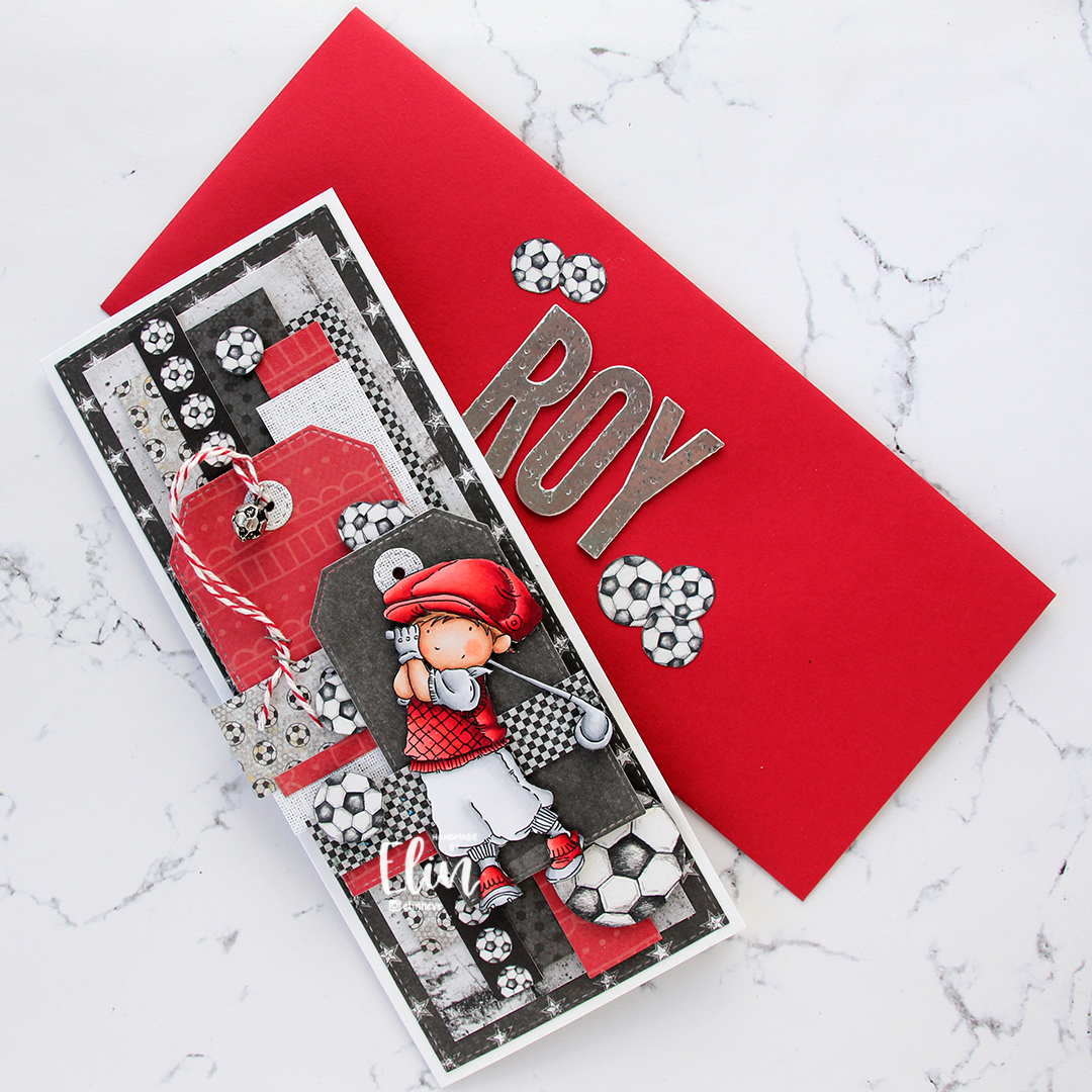
I felt like I hadn’t hit the brief in terms of the tinsmith part, so I decided to die cut the letters of his name in foil sheet and add to the front of the envelope. I put a couple of layers of plain card stock die cuts behind each foiled letter for dimension, and used an old hammer from Tim Holtz to add a little texture to the letters. A few footballs on either side of his name to complete the look.

Not a whole lot of Copics required for an image that mostly reads as red and white.


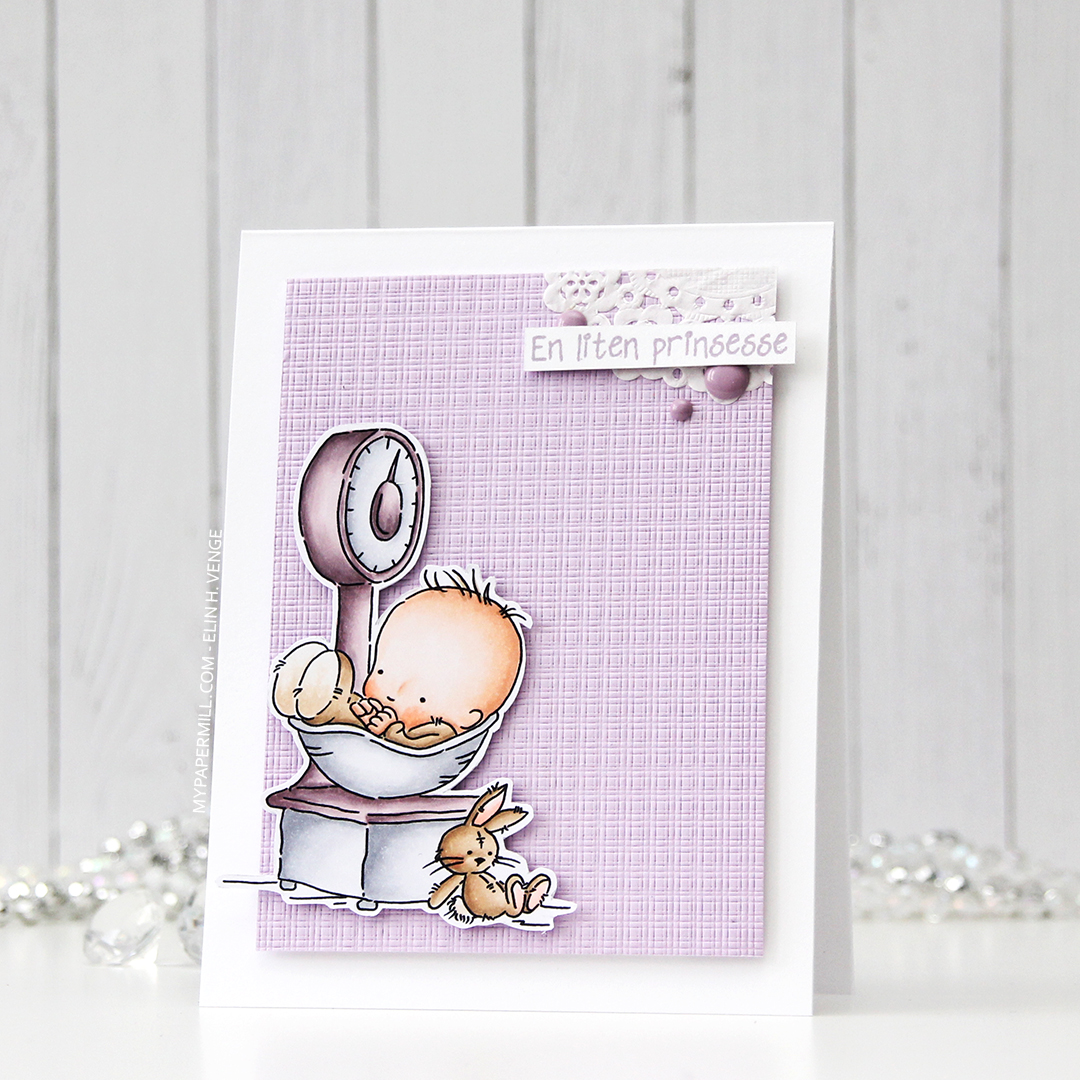
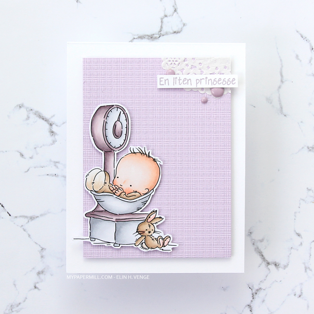
 Not a whole lot of Copics used for this image, it IS simple, after all. I also used V97, which is a color I’ve made myself.
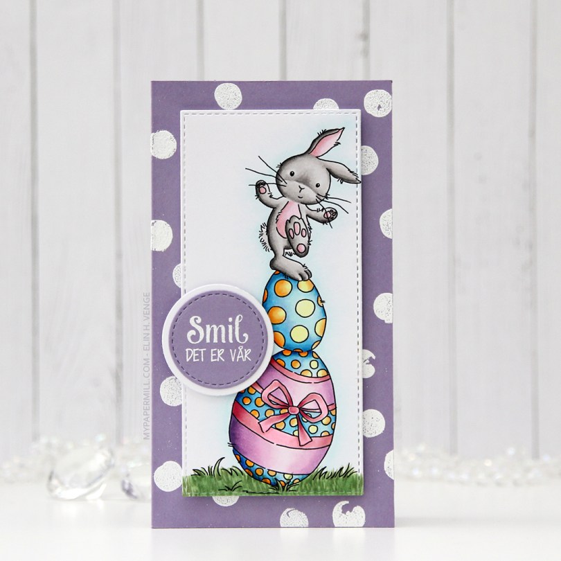
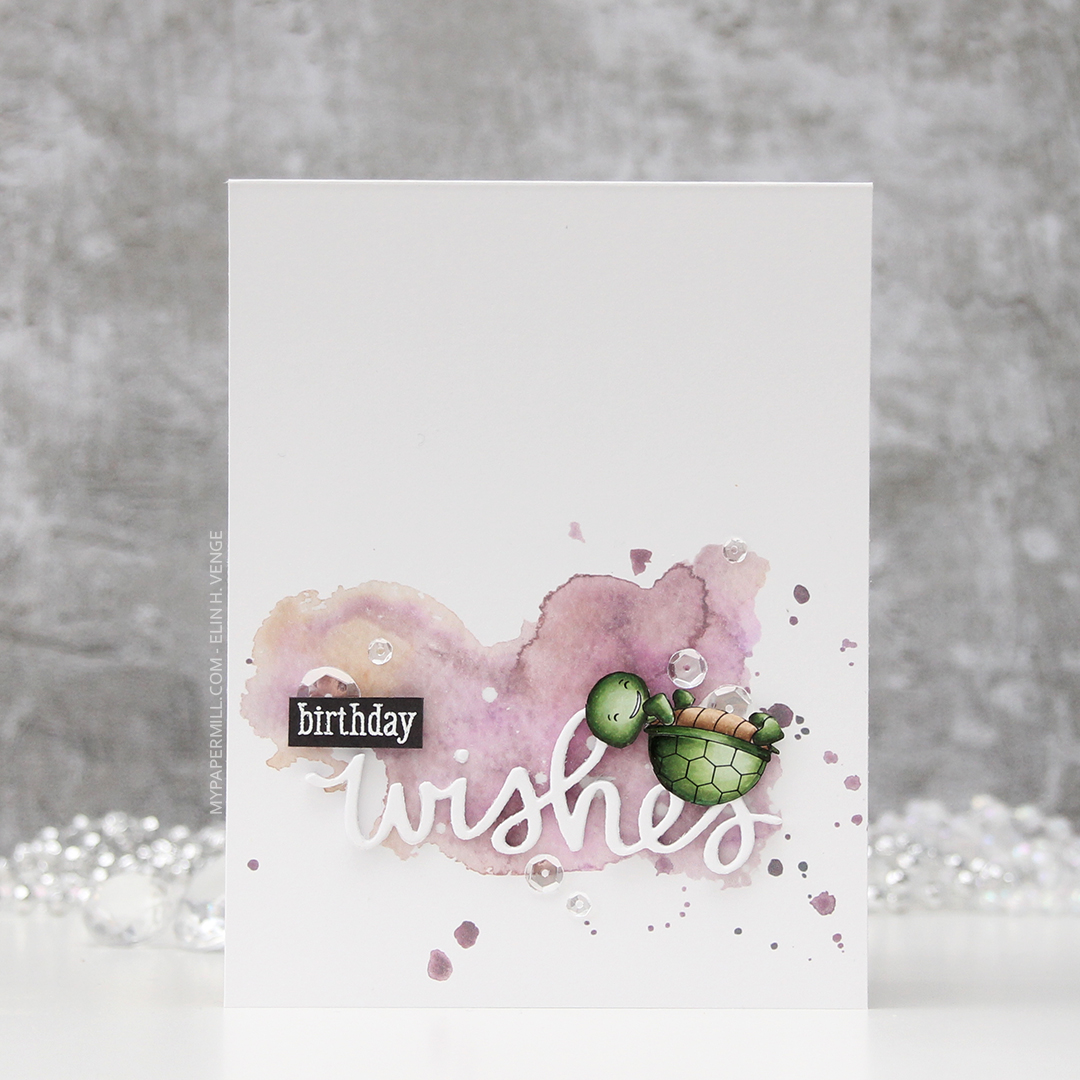
 I colored the image in with my Copics and used partial die cutting with a die from My Favorite Things to turn it into a tall, slim panel. I stamped and white heat embossed a stamp from the Pinstripe stamp set from Altenew repeatedly on a card base I made out of Winter Wisteria card stock from Papertrey Ink, and added my colored piece in the center using foam tape. I stamped and white heat embossed a sentiment from Papirdesign onto a scrap piece of card stock, die cut it and matted it with a white circle, before using 1 mm foam squares to pop it off the colored piece just a bit. And that finished the card for today. Super simple.
 Lots of colors used for this one, for some reason.
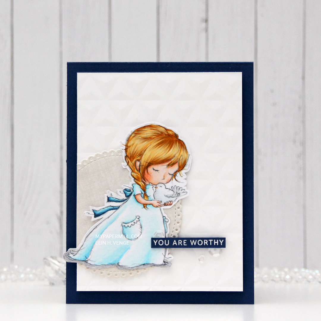 I wasn’t sure what to do at first, but wound up fussy cutting the image, leaving a white trim. I usually prefer cutting right up against the edge, but I didn’t want to cut off the sketchy lines on the perimeter of the image, and decided to leave the white border. I ran a piece of white card stock through my die cutting machine using a geometric embossing folder from We R Memory Keepers. It gives the background a nice texture without being too distracting from the image.
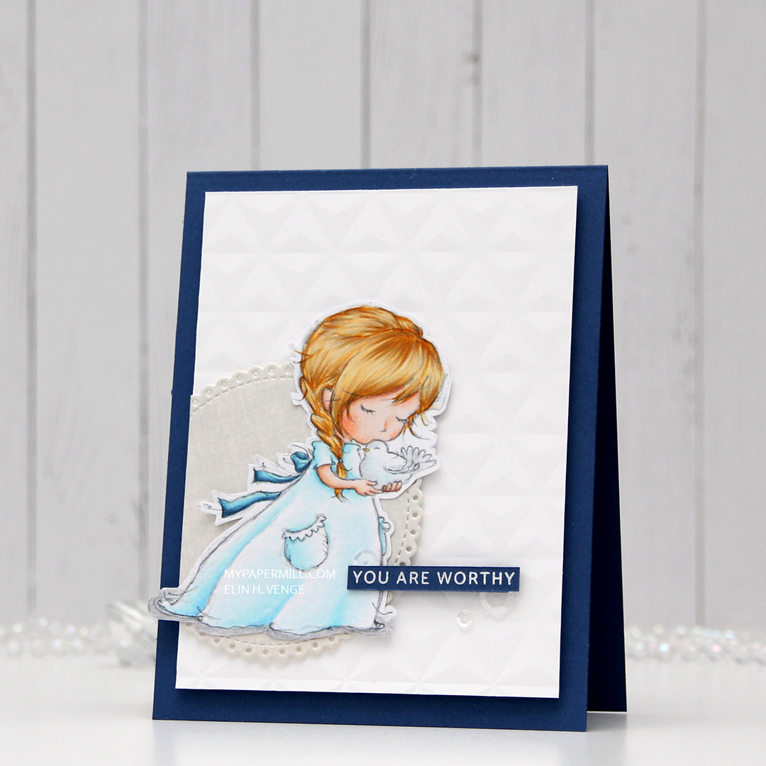 After die cutting an eyelet circle from a Cottage Cutz die set using a piece of patterned paper from DCWV, I did some aggresive cropping to one side and mounted the remainder of the circle on my dry embossed white card stock using 1 mm foam squares. I added the white panel to the card base using regular foam tape, and added the girl on top of the circle, before finishing off the card with a heat embossed sentiment from an Altenew stamp set and a few sequins from the White Orchid sequin mix from Little Things from Lucy’s Cards. The blue card stock is Blueberry from My Favorite Things.
 Last, but not least, the colors I used for my coloring.
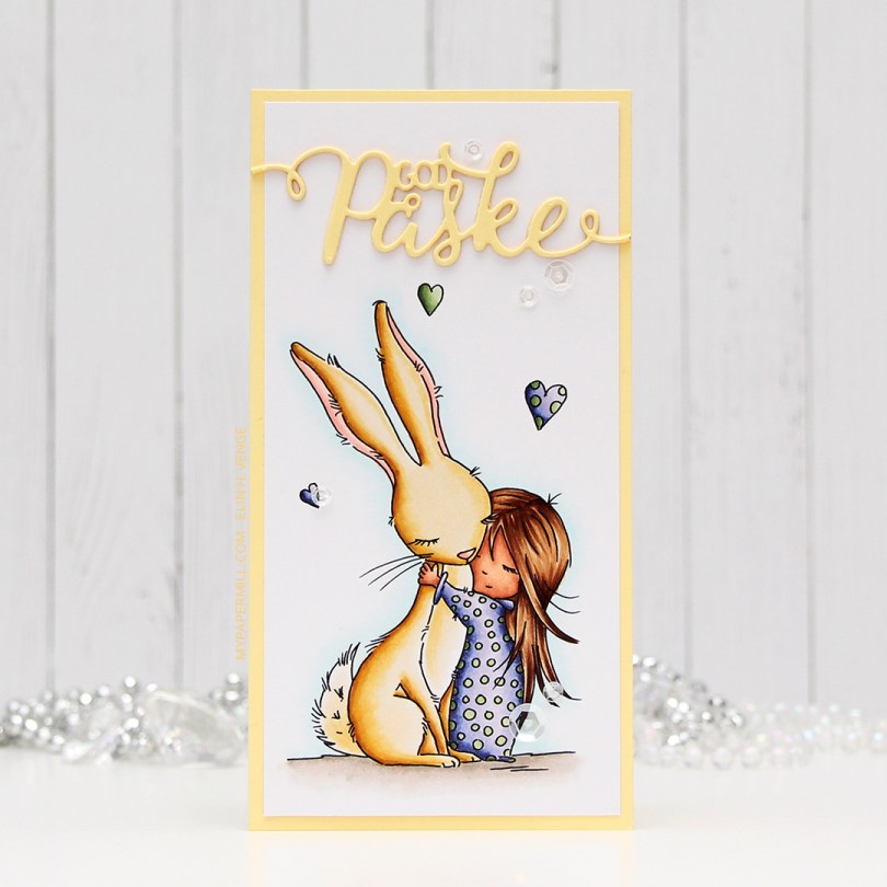
 I wanted a soft look to this, but at the same time, I also wanted to change things up a bit. I went with a darker skin tone than I normally do, and I really wanted a soft yellow bunny. I printed the image onto a piece of X-Press It blending card cut to 3×6″ for a mini slimline card. I adhered it to a card base I made from Lemon Tart card stock from Papertrey Ink with a 1/8″ border. I used the same color card stock to die cut “God påske” (Happy Easter in Norwegian) using a die from Papirdesign. I stacked three die cuts on top of each other and used a sparkle shimmer spray from Imagine to add lots of shimmer to the die cut. It has a really nice shimmer in real life, even though you can’t see it in the photo. To finish off the card I added a few sequins from the White Orchid sequin mix from Little Things from Lucy’s Cards.
 Part of me can’t believe I used five different greens for this one, but that tiny green heart? They all fit in there!