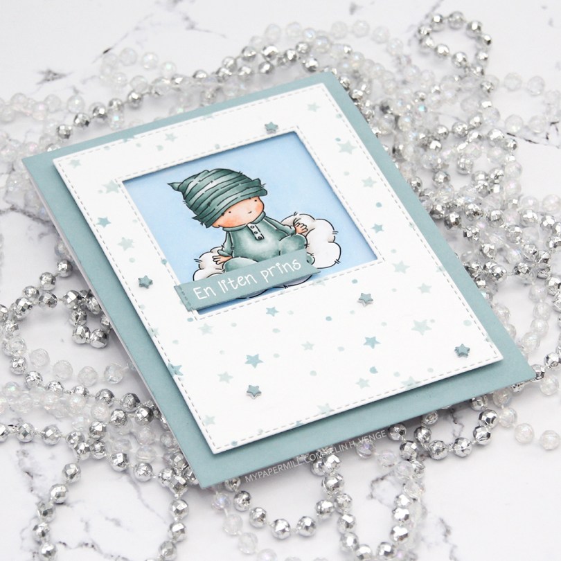
Hi, again! Two posts in one day doesn’t happen very often, but I have a baby card to share, featuring Baby Cloud from Lili of the Valley. Baby sitting on a cloud, what’s not to love?
 I had the beginnings of a plan before I started coloring this cutie, and knew that I wanted a window of sorts for the image to be sitting in. I traced a square die onto my panel before I started coloring, so I knew how large of an area I needed to fill in beyond the baby and the cloud.
 Using the Star turnabout stamp from Concord & 9th along with Misty Morning and Cloudy Sky Ink from Altenew, I was able to create a quick panel of scattered stars in colors that matched my colored image. Using dies from two die sets from My Favorite Things, I turned my panel into one with a window and nice faux stitching along the edges. I really like the look of the faux stitch lines that many of the MFT dies have. Other companies have faux stitching dies too, but there’s something about the length of the stitches, the distance between them and the adjacency to the edge of the MFT ones that make them a favorite of mine. I put foam tape on the back of my stamped star panel, making sure to center my image in the window.
 I didn’t have any card stock colors that fit my stamping and coloring perfectly, so I went direct to paper using the Cloudy Sky ink from Altenew onto a quarter piece of white lettersize card stock. I adhered that to a white top folding card base made out of Stamper’s Select White card stock from Papertrey Ink, which is the same card stock that I use throughout (except for the colored image, which is on X-Press It blending card, the only paper I use for Copic coloring). Using another die set from MFT, I die cut tiny little stars and stacked some scattered around on the stamped star panel. I stamped and white heat embossed a Norsk Stempelblad AS sentiment onto a scrap piece of my dyed card stock, before using a couple of additional dies from MFT to turn it into a banner. I love my MFT dies!
 Limited color palette. For the sky, in addition to B21, I used B20, which is a color I’ve made myself. I also used BG71, another color I’ve made, for the clothing on the baby.
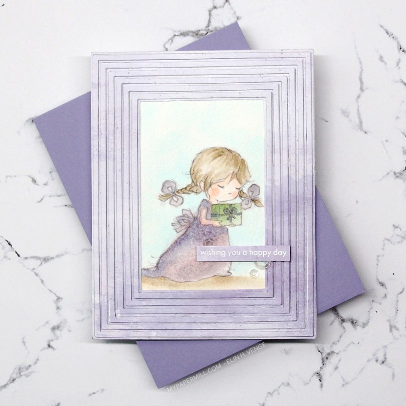
 Meet Grace. She comes in seven different poses, and each pose comes in a regular black lined version, and a more sketchy pencil style version, which is what I used for my card. I thought the sketchy look would be amazing with watercolor, but watercolor doesn’t play well with the ink in my printer, so I’ve totally cheated and used Copics. Well, Copic refills on watercolor paper, to be exact. Works like a charm and you get soft results, it’s fast to do and you don’t need a lot of colors. And for a sketchy style image like this, it doesn’t even matter if you go outside the lines a bit, it adds to that watercolor feel. I used this technique years ago (blog post
  I wanted all the focus to be on the image, and used the Fine Frames Cover die with some patterned paper from Papirdesign in a soft, matching purple, adding dimension behind every other frame (the wider ones), while gluing the others straight onto the card base.
 I stamped and white heat embossed a sentiment from the Statement Flowers stamp set from Altenew, before adding a few sequins from the White Orchid Sequin Mix from Little Things from Lucy’s Cards.
 Very limited color palette. I put a drop or two of color onto my glass work surface and picked up the color with a watercolor brush filled with blender solution instead of water. I have a watercolor brush just for blender solution.
 I had trouble deciding whether to make a card for a baby girl or for a baby boy, so I decided to go somewhat neutral with a combo of yellow and green. I colored the image with my Copics, added a clear coat of glitter on the green areas using a Wink of Stella glitter brush.
 I stamped a sentiment from Norsk Stempelblad AS using Fresh Leaf ink from Altenew, and decided to even add some clear crystals of various sizes from the Crystal Collection from Little Things from Lucy’s Cards.
 I used a frame die from Mama Elephant and die cut 3 frames; two from white card stock and one from Lemon Tart card stock from Papertrey Ink, which is a very nice soft yellow. I glued all three frames together for a stacked look and spritzed the frame with a sheer shimmer spray from Imagine, before adhering the frame onto the colored piece, and then onto a white card base. I paired it with a Lemon Chiffon envelope from My Favorite Things. It’s not a perfect match, but it’s close enough.
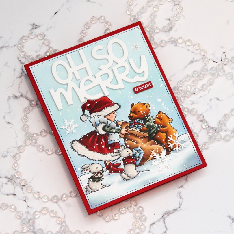
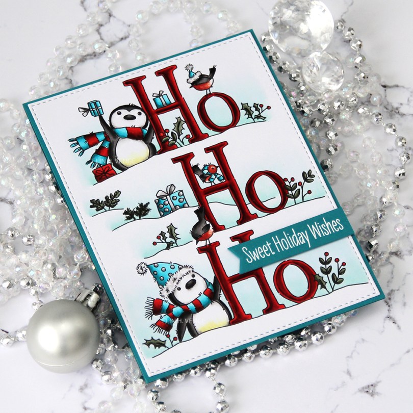
 For today’s card, I used the image “
 I die cut the words oh so merry from the Penguin’s Waddle die set from Mama Elephant a few times from white cardstock and stacked them for a dimensional look. I added chunky white embossing enamel to my scene, glued my panel onto a card base made from Pure Poppy cardstock from Papertrey Ink and glued my diecut words in the sky. I stamped and white heat embossed “& bright” from the Holiday messages stamp set from Mama Elephant onto a scrap of the same red cardstock and glued that below my diecut words. I added a few diecut snowflakes with pearls in the centers as my finishing touch.
 Lots and lots of marker, many of them used on the snow, believe it or not.
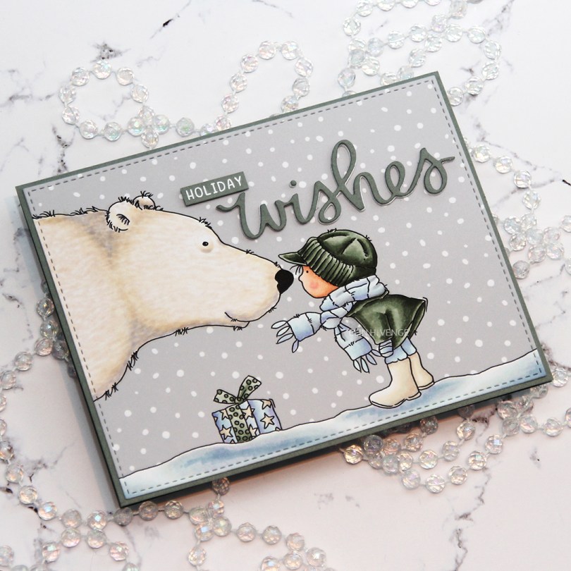
 Once I’d colored the image with Copics, I used the largest die in the A2 Stitched Rectangle STAX Set 2 from My Favorite Things to die cut a landscape oriented panel that would fit perfectly on my card base with a 1/16″ border around. I like the 1/16″ little frame, AND it’s the same width as the distance from the faux stitching to the cut line. I like having them the same. Little details like that matter, to paraphrase a famous German architect (Ludwig Mies van der Rohe, who coined the term “God is in the details”).
 I created a top fold card from Stormy Sea cardstock from Papertrey Ink. It’s a color that matches the BG90 family from Copic really really REALLY well. I need to order more, I only have half a sheet left of this color. I used the same color cardstock to diecut the word wishes using a die from Mama Elephant that was free with purchase if you spent a certain amount during their birthday extravaganza back in September. Normally I’d diecut the word several times in the color I wanted, but since I was running super low on this particular grayish green, I used a few layers of white diecut words, and only one layer of the colored cardstock on top. I stamped and white heat embossed the word “holiday” from the Iconic Ornament stamp set from Mama Elephant, also free with purchase over a certain amount on the Mama Elephant site back in September. I added a few more layers of cardstock behind it for dimension and glued it to my sky using Gina K liquid glue, which I also used for the die cut word.
 I decided not to add any additional elements. No embellishments, no nothing, I didn’t want to distract too much from that adorable image.
 Not a lot of Copics for this one, and 14 of these were used for the snow and polar bear.
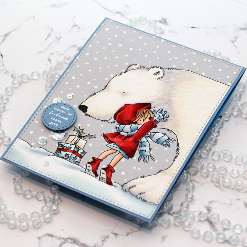
 I colored this image a while back, but only now had time to turn it into a card. I considered using a red card base for this, but really wanted the girl to pop, so I went with my trusty blue. This time I chose Blue Yonder card stock from My Favorite Things.
 I die cut the panel with the girl and the polar bear with the largest faux stitch rectangle die from My Favorite Things from their Stitched Rectangles STAX 2 set of dies.
 I used another faux stitch die to create the little circle for my sentiment, which is a stamp from Norsk Stempelblad AS. I stamped the sentiment in VersaMark ink and sprinkled on super fine detail embossing powder from Ranger before heating that until it melted.
 I mounted my little circle sentiment with foam tape and had planned to leave it at that, but I managed to spill a drop of coffee on the snow portion of my image and needed to cover that up. One single sequin would look silly, so I added a few more to make it look intentional. No one will ever know that there’s a coffee stain under that smallest one. The sequins are sparkling clear from Pretty Pink Posh.
 I use a crazy amount of markers to color snow…
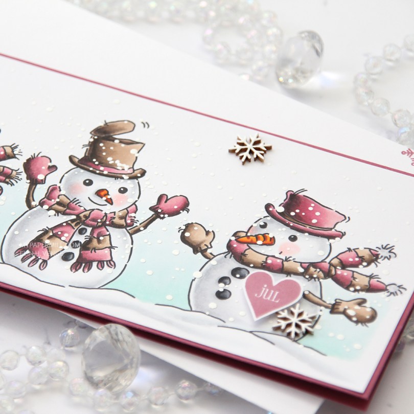
 This color palette is definitely not the norm for me, but I was surprised at how much I like it. I think the secret was finding a pink combo I liked that wasn’t a screaming hot pink, and that also had a bit of contrast within it. Even better – my pink color combo matches the Autumn Rose color from Papertrey Ink, so I created my cardbase from a sheet of Autumn Rose cardstock and even stamped a few snowflakes from an old Simon Says Stamp stamp set (Holiday Envelope Sentiments) on the envelope using Autumn Rose ink. The envelope itself is a Deluxe white slimline envelope from My Favorite Things.
 After coloring all my snowmen with Copics, I added a sprinkling of chunky white embossing enamel from Stampendous and heated my panel from the back until all the granules had melted. It warped quite a bit, so I ran the panel through my Gemini Jr without any dies, just sandwiching the panel between my cutting plates. That took care of the warping, and I could continue by gluing the panel of snowmen to the cardbase, before popping up a Norsk Stempelblad AS heart sentiment that I stamped using Autumn Rose ink. I also added a few Crafty Moly snowflakes that I covered in three layers of white embossing powder.
 RV99, R56, RV34 and RV32 – who would have guessed that it made such a pretty pink? Not me, that’s for sure, but I’m glad I stumbled upon this combo.
 This image was part of the Christmas release from Lili of the Valley that came out a few weeks ago, you can find the stamp


 I created a scene from a penguin party using Photoshop. These files are in png format, making it very easy. Looks like a surprise party to me. On this card, I used 7 of the 9 penguin images in the set, and also a couple of party hats for the penguins in front holding the birthday banner.
 I had so much fun coloring this one, and I actually used three different gray Copic families for the different penguins. The only ones I didn’t use were the cool grays. The card itself measures 8 1/2 x 3 1/2″, and I made it very simple by just gluing on my little penguin party scene to a cardbase that I created from some Smokey Shadow cardstock from Papertrey Ink.
 Really bright pops of color, I’m hoping you can’t help but smile when you see this one. Ten penguins in one card, that’s a whole lot of happy and a good way to kick off the weekend.
 These are just some of the penguin images in this set. You’ll find all the birthday penguins in the Lili of the Valley Etsy shop