
Hi, everyone! Another Wednesday already. Man, the weeks fly by so quickly. I’ve got another Mo Manning cutie to share today.
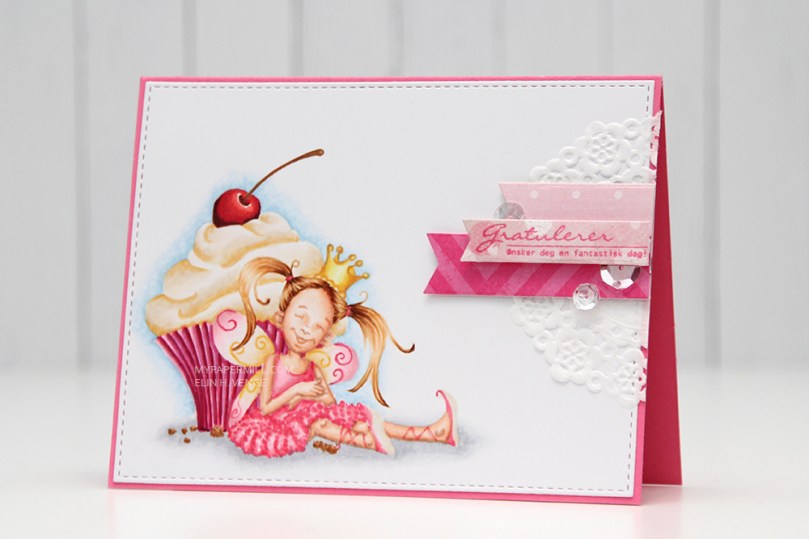 This is one of Mo’s birthday fairies. Her name is Dee, and you can find it in the store here. I actually have a red rubber version from Penny Black of this image that I actually used for this card. I stamped it in fadeout ink from Inkon3 and went to town with no line coloring. When doing no line coloring I usually stamp (or print) the facial features in a darker ink than the rest of the image, but I forgot on this one, and had to draw everything back in once my coloring was done. I used a Prismacolor pencil and held my breath as I added those details back in.
 I diecut my panel using the largest of the faux stitch rectangle dies from My Favorite Things. I think it’s the perfect size as it creates a 1/16″ border when I add it to my cardbase. The color scheme might not be typical of me, but the layout definitely is. I added half a mini paper doily from Doodlebug Design, diecut some scraps of pink patterned paper to go with my image using another favorite MFT die set (Fishtail Flag Frames) and stamped a Norsk Stempelblad AS birthday sentiment using Papertrey Ink Hibiscus Burst ink. The ink matches the cardstock, which is also Hibiscus Burst from Papertrey Ink.
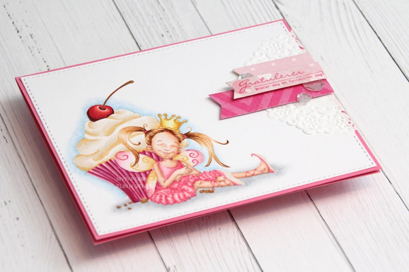 I added my banners using foam tape and embellished very simply with some sequins from Pretty Pink Posh. I even used my scissors on one to cut a little bit off and tucked it underneath that sentiment banner. Laura Bassen would be proud, haha.
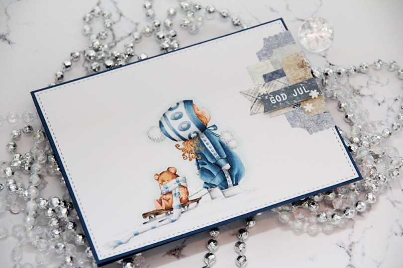
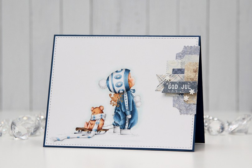 I had to use my favorite color combination for Christmas on this one. Blue, grey and brown. I made my greys very light, so they look more white than grey, and I have to admit I kind of love the look! I printed the image with 15 % opacity and did no line coloring. I love no line coloring!
 This card is very “me”. The cardbase is made from Papertrey Ink Enchanted Evening cardstock, I used a die from My Favorite Things to add the faux stitching detail on the main panel, and I added a little cluster of diecut patterned paper scraps. I stamped and heat embossed a Norsk Stempelblad AS sentiment on one of the patterned paper pieces and added three snowdrift sprinkles from Little Things from Lucy’s Card as my finishing touch.
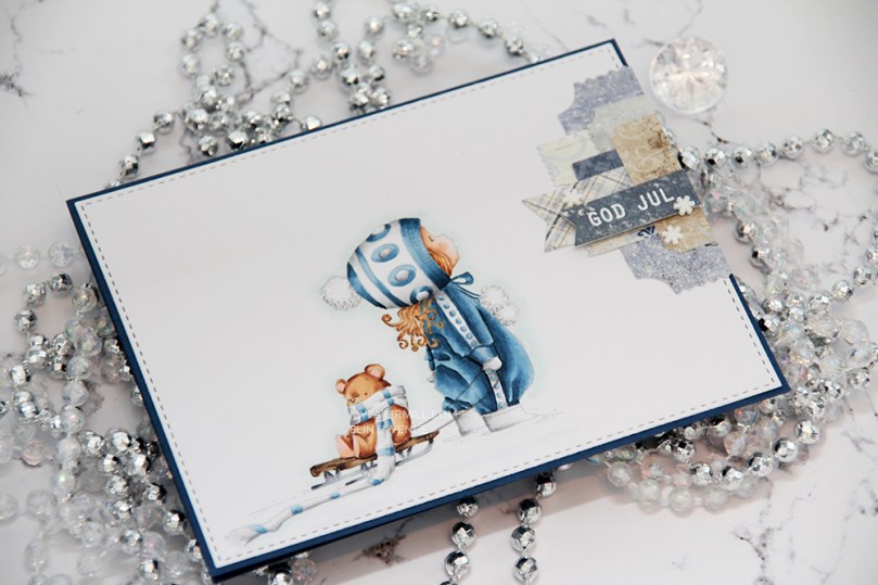 Clean and simple with cluster, these cards come together so easily once the image is colored.
 I used quite a few colors for this simple image. Lots of different earth tones for different parts of the image, and two grey families.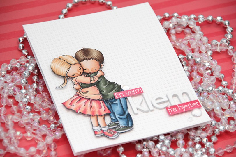
 I colored up
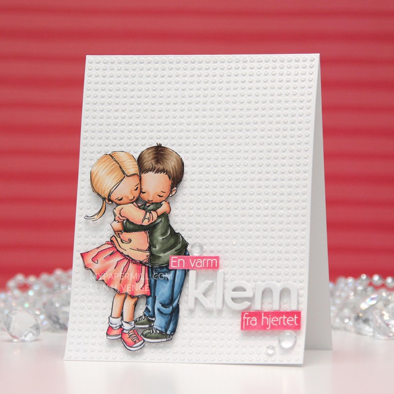
 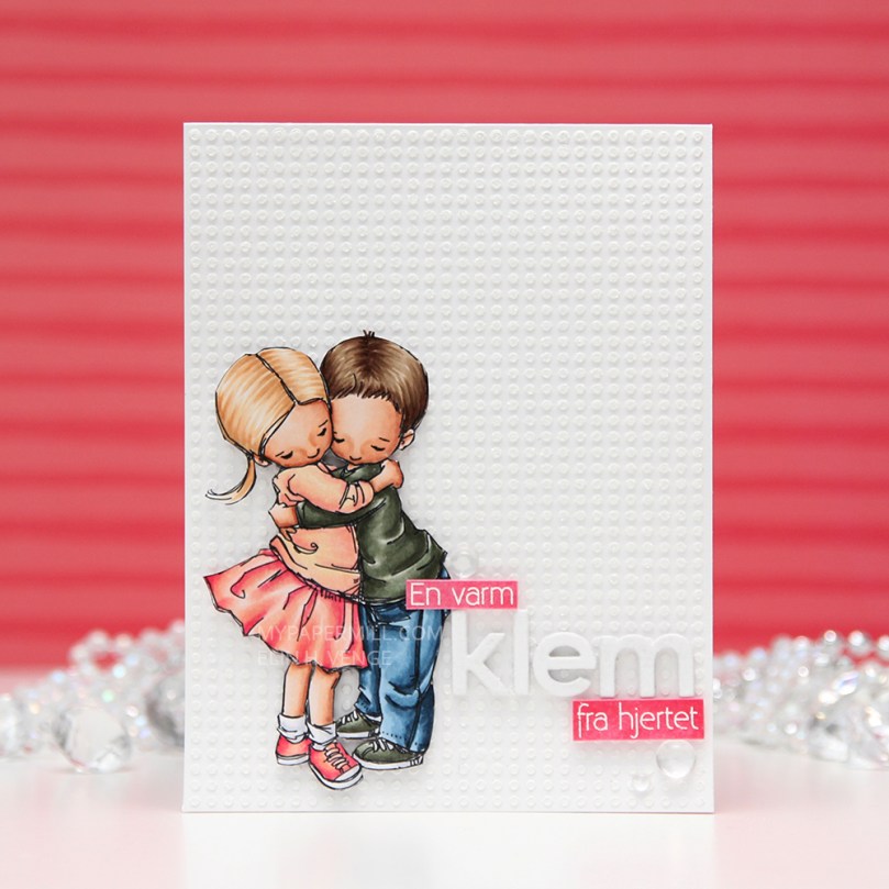 This card is somewhat different for me. It has a lot of white space, which is fairly common for me, but I used a stencil and texture paste on the card base to change it up a bit, which definitely isn’t normal for me. I even sprinkled distress glitter all over the texture paste while it was still wet, so the card sparkles when you tilt it in the light. Glitter is a nightmare to photograph, though, so it doesn’t show up in the photos very well.
 I used the Parker alpha set from Memory box to diecut the word klem, which means hug in Norwegian. I diecut each letter five times and glued them together for a stacked, dimensional look. I created a couple of pink cardstock pieces by using one of the Copic markers I used on the skirt, stamped the remainder of my sentiment and heat embossed in white before glueing them on with clear foam tape.
 By adding part of my sentiment on top of the image, I get a more cohesive design than I would have if I had put my little sentiment strip above the word only. Just a little design tip. I finished off the card by adding a few raindrops from Little Things from Lucy’s Cards.
 These are all the Copics I used, and I must admit that I really love the pink and peach combos I came up with for this one.
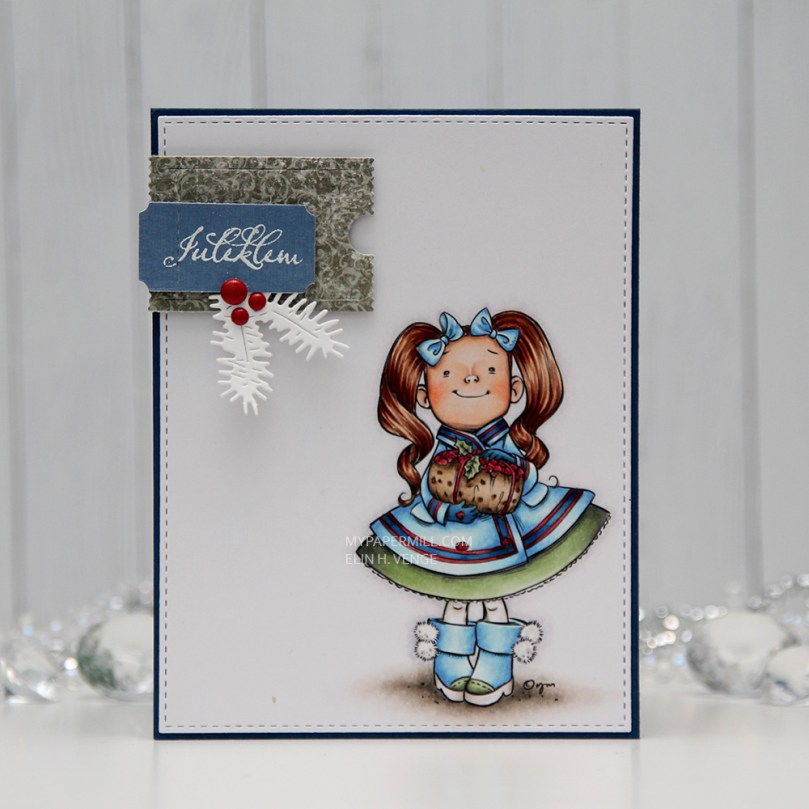 I colored up
 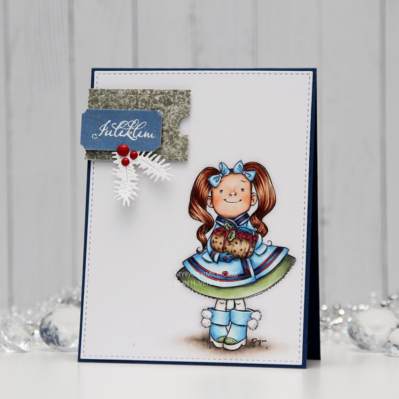 I used a Docrafts die to create those tickets from scraps of patterned paper from Maja Design, popping them up on foam squares from Gina K designs to give them a little bit of dimension. I white heat embossed a sentiment from Ladybug & Friends on one of the tickets and tucked a diecut pine branch behind it. I finished by adding a few red enamel dots from Papirdesign, tying in the red details from the colored image.
 As usual, I finish with the Copic colors I used to color my image.
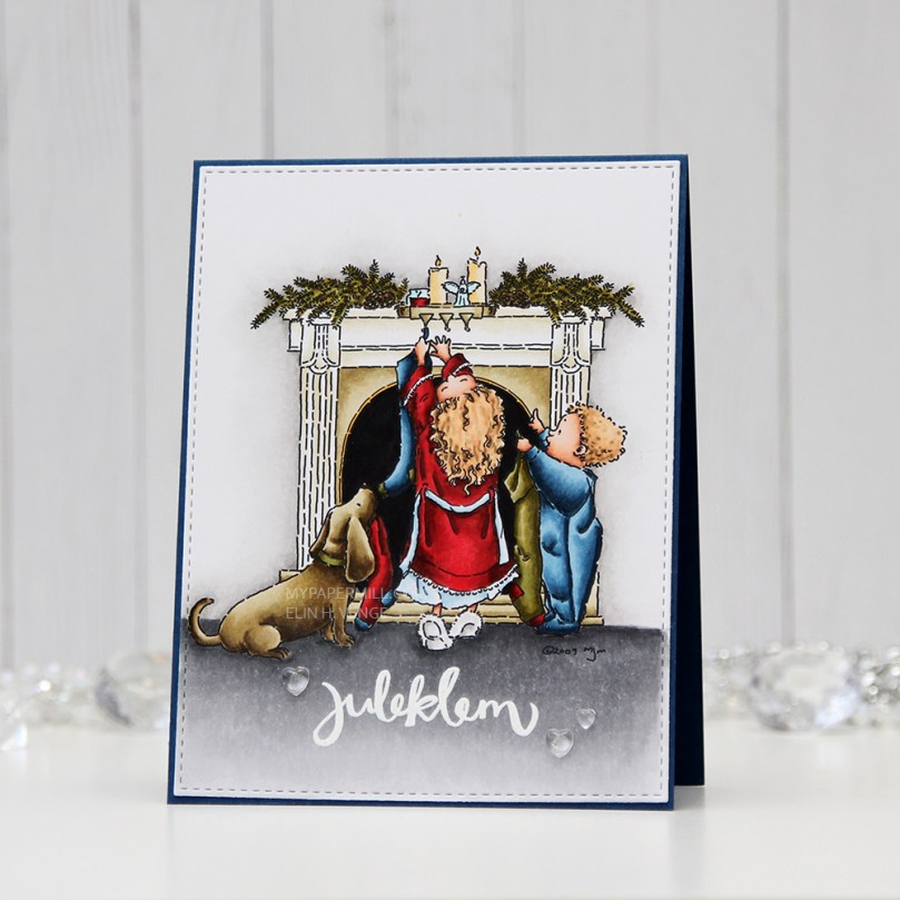 I colored up
  I’ve had this image for so long, and it really felt good to finally color it up. I used the largest of the dies in the Stitched Rectangles STAX (2) set from My Favorite Things, before heat embossing a Norsk Stempelblad AS sentiment in white using super fine detail embossing powder from Ranger.
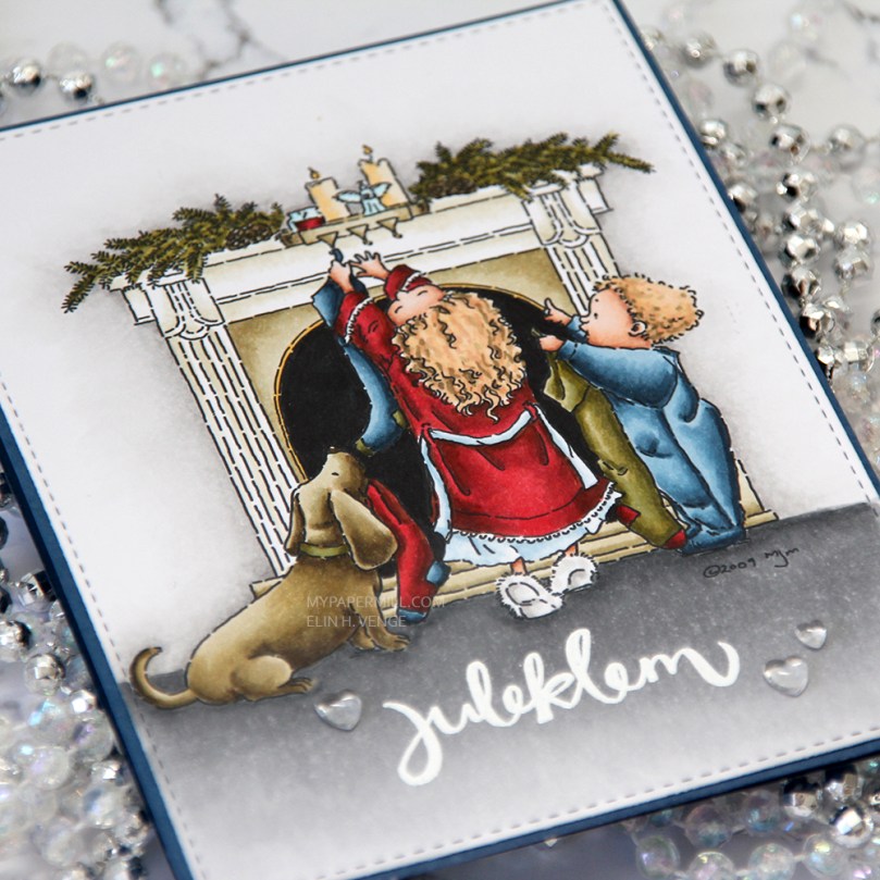 I love the look of those heart shaped raindrops from Little Things from Lucy’s Cards. They’re part of the crystal collection and add the perfect little touch to such a simple card.

 I turned my image into a card last night by stamping a sentiment, diecutting the entire panel with a faux stitch rectangle die, adding that to my card front and embellishing very sparingly with three clear crystals from the Ice Water mix from Little Things from Lucy’s Cards. That’s it.
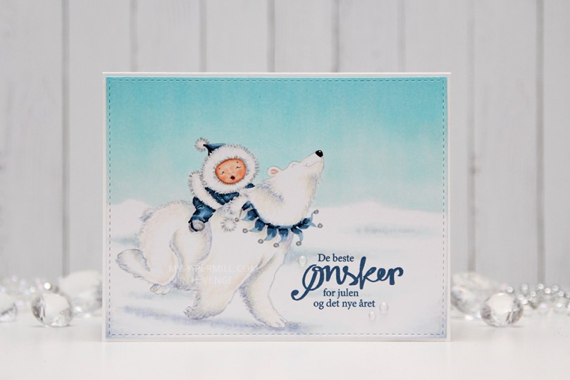 The sentiment is from the B04 stamp set from Norsk Stempelblad AS. I love the stamps Åshild has designed and am so glad I have so many different sets from them. I used Enchanted Evening ink from Papertrey Ink. It’s a beautiful dark blue color.
 Cards don’t get much simpler than this. And cards like this are so fun to make, too.
 Would you believe I used 10 (yes, ten) different colors for the fur?? Am I crazy?
 I colored her up with my Copics, focusing on the RV90s that go so incredibly well with the patterned paper from Papirdesign that I used, it’s ridiculous!
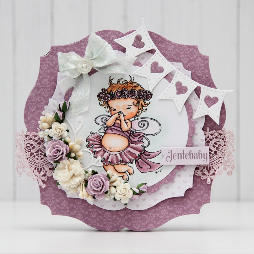 I made a shaped card using the third largest die in the XXL Square Frames Frilly #10 set from GoKreate, and did a whole bunch of diecutting elsewhere on the card too. To break up the monotony of a diecut on top of a slightly larger diecut on top of a slightly larger diecut on top of a slightly larger diecut, I cut some Kort & Godt lace and put it across the card. The diecut heart banner, the word banner and all those Wild Orchid Crafts flowers also help. The flower berries and pearls are from Kort & Godt.
 There’s a banner hidden behind that image, diecut with a Magnolia die. I tied a bow of seam binding ribbon with the help of a DIY bow easy, I can’t make nice bows for cards to save my life (true story!), so the Bow Easy helps. I stamped a Papirdesign stamp using Memento Sweet Plum ink, which also matches the patterned papers beautifully. On top of the bow I added an old button from Melissa Frances.
 Is that an adorable little fairy or what? Those flower berries from Kort & Godt are really old, I think they might actually be from their first production of flower berries. They made some later on that had more of a greenish yellowy tint, but these are more creme colored and perfect for this card. I still have a few left, I only use them on very special cards.
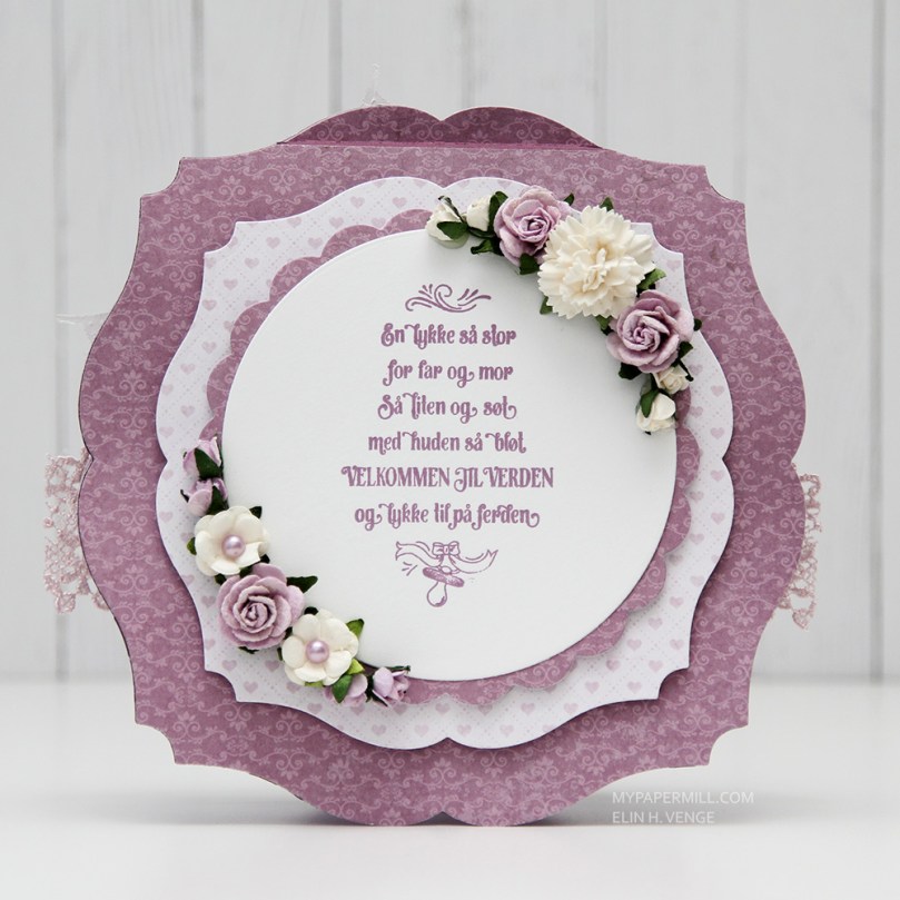 I added another Papirdesign sentiment stamp on the back of the card, along with a few more flowers. I removed the centers of the sweetheart blossoms and added back in some purple pearls from Papirdesign that once again matched the colors of everything else.
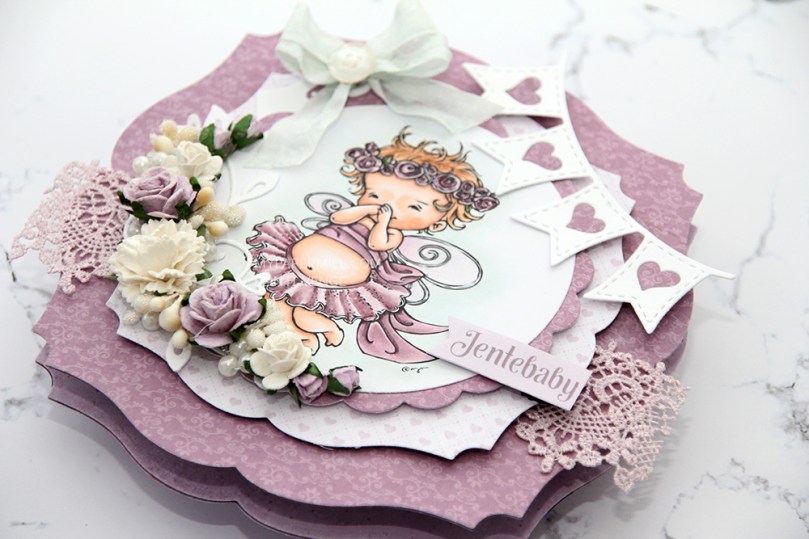 As you can see from the above photo, this is a very dimensional card and not at all mail friendly, it’s super thick.
 Not too many Copics used for this one. Probably because it’s mostly that one dominating color.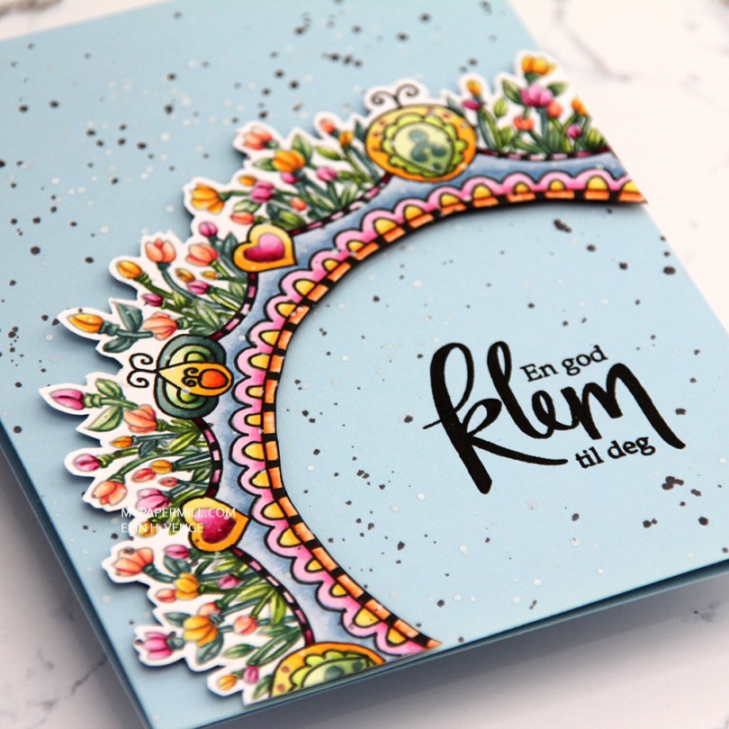
 This is a lot more artsy than what I normally do. I printed the image with an opacity setting of 25%, colored it with Copics and then used a Copic multiliner to add back in some black lines in selected areas before fussy cutting my image with a thin, white border on the outside and straight up to the black line on the inside.
 I used foam tape from Gina K to pop up my colored piece onto a cardbase I made from Spring Rain cardstock from Papertrey Ink.
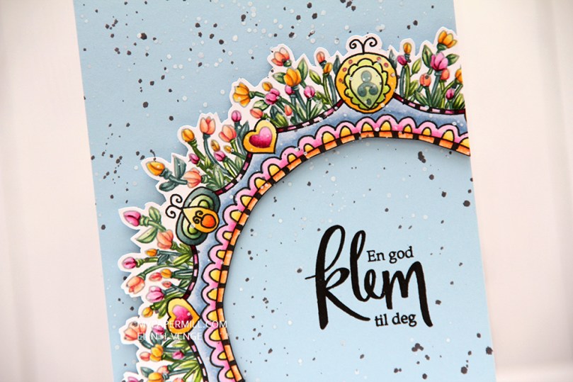 I stamped a Norsk Stempelblad AS sentiment using VersaFine Onyx Black ink, and added splatters across the entire card with white liquid watercolor from Hero Arts and a watered down black ink.
 Not exactly my usual style of card, this one. What do you think?
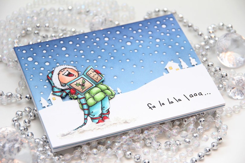
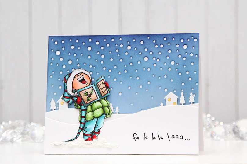
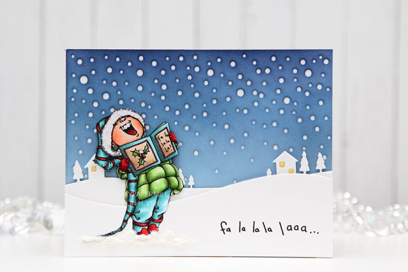 I diecut a panel of Spring Rain cardstock from Papertrey Ink using the Snowfall Backdrop die from Lawn Fawn and ink blended over the top. I used Chipped Sapphire Distress ink, Faded Jeans Distress ink, Stormy Sky distress ink and Spring Rain dye ink working my way from top to bottom, dark to light. I glued the piece straight onto my white cardbase.
 I used the Country Landscape die from Memory Box to diecut the background hills from Stamper’s Select White cardstock from Papertrey Ink. I used the same die to diecut the windows using Harvest Gold cardstock, also from PTI, and inlaid them. I popped the entire panel on low foam tape for a little bit of dimension. I then diecut my panel with the sentiment already printed using a die from the Stitched Hillside Borders die set from Lawn Fawn. I’m a huge fan of faux stitch dies, but since the Memory Box die doesn’t have the faux stitching, I didn’t want it on my top panel either, so I used the die upside down and glued this snow bank on with low foam tape. To ground my image I used snow paint just below it as snow, and sprinkled rock candy distress glitter on top while the snow paint was still wet.
 I changed up the sentiment a little. There’s an exclamation mark at the end, but I wanted that to be on the inside, so I added three dots instead and printed the same sentiment on the inside with the three dots in the beginning and the exclamation mark at the end.
 I was a little hesitant about using my blue background at first, because I didn’t think the image stood out enough against the blue. When I created the snow banks, the whole thing transformed, and I’m glad I stuck with the blue.
 Not a lot of markers for this one.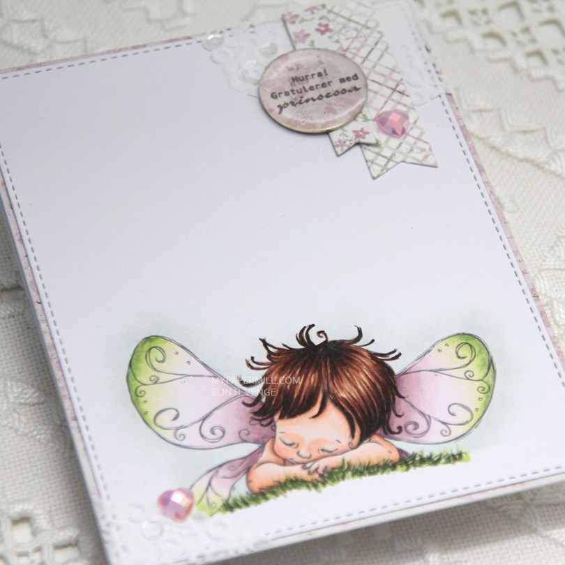
 I printed my image on a piece of X-Press It cut down to 4 1/4 x 5 1/2″. I colored my image with my Copics and used the largest of the stitched rectangle dies from My Favorite Things to cut it slightly smaller.
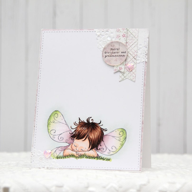 I’m also doing my best this year to use scraps of patterned paper. I have a basket of scraps that I’ve cut down to card front sizes, and I realized pink is the color I have the most of, which was the reason for my color choice today. I found a pink scrap in the basket that I wanted to use, colored my image in matching colors and took a bit of a dive into my smaller scraps to find pieces to use for my cluster. The circle with the sentiment is actually cut from the center of the patterned paper I used on the front of this card, which is a scrap from the Vintage Summer Basics collection from Maja Design. The diecut banners are from the Sofiero collection, the colors were perfect for this card.
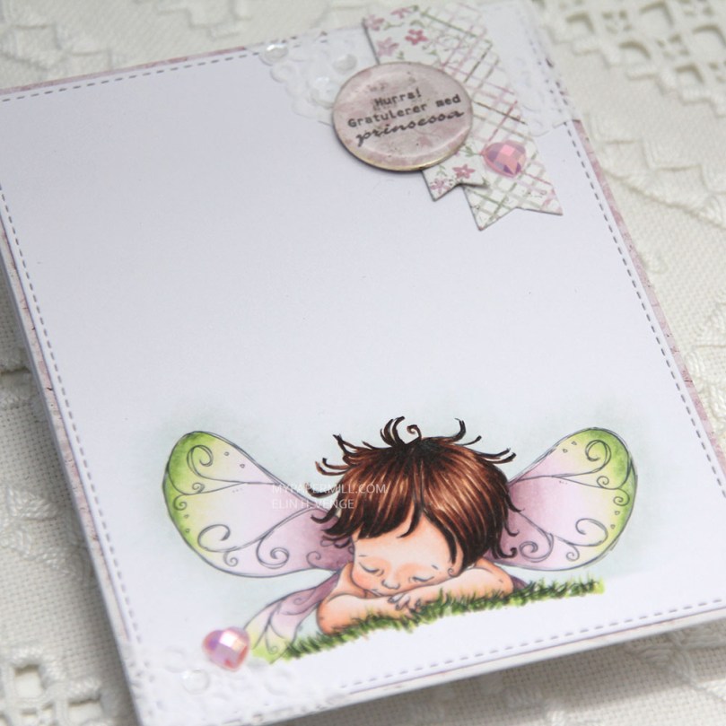 I used part of a Doodlebug mini paper doily in the top right corner as a base for my small cluster. I had a tiny bit left over and glued in the opposite corner. I embellished very simply with a couple of hearts from the Rosy Glow mix from Little Things from Lucy’s Cards and sequins from the White Orchid Sequin mix, also from Little Things from Lucy’s Cards. I added an epoxy pebble to the sentiment circle for a little bit of extra dimension and interest.

