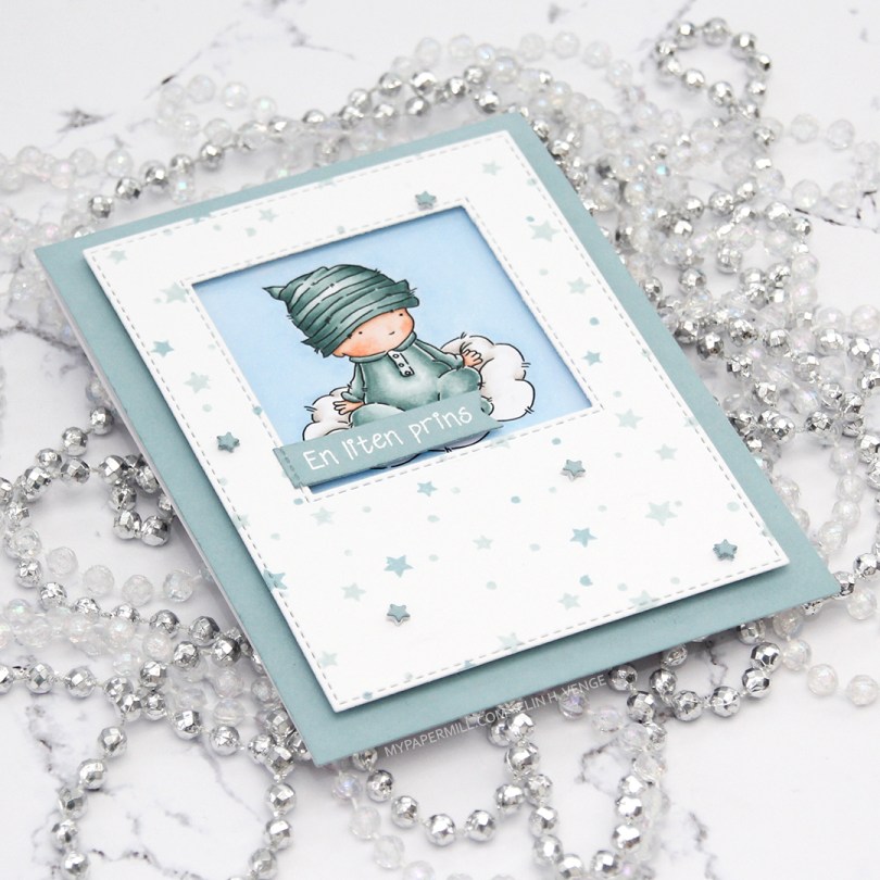
Hi, again! Two posts in one day doesn’t happen very often, but I have a baby card to share, featuring Baby Cloud from Lili of the Valley. Baby sitting on a cloud, what’s not to love?
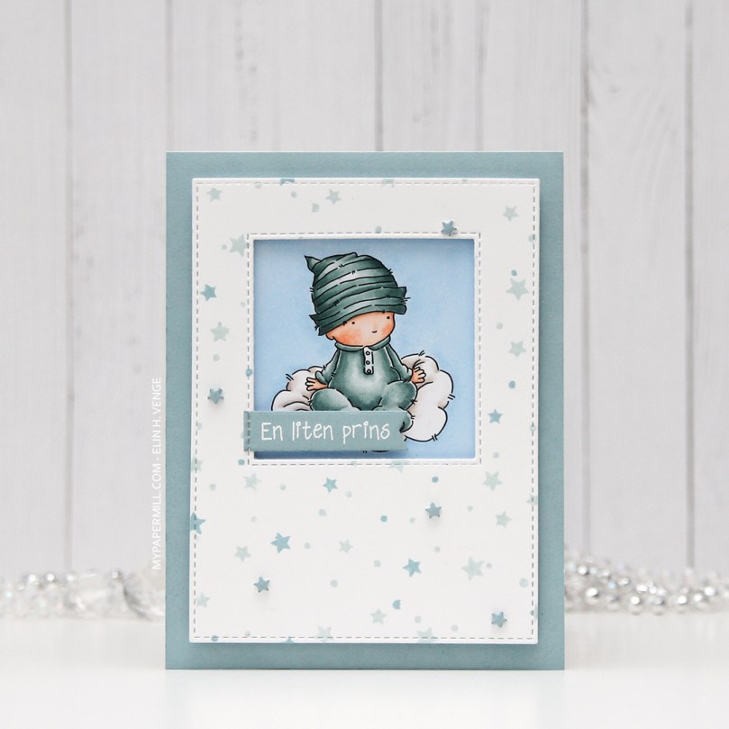 I had the beginnings of a plan before I started coloring this cutie, and knew that I wanted a window of sorts for the image to be sitting in. I traced a square die onto my panel before I started coloring, so I knew how large of an area I needed to fill in beyond the baby and the cloud.
 Using the Star turnabout stamp from Concord & 9th along with Misty Morning and Cloudy Sky Ink from Altenew, I was able to create a quick panel of scattered stars in colors that matched my colored image. Using dies from two die sets from My Favorite Things, I turned my panel into one with a window and nice faux stitching along the edges. I really like the look of the faux stitch lines that many of the MFT dies have. Other companies have faux stitching dies too, but there’s something about the length of the stitches, the distance between them and the adjacency to the edge of the MFT ones that make them a favorite of mine. I put foam tape on the back of my stamped star panel, making sure to center my image in the window.
 I didn’t have any card stock colors that fit my stamping and coloring perfectly, so I went direct to paper using the Cloudy Sky ink from Altenew onto a quarter piece of white lettersize card stock. I adhered that to a white top folding card base made out of Stamper’s Select White card stock from Papertrey Ink, which is the same card stock that I use throughout (except for the colored image, which is on X-Press It blending card, the only paper I use for Copic coloring). Using another die set from MFT, I die cut tiny little stars and stacked some scattered around on the stamped star panel. I stamped and white heat embossed a Norsk Stempelblad AS sentiment onto a scrap piece of my dyed card stock, before using a couple of additional dies from MFT to turn it into a banner. I love my MFT dies!
 Limited color palette. For the sky, in addition to B21, I used B20, which is a color I’ve made myself. I also used BG71, another color I’ve made, for the clothing on the baby.

 I really enjoyed playing with the mini slimline format last week, so I wanted to create another mini slimline. Last time, I slightly miscalculated the measurements I needed to create the matching envelope, so I made this one a little bit smaller, so it fits inside the envelope from last week that was just a tad too small for that particular card. This one measures 3 3/8 x 5 7/8″. I didn’t want to mess with the scene too much, so I die cut a few clouds from vellum using dies from Papertrey Ink and white heat embossed a Norsk Stempelblad AS sentiment onto one of the clouds. I mounted the clouds onto tiny pieces of foam, and added enamel dots from Papirdesign on top in very strategic spots.
 I used a bright color palette for this one.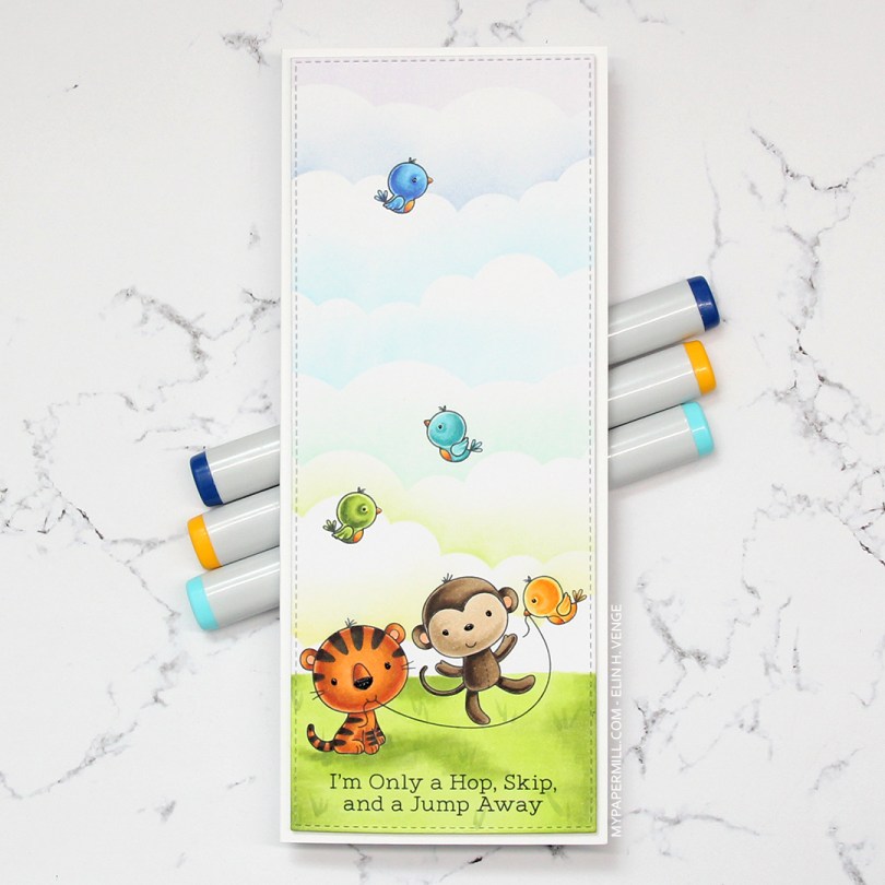
 I colored in all the critters using Copics, before masking them off and creating clouds behind them using a
 I don’t often purchase coordinating dies for stamp sets, but boy, they make it easy to add dimension. Once I’d colored up the little girl with the balloon, I die cut her and four additional pieces from white card stock to add dimension behind her. Way more sturdy than foam tape.
 I wanted to use lots of other goodies from MFT on this card, so I used the cloud stencil with a very light blue ink (Iceberg from Altenew) to create a barely there puffy cloudy sky behind her. It’s really soft, but shows up better in real life than in photos. I used a couple of elements from the Scene Builder stamp set and stamped those near the bottom using Fadeout ink from Inkon3 for a little bit of no line coloring. I die cut the largest of the Stitched Rectangle Scallop Edge Frames four times from Peach Bellini card stock and glued them together for dimension.
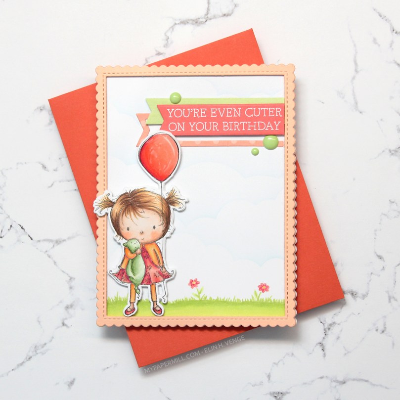 I added clear Wink of Stella glitter and a thick layer of Glossy Accents on the balloon, before stamping and white heat embossing one of the sentiments in the Birthday Cutie stamp set onto Berry Sorbet card stock from Papertrey Ink. I die cut the sentiment using one of the Fishtail Flag Frames dies from MFT, and found some scraps in my stash that I’d already die cut using dies from the same set. I use that die set a lot. I added three green enamel dots from the Tropical Forest set from Altenew and my card was finished. I paired the card with a Persimmon envelope, also from MFT. I love their envelopes!
 Lots of colors for this one! I was going for a peachy pink jacket and leggings, but it was too close to the pink I’d used for the rest of her, so I added some yellows on top. I also decided to go for a brighter green on the grass than her little stuffie.
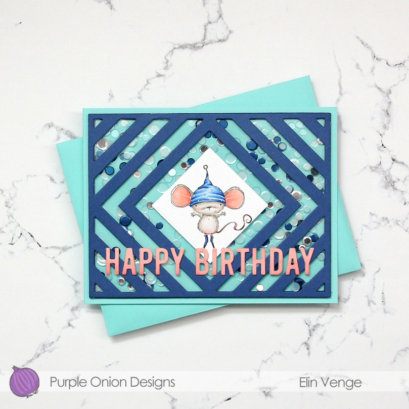 My sister’s birthday’s in a few weeks, and I thought this was the perfect card for her. She used to have the nickname “musa” (the mouse) when we were kids. Our cousin, a few months younger, was also quite a bit bigger, earning her the nickname “rotta” (the rat). Of the two, I think my sister got the better nickname.
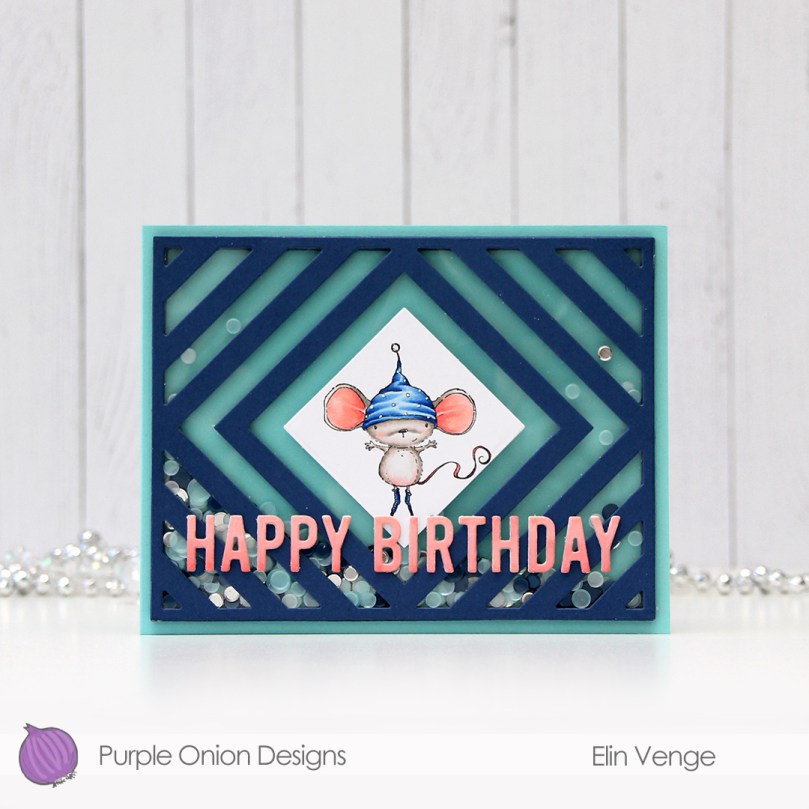 I die cut the frame five more times, cutting away the interior pieces and stacking the frames to form the walls of my shaker. The frame is quite thin, so I didn’t trust myself enough with a ruler and a craft knife to create five identical frames. Die cutting seemed safer and quicker. I’ve kept all the pieces and am planning on using them in the future for a card or two.
 There’s quite a bit of dimension in this. Card base, five layers of walls for the shaker, a piece of acetate, die cut cover frame on top, then three layers of letters. Dimension is life!
 Limited color palette with such a small image.
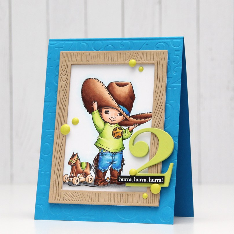 I colored up the image with my Copics. Nothing unusual about that, but these blues are brighter than the ones I normally use. The colored panel was too narrow to fill the width of a regular card, so I decided to put a frame around it. I used one of the wood frame nested dies from Hero Arts to create my frame from Classic Kraft card stock from Papertrey Ink, and built up layers by adding a few more frames behind the top one. I created a card bas from Lush Lagoon card stock from Papertrey Ink, and used the By the numbers impression, also from PTI, to create a debossed look to the card base. There’s quite a bit of blue showing outside the frame, so I wanted a little bit of texture there.
 Using Limelight card stock from My Favorite Things, I die cut the number (from the By the numbers die set from Papertrey Ink) four times and stacked them for a dimensional look. I adhered the number to the frame using liquid glue, and glued a white heat embossed black sentiment strip on top, with two more layers of black card stock behind that, for even more dimension.
 I added a bunch of green enamel dots from Papirdesign, and rummaged through my old patterned paper for one I could make an envelope from. I struck gold with this green one from Pion Design from 2010. I don’t use a lot of patterned paper anymore (at least not big pieces), but I can’t exactly throw it away, either, so I figure it’s perfect to create envelopes from. This way, they get used!
 Super bright colors. Well, except for all the browns. I actually used five colors for his sheriff’s badge before I ended up with a color I liked.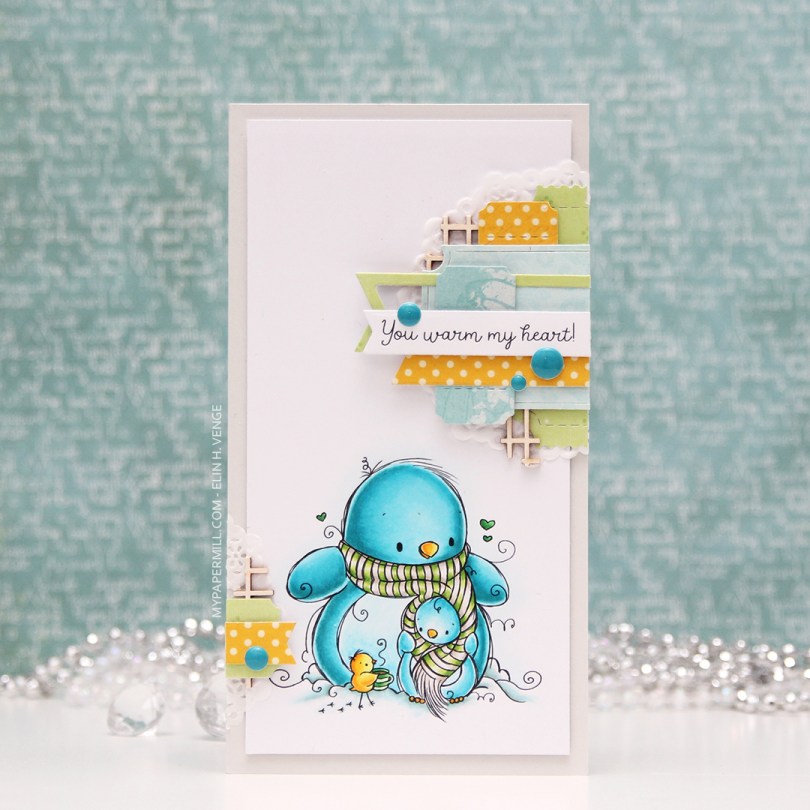
 My card measures 3 1/2 x 6 1/2″. I printed the image onto X-Press It blending card and colored it with my Copics. I was planning on doing a split complementary color scheme, but went with an analogous in the end, which is never a bad idea, in my opinion. I adhered the colored panel onto a card base I made from Soft Stone card stock from Papertrey Ink, adding two layers of cardstock behind the image for added dimension.
 It’s no secret that I love enamel dots, and the Cool Summer Night enamel dots from Altenew were the *perfect* color to match my penguin. Since I didn’t have any envelopes in the right size for this card, I created my own using patterned paper from Papirdesign and my envelope punch board from WRMK.
 I love this color palette. In addition to these colors, I also used BG71, which is a color I’ve created myself.
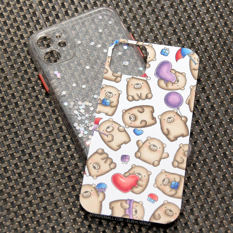 I stamped the bears randomly across a piece of X-Press It blending card using Extreme Black ink from My Favorite Things. It’s a great all around ink that you can use for both watercolor and alcohol markers. I colored the bears and realized I needed some colors for the accessories. I didn’t want to mess up, so I called my niece. She didn’t hesitate for even a fraction of a second, she wanted red, blue and purple. I wish I could make decisions that quickly. She actually colored one of the cupcakes herself. I wasn’t done when it was time to head to dinner at my parents’, so I brought the markers and a few other bits with me so I could finish it there.
 I think it looks kind of cool with the silicone cover on the back, all glittered up. 10 year olds like glitter, I suppose.
 Given how small these bears are, it’s a wonder I was able to cram this many colors into them.
 I didn’t have any birthday sentiment dies that fit my slimline plan, but this Stacked Merry die from My Favorite Things was perfect. I die cut four from white card stock and stacked them for a dimensional look, before adding embossing powder on top and heat embossing for a shine that matches the embossed snow in the background. I stamped “& bright” from the
  I used quite a few colors for this very simple image. Building color to create contrast is key when doing no line coloring, and the first 7 markers in this graphic were all used for the snow. It might be difficult to tell from the photo, but the orange combo I used for carrot is different than the combo I used for the scarf and pocket, which isn’t as bright a combo in real life.
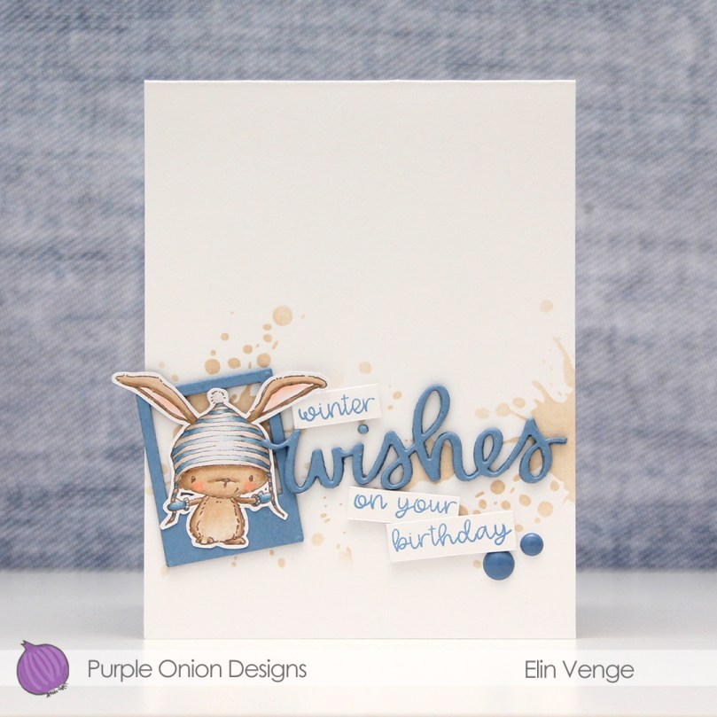 I stamped
 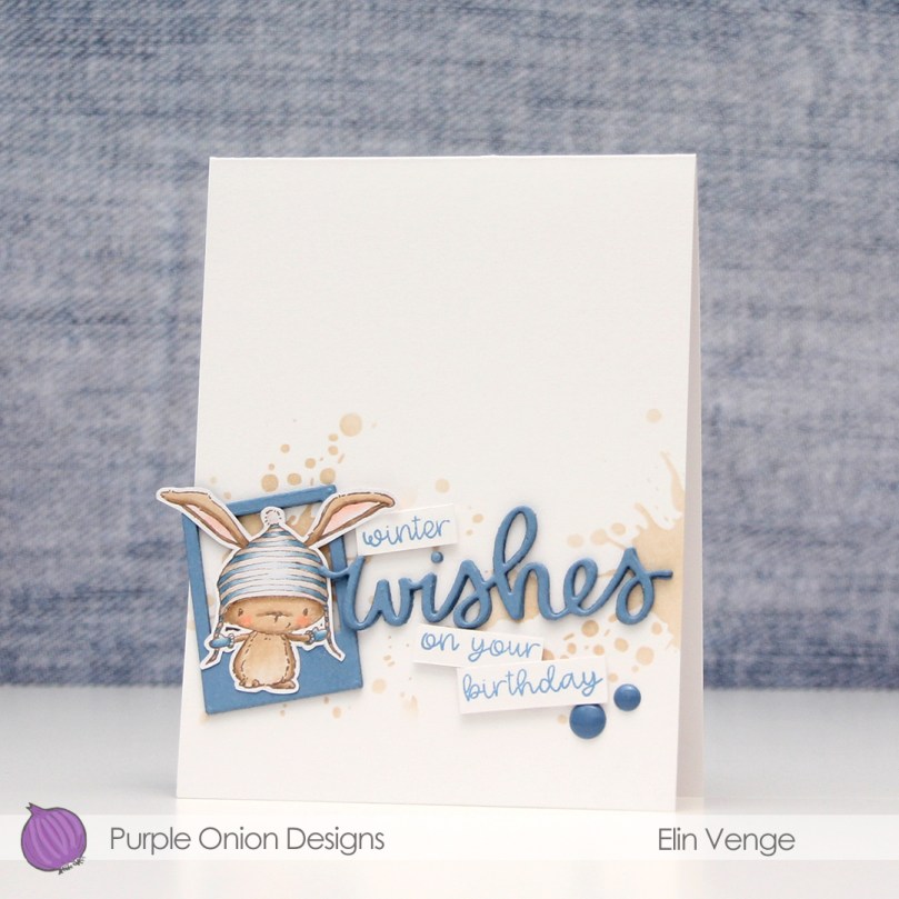 I used one of the Precious Polaroids dies from My Favorite Things, as well as a wishes die from Mama Elephant. I die cut both four times from Blue Yonder card stock from My Favorite Things and stacked them for a dimensional look. Directly onto the card base, I used a blender brush from Taylored Expressions with Classic Kraft ink from Papertrey Ink over a Tim Holtz mini layering stencil to create some interest in the background. I stamped selected words from two sentiments from the
  I’m woefully short on envelopes to fit A2 cards, and definitely didn’t have any blue, kraft or white ones to go with my card, so I pulled out my A2 V Flap Envelope dies from Simon Says Stamp and created one using scraps of patterned paper from Papirdesign. Blue with snowflakes, can you get any better for a blue, wintery birthday card?
 Very limited color palette this time, but it’s no wonder given the size of the image. I also used B90 for the hat, which is a color I’ve made myself.
