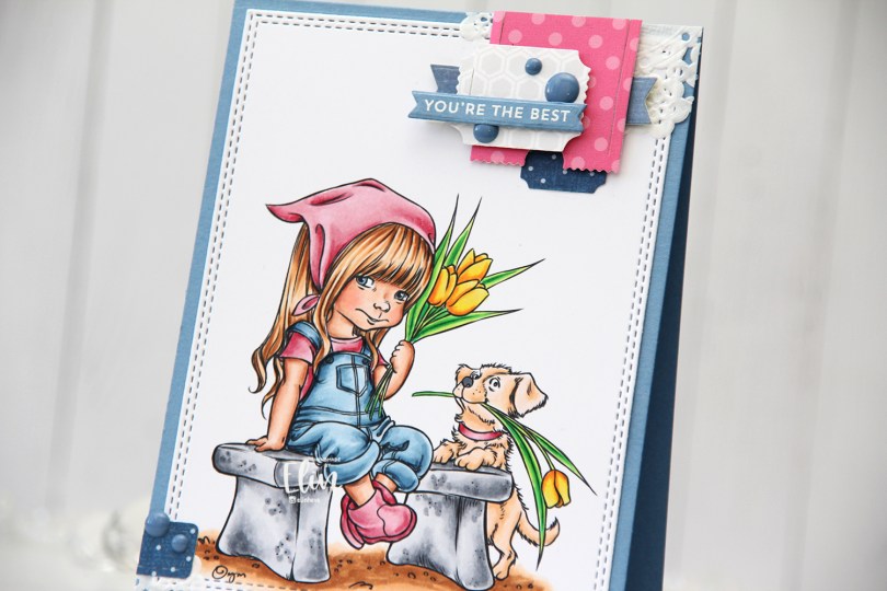
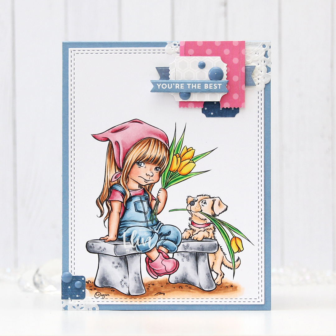
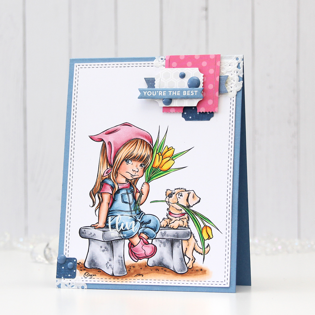
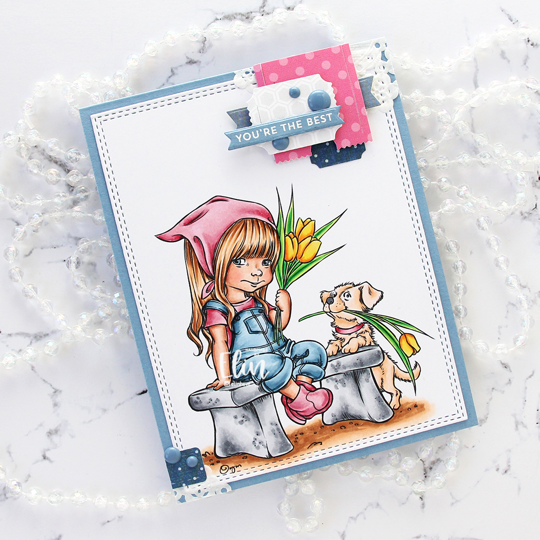
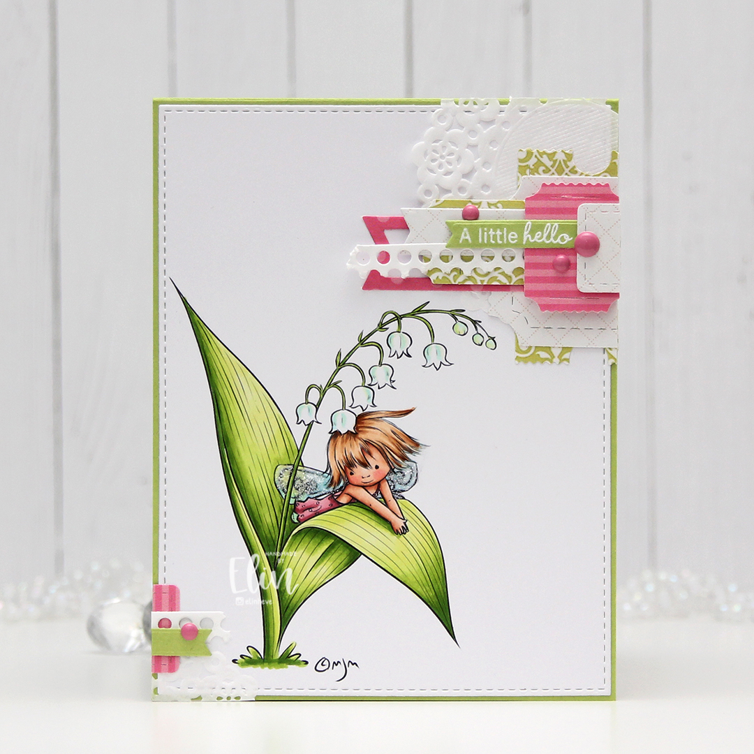
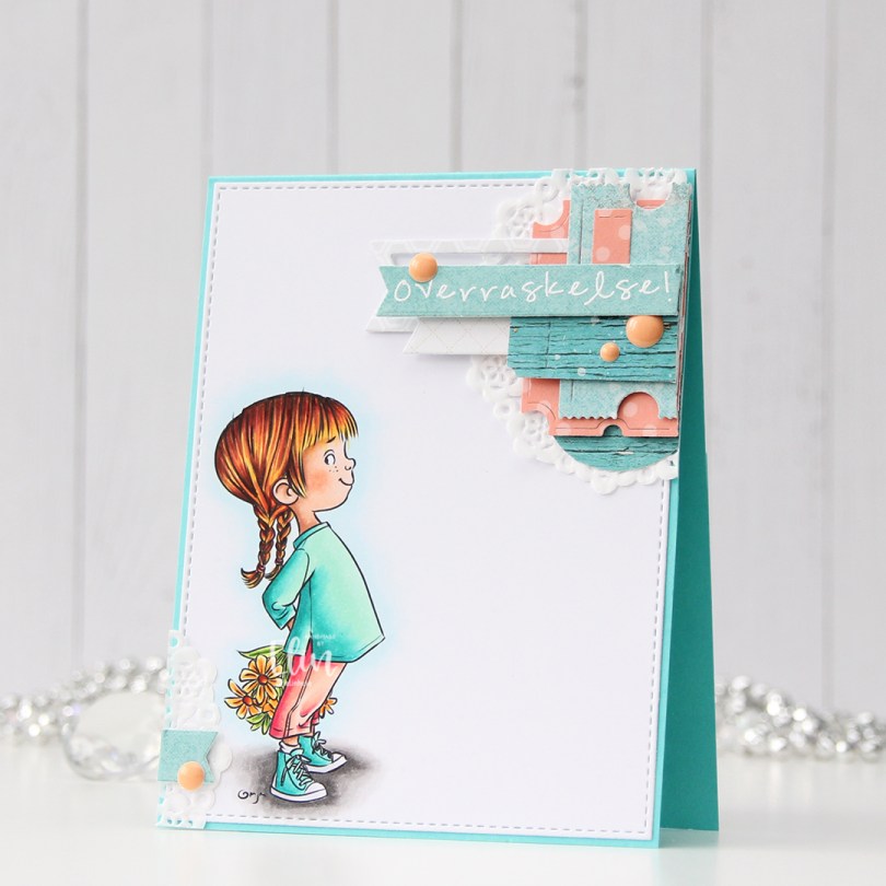
Hi, everyone. We’re almost two weeks into spring, but there are still patches of snow and ice on the ground, and there’s even more snow in the forecast. I’m compensating by making happy, colorful cards and this one features Daisy Daisy from Mo’s Digital Pencil.
 I colored the image with Copics, added some simple ground and flowers next to her and die cut my panel using the largest die in the Additional A2 Layers die set from Waffle Flower, before adhering it to a card base I created from Lazy Day cardstock from My Favorite Things. It’s been a really long time since I’ve made one of my signature “cluster cards”, so I decided it was time for a new one. I keep little die cut scraps in storage pockets sorted by color, which makes it easy to find pieces that will fit any color combination I’ve chosen for my image. I play around with the composition, and when I’m happy, I adhere it all to my card. Some directly, some using foam tape. This gets very thick very fast, but I love this process.
 I stamped a sentiment from the Pristine Peonies stamp set from Altenew using Picked Raspberry Distress Oxide ink, then die cut it into a banner using one of the dies in the Essential Stitched Sentiment Strips die set from My Favorite Things. This goes really well with the other fishtail banners I already had going in my cluster, and the color matches nicely with the pink striped patterned paper from Sunny Studio that I used. I finished off with a few enamel dots from the Pocketful of Sunshine pack from Altenew.
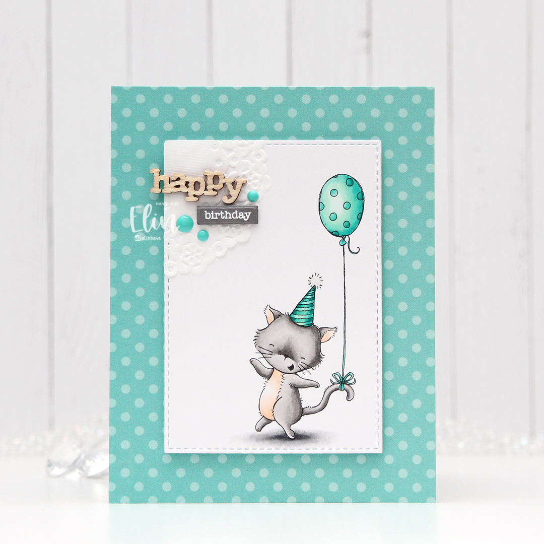
 Very springy color palette. I’m here for it!!
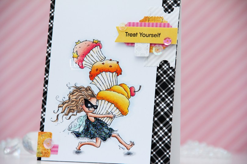
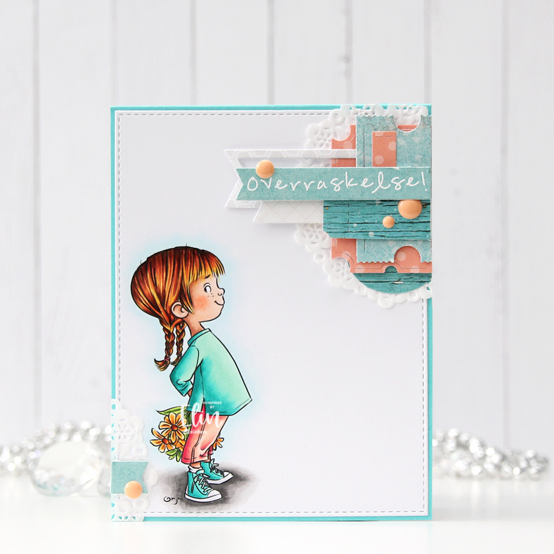
 This is Cupcake Thief. I’ve used the image once before. This time, I flipped it so she’s facing right, it’s one of the many advantages of using digital stamps. I colored her with Copics and cut my panel down to a width of 3 1/2″. I put it aside, covered a white card base with the black and white plaid patterned paper from My Favorite Things, then mounted the colored panel on foam tape, leaving a little bit of the patterned paper showing on one side, and more showing on the other.
 On my desk, I keep storage pockets of die cut patterned paper scraps that I use on my cards. I keep them organized by color family, and pulled out the pink, orange and yellow ones for this, as well as a grey/white/neutral one. The great thing about this system is that everything’s already die cut (using the Happy Days Ticket Stubs die from XCut [which cuts 9 different tickets with one die] and the Fishtail Flag Frames die set from My Favorite Things), so I just play with sizes, colors and composition of the different pieces until I’m happy with the result. For this particular card I used a combo of patterned papers from Sunny Studio, P13 and Bo Bunny. Onto one of the die cut banners I stamped a sentiment from the Little Birthday Notes stamp set from My Favorite Things using Obsidian ink from Altenew. I finished off the card with a few sequins from the Sweet Shop mix from Little Things from Lucy’s Cards and some Stardust Stickles to the dress.
 Quite a few Copics for this one. I also used B90, which is a color I’ve made myself, for a subtle hint of a sky.
 I added a bunny to the top of the teacup stack and colored the image with Copics, before fussy cutting, leaving a thin white border around the edge. I used a black glaze pen from Sakura to add shine and a tiny bit of dimension to the bunny’s eyes, then a white dot of Gelly Roll 05 on top of the black, once the black was dry. The glaze pen dries fairly quickly once applied, so I didn’t have to wait long.
 I adhered a panel of Blueberry cardstock from My Favorite Things to my white card base. Using a die in the A2 Double Stitched Rectangle STAX die set, also from My Favorite Things, I die cut a piece of patterned paper from Sunny Studio to adhere on top of the blue. This patterned paper is from the Subtle Grey Tones pack, and it really is subtle.
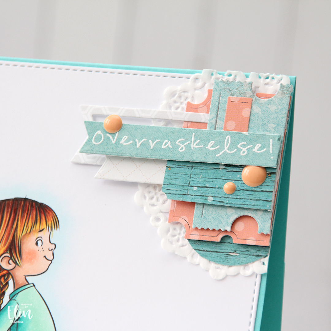
 I realized I hadn’t made any of my signature clusters in a while, and decided to pull out my die cut scraps of patterned paper and have a play. These patterned papers are from Sunny Studio (more from the subtle grey pack), Kaisercraft (light blue with dots), Papirdesign (dark blue with smaller dots) and Maja Design (pink floral), all die cut using a combination of the Happy Days Ticket Stubs die from XCut and the Fishtail Flag Frames dies from My Favorite Things. I used a mini paper doily from Doodlebug to mat my little clusters, and embellished with sequins from Pretty Pink Posh and Simon Says Stamp.
 The sentiment is from the Coffee and Chocolate stamp set from hÄnglar & Wings, white heat embossed on a strip of the same color cardstock I used for the card front. I then die cut it using one of the dies in the Itty Bitty Banners die set from My Favorite Things.
 The interactive element that I mentioned at the beginning of the post is actually the image. As you can see in this photo, it sits pretty high off the base. The reason for that is that it’s on an action wobble, so it’ll shake and move once you help it along a tiny bit.
 Fairly simple color palette for this one.
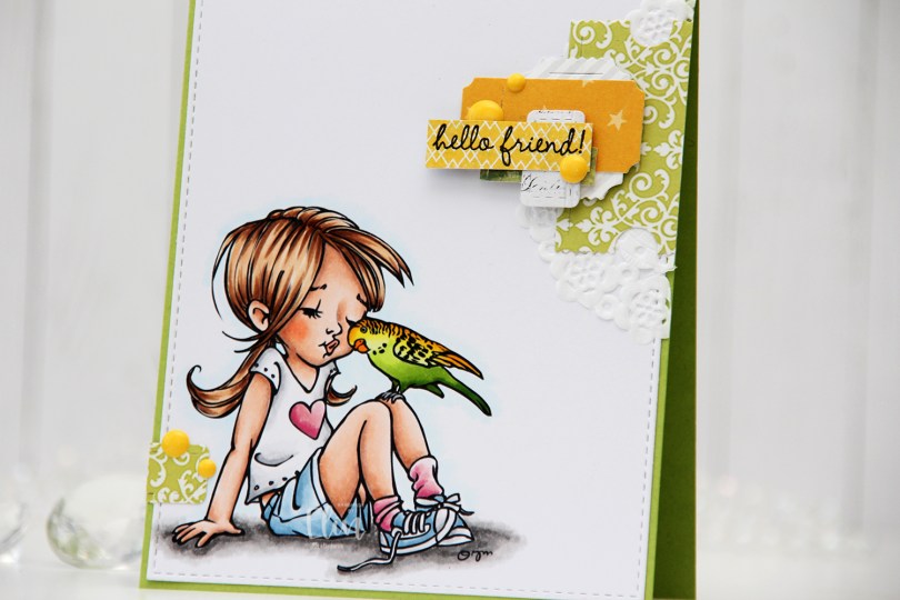
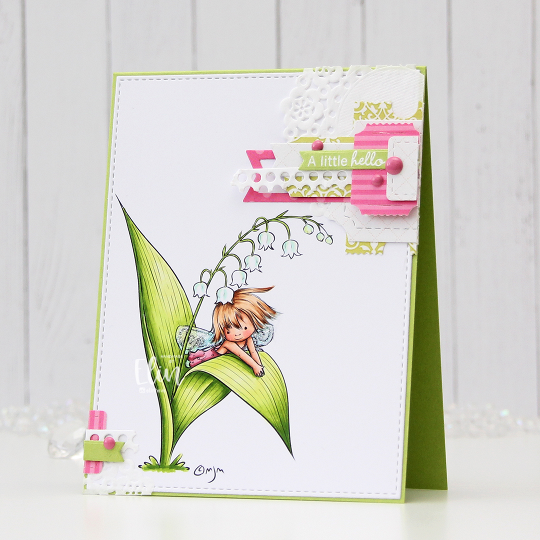
 I colored the image with Copics and die cut the panel using the largest die in the A2 Stitched Rectangles STAX 1 die set from My Favorite Things, before adhering it to a card base I created from Sour Apple cardstock, also from My Favorite Things.
 On my cluster cards, I usually choose two to three colors from the image to create scraps from. This time I chose green and yellow with a little bit of gray. Neutrals are always a good thing to add. I keep die cut scraps in stamp storage pockets on my desk, sorted by color. Whenever I want to create a cluster, I choose the storage pockets with the colors I want, dump the contents on my desk and start PLAYING.
 For this card I wound up using scraps from 3ndypapir, Karen Foster, Sunny Studio, P13, Magnolia and Papirdesign. By limiting the size and colors of my clusters, the design stays harmonious and you can’t tell that I’ve used patterned paper from 6 different companies. I adhere some directly to the layer below, some using foam squares. As a base, I used half a doily from Doodlebug Design that I had in a drawer. I love these tiny paper doilies, they’re perfect for this.
 Using VersaFine Onyx Black ink, I stamped a sentiment from the
  These cluster cards are so fun to make. They make my piles of scraps shrink EVER so slightly, but anything’s better than nothing, and I love the dimension they add to the card.
 I used quite a few colors for this one.
 The dragon has a little friend handing him a note, and it’s just so cute. I colored the image with Copics, fussy cut it leaving a thin white border and put it aside while I worked on the rest of the card.
 I really like the stars scattered around in the image, and decided to die cut a piece of patterned paper from the Subtle Grey Tones 6×6 pack of patterned paper from Sunny Studio using a die from the Wonky Stitched Rectangle STAX die set from My Favorite Things. I mounted it on foam tape on a card base I created from Harvest Gold cardstock from Papertrey Ink.
 I mounted the colored image on foam tape and added it to the top center of the card. I die cut and folded and envelope from the Mini Mail die set from My Favorite Things and glued it below the colored image.
 Inside the envelope, I die cut another piece from Harvest Gold cardstock using the same die set. I love the little scalloped edge at the top. I stamped a sentiment from the Monster Hugs stamp set from the Concord & 9th/Simon Says Stamp collaboration stamp set from Stamptember 2018 using VersaFine Onyx Black ink and slid it into the envelope. I didn’t glue it down, it can be a nice little interactive element on the card, it fits perfectly inside the envelope on the front. To finish I added a couple of enamel stars from the Pocketful of Sunshine enamel dots pack from Altenew.
 Lots of dimension on this card, but it’s still simple. The envelope with the message inside is a nice nod to the image with the dragon and the bird.
 Aside from the colors I used for the background, this is a very warm color palette.
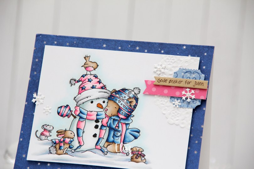
 I cut down my panel of X-Press It blending card significantly when my coloring was done, and mounted it on foam tape onto the cardbase, which I’d covered with a scrap piece of patterned paper from the Hjem til jul collection from Papirdesign.
 I added a small cluster towards the top right corner of the card, using a mini doily from Doodlebug, as well as some die cut scraps of patterned paper from Maja Design and Sunny Studio. I stamped a sentiment from Norsk Stempelblad AS using Dark Chocolate ink from Papertrey Ink onto Classic Kraft cardstock, also from Papertrey Ink. The dies I used in my cluster are a combination of My Favorite Things (Fishtail Flag Frames and Itty Bitty Strips) and X-Cut (Happy Days Ticket Stubs). I also used the Hero Arts Snowflake Confetti fancy die to die cut snowflakes that I scattered across the card, and I put a white pearl from Kort & Godt in the center of each snowflake to finish the card.
 This color combination of blue and bright pink sure was fun, and these are brighter blues than the ones I normally use. I also used a ton of colors for the snow in this little scene. I just can’t help myself.