 Dagens kort viser kunsten å balansere en veldig høy kake.
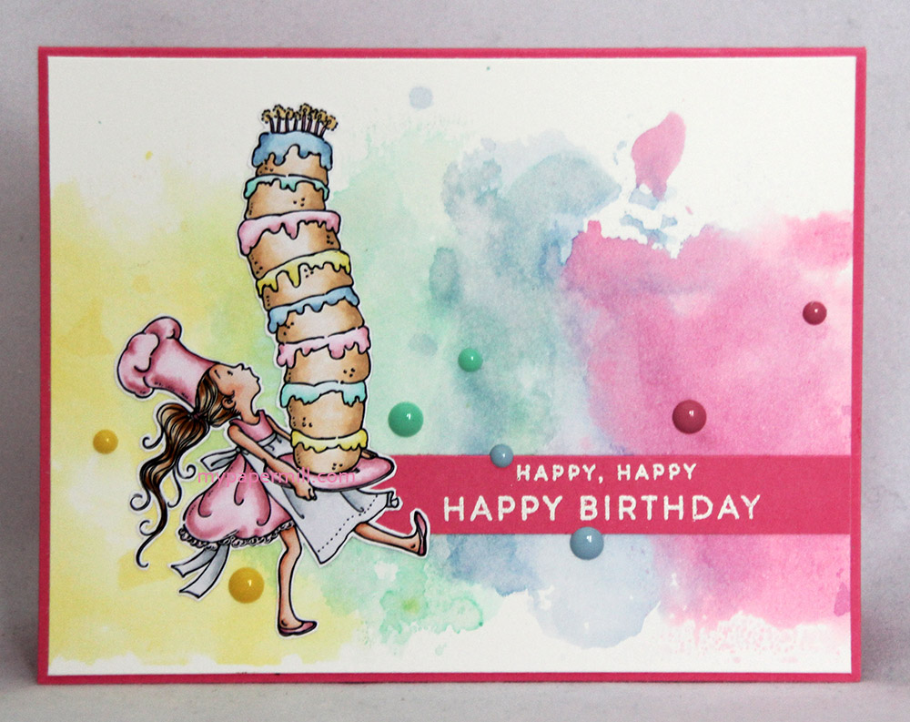
Today’s card shows you the art of balancing a very tall cake.
 Kortet er publisert i oktobernummeret av Ett Trykk og er også på Mo’s Clubhouse-bloggen i dag. Vi i designteamet skulle la oss inspirere av Tim Holtz. Mannen er kjempeflink til å grise med blekk og få ting til å se grungy ut. Jeg hater å få gris på fingrene og er ikke spesielt grungy av meg, så min variant er litt mer fargerik.
The card was published in this year’s October issue of the Norwegian cardmaking magazine Ett Trykk, and is also featured on Mo’s Clubhouse blog today. The DT gals at Ett Trykk have been making projects inspired by Tim Holtz. The man is great at messing around with inks and making things look grungy. I hate getting ink on my fingers and am not particularly grungy, so my version is a little bit more colorful.
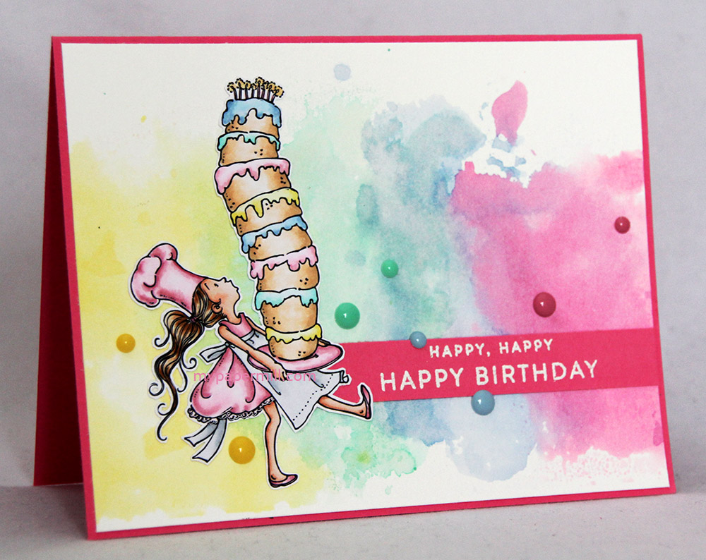 Motivet Tall Cake fra Mo Manning er fargelagt med Copics på X-Press It og så klippet ut og limt rett på den ink smooshede bakgrunnen. Tekststempelet (som egentlig er to forskjellige stempler, jeg har bedrevet litt stempelmassakre) er embosset i hvitt på Hibiscus Burst-kartong fra Papertrey Ink, som er den samme kartongen som jeg har brukt til basen min. Jeg har satt på noen enamel dots i koordinerende farger, og det er faktisk hele kortet.
I colored Mo Manning’s Tall Cake with Copics on X-Press It blending card, fussy cut with a little bit of a border (a border was the only way not to mess up all that hair) and glued it straight onto my ink smooshed background. I embossed the sentiment (which is technically to separate stamps, I did a little bit of stamp massacring) in white on Papertrey Ink Hibiscus Burst cardstock, which is also the cardstock I used for my card base. I added some enamel dots in coordinating colors, and that’s it.
 På baksiden har jeg embosset et annet stempel fra det samme stempelsettet fra PTI som de to tekstene på fronten av kortet, og satt på enamel dots i de samme fargene.
On the back I heat embossed another sentiment from the same PTI stamp set as the sentiments I used on the front, and added enamel dots in those same colors.
 Ink smooshing er veldig enkelt, og ikke fullt så sølete som det høres ut som. Hvertfall ikke når jeg gjør det på en litt annen måte enn Tim Holtz. Han bruker jo craft sheet og drar prosjektet gjennom blekket, men jeg bruker en måte hvor man har litt mer kontroll. Både på hvordan det blir seende ut til slutt og på hvor mye blekk som havner på fingrene – der man absolutt ikke vil ha det!
Dette trenger du:
- en bit akvarellark – jeg har brukt ekstra glatt varmpresset 300 gsm-ark fra Daler Rowney, biten min måler 4,5 x 6″, som er et kvart ark.
- vannbasert blekk – jeg gikk for Memento Dandelion fra Tsukineko og fargene Aqua Mist, Blueberry Sky og Hibiscus Burst fra Papertrey Ink. Noen blekk egner seg bedre enn andre til denne teknikken. Prøv deg frem med det du har.
- en misterflaske med vann
- en bit acetat – jeg har brukt plasten fra en stempelplate
- en plate til å lime akvarellarket på – når du limer fast hele arket vil det ikke bule og bøye seg så mye på grunn av vannet. Platen min er en 30×30-plate i plexiglass.
Ink smooshing is very easy, and not as messy as it sounds. At least not when I do a little differently from Tim Holtz. He uses a craft sheet, dragging his project through the ink, but I use a different approach where I have a little more control – on how it looks in the end and on how much ink winds up on my fingers – where I absolutely don’t want it!
You’ll need:
- a piece of watercolor paper – I used extra smooth hot pressed 140 lb paper from Daler Rowney, my piece measures 4,5 x 6″, which is a quarter of a sheet.
- waterbased ink – I used Memento Dandelion from Tsukineko, and Aqua Mist, Blueberry Sky and Hibiscus Burst – all three from Papertrey Ink. Some inks work better than others for this technique, I encourage you to try what you may already have.
- a mister bottle of water
- a piece of acetate – I used the plastic sheet from a stamp set
- a board to glue your watercolor paper onto – when you glue the entire piece down it won’t buckle as much because of the water as it would otherwise. Mine is a 12×12″ piece of plexi glass.
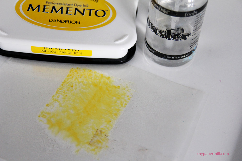 Gni stempelputen over plastarket og spray et par dæsjer med vann oppå. Press plastarket ned på akvarellarket der du vil at fargen skal være og gni baksiden av plastarket litt med fingrene, så blekket får spredt seg godt. Du kan også løfte opp plastarket og dabbe litt her og der, da får du mer konsentrerte områder med farge.
Rub your stamp pad over the piece of acetate and spritz it a couple of times with water. Press the acetate down onto the watercolor paper where you want the color to be and rub the back of the acetate a little with your fingers, spreading the ink. You can also lift your piece of acetate and do a little dabbing and pouncing here and there, it will give you small pools of more concentrated color.
 La fargen tørke (evt. bruk varmepistol) før du går over til neste farge. Jo tørrere en farge er før du bruker neste farge, jo renere og klarere blir fargene. Her syns det godt at den gule fargen har vært relativt tørr før jeg tok Aqua Mist, mens den ikke hadde tørket ordentlig før jeg tok den blå, så det blir en blanding av Aqua Mist og Blueberry Sky på store deler av der jeg tok på blått. Da alle fargene var tørre kuttet jeg ned panelet mitt til 5 3/8 x 4 1/8″.
Let the color dry (or use a heat gun) before you move on to the next color. The more your color has a chance to dry before you add the next color, the more vibrant the result. In the above photo, you can see that the yellow has had time to dry before I added Aqua Mist, but the Aqua Mist wasn’t quite dry when I added the blue, so there’s a mixture of Aqua Mist and Blueberry Sky on large portions of where I added the blue. When the colors were all dry I cut my piece down to 5 3/8 x 4 1/8″.
 Jeg avslutter som vanlig med fargene jeg har brukt på motivet mitt.
As usual I leave you with the colors I used on my image.

super fint kort – great card
Fantastisk lekkert kort! Digger den bakgrunnen, så det må jeg teste ut 🙂