Hei og hopp! Det har kommet et par robotkort fra meg i det siste, og her er enda et. Dette er nok det mest omfattende av de jeg har laget, her er det lag på lag og klipping tett inntil motivet. Dette er et ganske bildetungt innlegg, så det er bare å sette seg ned med noe godt å drikke og scrolle seg nedover.
 Dette Robots Blueprint-settet fra Stampers Anonymous kan man jo gjøre så mye med, og her har jeg fargelagt én av robotene, klippet ham ut og limt ham på kortet mitt med gjennomsiktig 3D-teip.
 Mine lag-på-lag-kort har en tendens til å bli såpass tykke at de ikke får plass i konvolutt, derfor pleier jeg ofte å lage en slags eskekonvolutt. Denne gangen lagde jeg den av et mønsterark, embosset roboten i hvitt, limte på navnet på jubilanten og pyntet veldig enkelt i det ene hjørnet.
 Arkene i Denim & Friends-serien til Maja Design syns jeg passet ypperlig til dette kortet, og jeg har til og med brukt den matchende kartongen fra Maja Design som både kortbase, og til å stemple tekstene mine på, i tillegg til å stanse ut tallene.
 Den venstre innsiden har flere tekster fra NSB og et par tannhjul, mens den høyre innsiden har et tannhjul til og masse god skriveplass, mønsterarket er nemlig såpass lyst at det fint kan brukes som skrivefelt.
 Flere tekster og tannhjul på baksiden. Litt pyntet, men heller ikke for mye, med tanke på at det er et herrekort.
 Jeg startet med å fargelegge roboten min og klippe ham ut. Jeg lot stilken til antennen være igjen i første omgang, og gikk over kantene med en svart Memento-tusj for at den hvite kjernen på arket ikke skulle synes fra siden.
 Jeg kuttet til paneler til kortet mitt. Jeg har det samme oppsettet på alle fire sidene, så dette er en enkel prosess.
 De brune panelene satte jeg på lave 3D-puter fra Clas Ohlson.
 Jeg brukte deler av finérbiter fra SnipArt og limte i motsatte hjørner på det brune panelet.

Jeg fargela noen tannhjul fra samme produsent med en brun Copic-tusj for å matche det brune fra mønsterarket.
 Tannhjulene mine dyttet jeg så rett ned i en gammel, litt stygg VersaMark-pute (denne er perfekt for dette bruket) med den fargelagte siden ned.
 Jeg dynket dem så med Distress embossingpulver i fargen Vintage Photo og embosset.
 Mer mønsterark på lave 3D-puter.
 Så tannhjulene strategisk plassert. Jeg stanset ut tallet 50 i noen lag blå kartong og limte på et av tannhjulene.
 Jeg la gjennomsiktig 3D-teip på baksiden av roboten min. Her har jeg også klippet til stilken på antennen, den er veeeldig tynn!
 Roboten passer perfekt på det lyse mønsterarket. Jeg tok en bitteliten bit med den gjennomsiktige 3D-teipen og la under “klumpen” på antennen også. Lagde meg noen strimler med bursdagstekster av stempler fra Norsk Stempelblad AS og limte dem oppå tannhjulene i visuell trekant.
 Jeg stemplet noen flere NSB-tekster til innsiden og baksiden med Enchanted Evening blekk fra Papertrey Ink, forøvrig det samme blekket jeg brukte på strimlene mine.
 Jeg følte jeg måtte pynte litt på innsiden også, så jeg satte på et par tannhjul til.
 Etterfulgt av et par strimler til med bursdagstekster.
 Til slutt gjorde jeg det samme på kortets bakside. Da får jeg en rød tråd gjennom hele kortet.
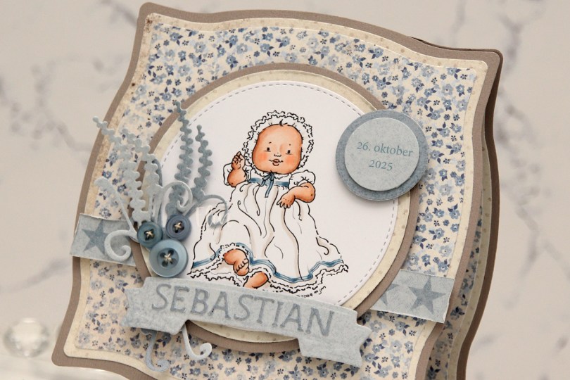
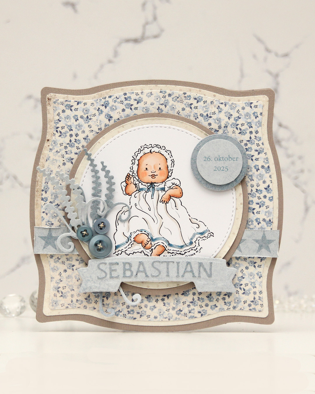 I colored the image and die cut it using one of the circle dies in the Stitched Circle STAX die set from My Favorite Things. I also die cut circles from grey cardstock and patterned paper from the Denim & Friends collection from Maja Design using the Nesting Circles die set from Lifestyle Crafts. The shape of the card is created with the Nesting Frames #8 die set from Lifestyle Crafts.
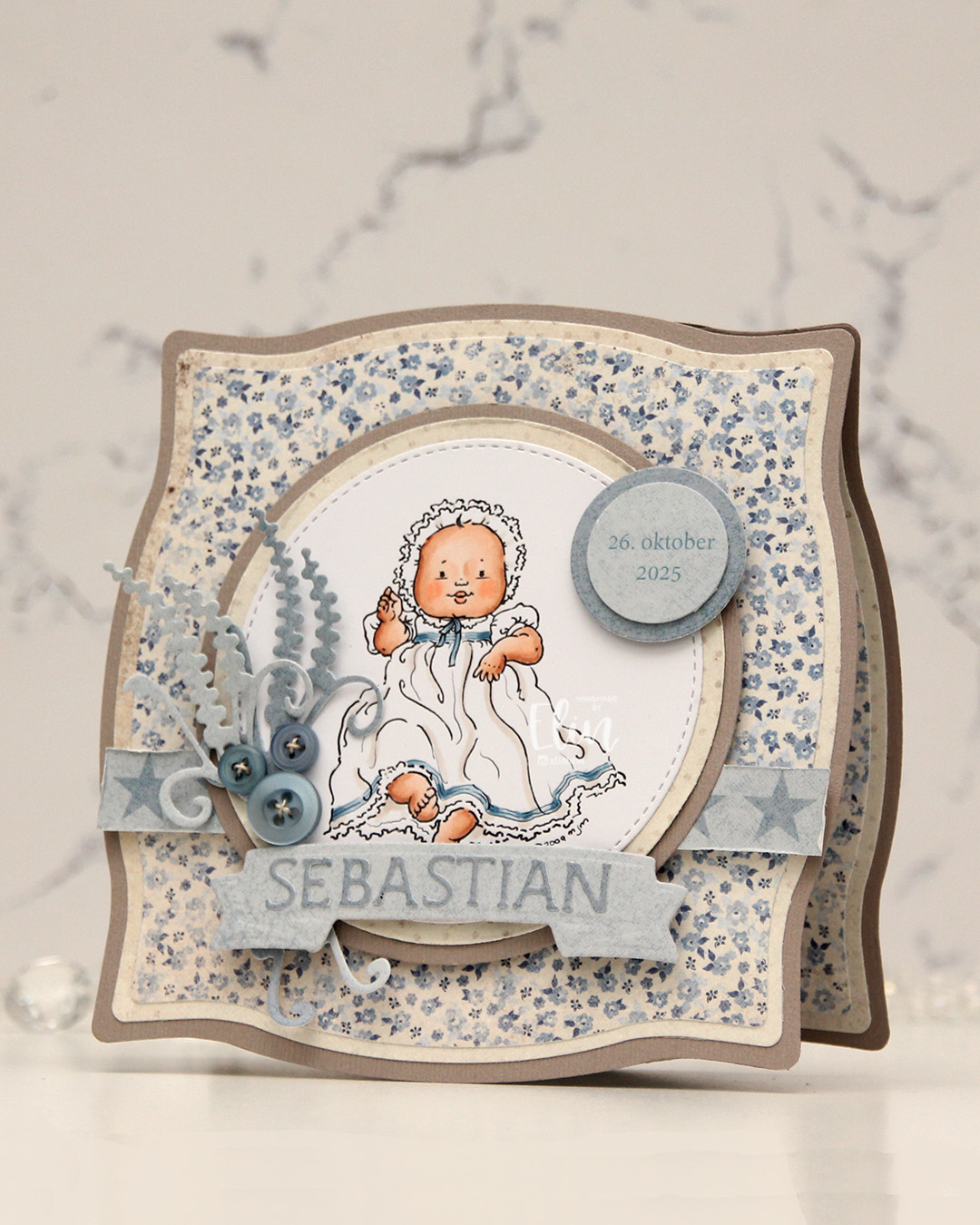 I popped some pieces up using foam tape, die cut the letters for the name using an alphabet die set from Scrapmagasinet and adhered the letters to a banner I die cut with an old die from Spellbinders. I used an old die from Marianne Design for the spriggy things on the left, and used some old Blueberry Sky buttons from Papertrey Ink to embellish.
 Very limited color palette for this one.
 The card was made on order for a superintendent turning 60. I was told he likes wine, good food, sunny, warm weather and enjoying life and was given free reign to do as I pleased.
  I rarely use patterned papers on my cards anymore, and certainly not pieces this big, but I love the XXL Square Frames Frilly #10 die set from GoKreate, the dies in the set are perfect for creating shaped cards. I use two 12×12″ sheets of patterned paper to make one of these cards, and this time I used the Drivers License patterned paper from the Denim & Friends collection as well as the Tough but sweet sheet from the Denim & Girls collection, both from Maja Design. I can cut two of the larger shapes and two of the smaller shapes from one sheet, so the insides of the card are reverse.
 I colored the image in colors that went with the patterned paper, adding a bit of red to catch the eye and writing the words on his t shirt with a black Copic friendly pen. I thought the pun would tick the “loves wine” box.
 I used foam tape to add the smaller shape to the larger one, and also to add the die cut circle to the smaller shape. I stamped postmarks from various cities in the world using Memento Rich Cocoa ink to add a little bit of interest to the circle and the panel behind it. I figure if the guy loves warm, sunny weather, he probably also loves to travel, there’s not a whole lot of warm days in Oslo over the course of a year.
 I added some metal embellishments from Tim Holtz in a bit of a cluster near the bottom left “corner”, as well as his age, die cut and put on a 1″ circle with an epoxy sticker on top for a bit of added dimension.
 I hid a die cut tag behind my image. I used to do this all the time, and it’s a fun way to add a sentiment without having to find space for it on the front of the card. The sentiment is from the Til mannen stamp set from Norsk Stempelblad AS. The dies I used for the tag and reinforcer are old ones from Magnolia. I tied a bow from twill onto the tag, and some cutlery charms to the twill bow using natural twine from May Arts. I thought the cutlery was perfect for a food lover, I have so many treasures in my stash that I forget about until I go looking for something to use.
 The inside of the card are pretty simple. The same patterned paper as the front, only with the reverse size. I used more of the postmark stamps from Marianne Design, as well as a sentiment from the Gratulerer stamp set from Norsk Stempelblad AS. There’s plenty of space for a personal message on the second circle, which only has the postmark stamps on the edges.
 The back of the card is also simple. Another sentiment from Norsk Stempelblad AS, this time it’s the B03 stamp set. I love their stamp sets and use them more than any other of my Norwegian sentiment stamps. They’re hard to get your hands on because the company is no longer in business, but they’re the best sentiments out there.
 Simple color palette.
 This
This  I used 3 different collections of patterned paper from Maja Design for this card. One of the benefits of using their papers is that their collections usually match pretty well. Vintage Basics Summer, Vintage Baby and Sofiero are the collections I used for this card, and they all match. I used older dies from Lifestyle Crafts, Cottage Cutz, Scrapmagasinet, Marianne Design and Spellbinders, as well as flowers from Wild Orchid Crafts and Papirdesign.
 The insides of the card have a very similar layout, and so does the back. Onto a white circular panel, I stamped a christening stamp from North Star Design using Soft Granite ink from Hero Arts.
 The card was too thick to fit inside a regular envelope, so I created a box envelope using a punch board from We R Memory Keepers. Onto a diecut eyelet circle I stamped a Norsk Stempelblad AS sentiment and adhered it to the box envelope.
 This image is so quick to color and doesn’t require a ton of markers. Easy peasy!
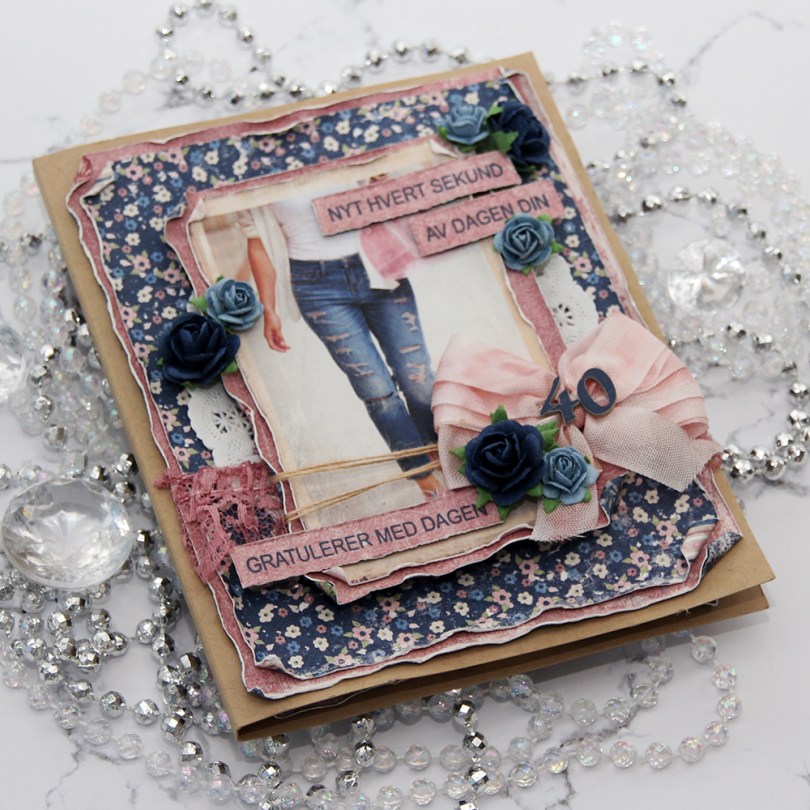
 I was told that the birthday girl likes blue, pink and flowers. I knew just which papers to dig out from my stash. The paper I’ve used here is all from the Denim & Girls collection from Maja Design. I love their collections, the patterns are nice and small and the colors to die for. I mean, look at those blues!!! Amazing!!! I’ve predominantly featured two sheets on this card;
  I started by cutting down the patterned paper to the sizes I wanted, before using a paint brush with clean water to wet all the edges. This makes the paper more pliable, and I can curl the edges with my fingers, giving the paper some dimension and interest. The cool thing is that when it dries, it stays like that, it’s very sturdy. With Maja Design patterned paper it’s extra sturdy, because the paper is so thick you can actually use it for card bases. It’s really nice.
 I added a paper doily, some pink lace, some May Arts natural twine, a bow, a couple of diecut numbers and a few paper roses from Papirdesign, in addition to a couple of sentiment strips. I stamped the
  When creating this type of card I go all out and decorate all four sides of my card. I used the same layout on the insides, but skipped all the embellishments. The kraft panels are actually removable. I added double sided tape to the back in generous amounts, but left the release paper on, and glued the panels on using just a glue dot. Glue dots are a nice temporary solution, and it enables you to pull the panels out fairly easily, write your personal message, remove the release paper from the double sided tape and glue the panels back where they belong. It’s a great way to not have to write inside a bulky card.
 I had to decorate the back, too. I just had to. Same basic layout on the back. Not as heavily embellished as the front, also not as bare as the insides. I stamped a birthday sentiment from Norsk Stempelblad AS using the same color ink as the sentiment strips on the front, and added a few blue roses to finish the card.
 With cards this thick, they don’t fit in regular envelopes, so I usually make simple envelope boxes to match. This one is 1″ high, and it actually could have been a little higher, it was a little bulgy when the card went in. I diecut the blue patterned paper with a Simon Says Stamp label die and added pink diecut letters from Scrapmagasinet to spell the name of the birthday girl. I did two layers so the name wouldn’t get completely lost with that busy background.
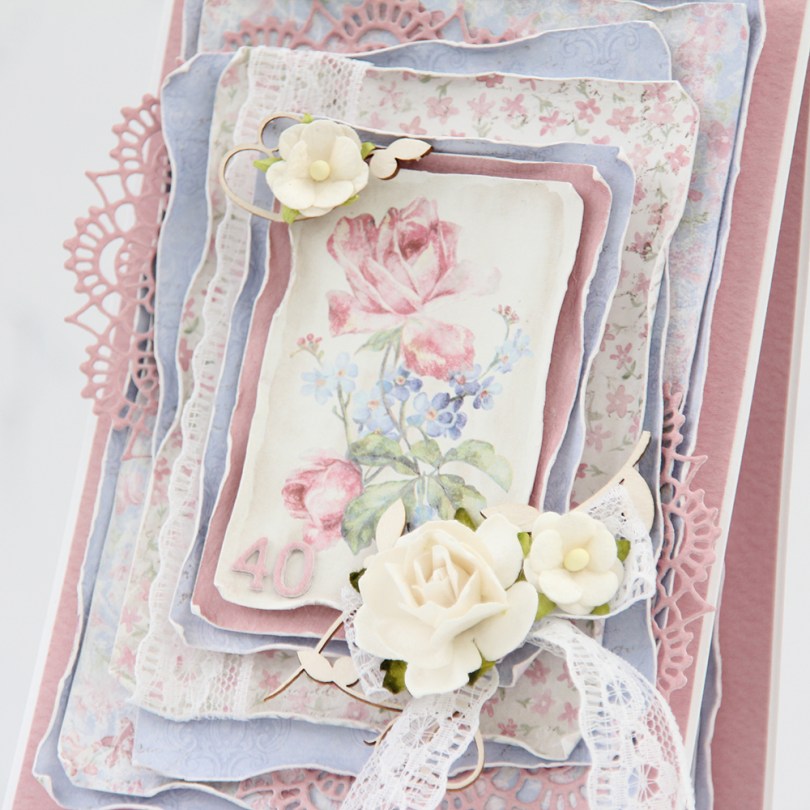
 There are two types of cards I love making more than any other: Christmas cards and birthday cards. I love making clean and simple cards, but also very layered ones with lots of patterned paper. Today’s card is one of those, made exclusively with papers from the Sofiero collection from Maja Design.
 One of the things I love the most about Maja Design paper is the quality of the paper they use. It’s almost as thick as cardstock, something I haven’t really found in other patterned papers. Their patterns are gorgous, too, making card making a breeze. The thick quality also means I can use a wet paint brush (with clean water) and run along the edges, before using my fingers to curl them slightly back. This is so much easier to do when the paper is wet, and so much easier to do with these good quality papers. Thinner paper won’t hold up as well to all that water. I love the look you achieve by doing this.
 I’m not an embellishment queen. I use a little bit on cards like this, but I rarely do a lot. This time, I used some pieces of chipboard from SnipArt and a few flowers to frame the image in the center of my card. I also used some lace to combat the rigid look you sometimes get when using just straight lines like square or rectangular panels.
 I also added a couple of diecut doilies to further break up the linear look, and added stacked diecut numbers to the bottom left of the focal point of the card. As you can tell from this photo, this is a card with lots of dimension, it’s not very mail friendly.
 I did a little bit of layering on the insides, as well. They are both the same, and those pink center panels provide plenty of room to write a personal message to the birthday girl.
 On the back of the card I stamped a sentiment from Norsk Stempelblad AS using Papertrey Ink Autumn Rose ink. The text is about butterflies, so I thought it fitting to add a few chipboard ones for a little bit of extra interest.
 Even though my card isn’t very mail friendly, I needed something to put it in, so I made a box envelope to go with it and added the recipient’s name on the front of it. The card was hand delivered, so this works perfectly.

 I’ve gone with a tried and true layout on my card. I didn’t have a whole lot of time to make this, so I needed to not reinvent the wheel. I colored up my image with Copics and used patterned papers from the Vintage Baby collection by Maja Design.
 I embellished with blue and white flowers and rose buds, along with a few Kort & Godt diamonds scattered around my flower clusters. I diecut the letters in the little boy’s name twice and stacked them for a little bit of dimension. I added the letters to a fishtail banner in the perfect size.
 I stamped a North Star Design sentiment on the back of the card using Papertrey Ink Blueberry Sky ink.
 I started by coloring the bunny with different blue Copics, before adding texture to it with a piece of cloth soaked with blending solution. When I was happy with that I colored in the rest of the image before diecutting it using a cute circle die from Cottage Cutz.
 I decided to go with patterned papers from Maja Design. These are from the Vintage Baby and Sofiero collections. I added his name in tiny diecut letters and embellished simply with flowers, some Kort & Godt diamonds, and some Studio Calico veneer stars. I thought they went well with the stars in the patterned paper.
 I printed a sentiment for one of the insides with blue ink and diecut it using that same circle die as I used on the front of the card.
 I kept the back of the card pretty simple, a few more flowers and stars and another printed sentiment on a diecut circle.
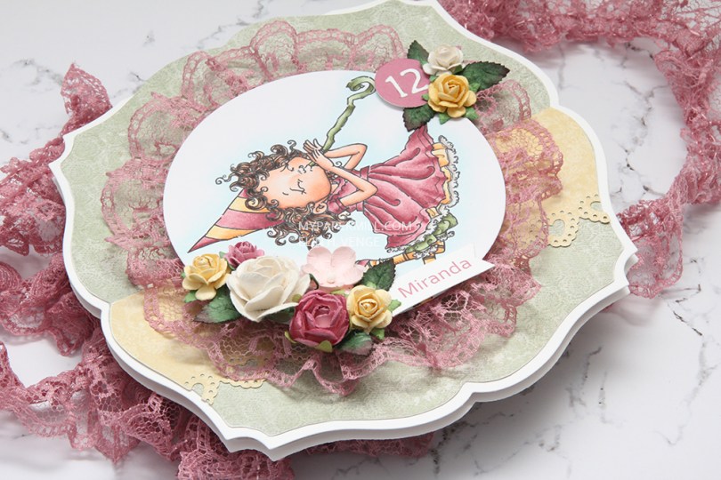
 Jeg fargela
  I tillegg til arkene har jeg brukt en blanding av blomster fra Wild Orchid Crafts og Papirdesign. Jeg har også stukket inn noen grønne blader her og der.
 På innsiden har jeg brukt litt andre ark. Det rosa er et gammelt et fra den gangen arkene fra Maja Design var ensidige og hadde litt skinn Det gule er fra Coffee in the Arbour-kolleksjonen og det grønne er et veldig tynt ensidig ark av ukjent produsent. Teksten fra B03-platen til Norsk Stempelblad AS er stemplet med Memento Bamboo Leaves, og spruten rundt er stemplet med Splash-stempelet til Inkido med Distress Ink Mustard Seed. Scallopsirkelen er laget med en die fra Papirdesign.
 Baksiden har nok et NSB-stempel, og også her har jeg pyntet veldig enkelt med blomster og blader.
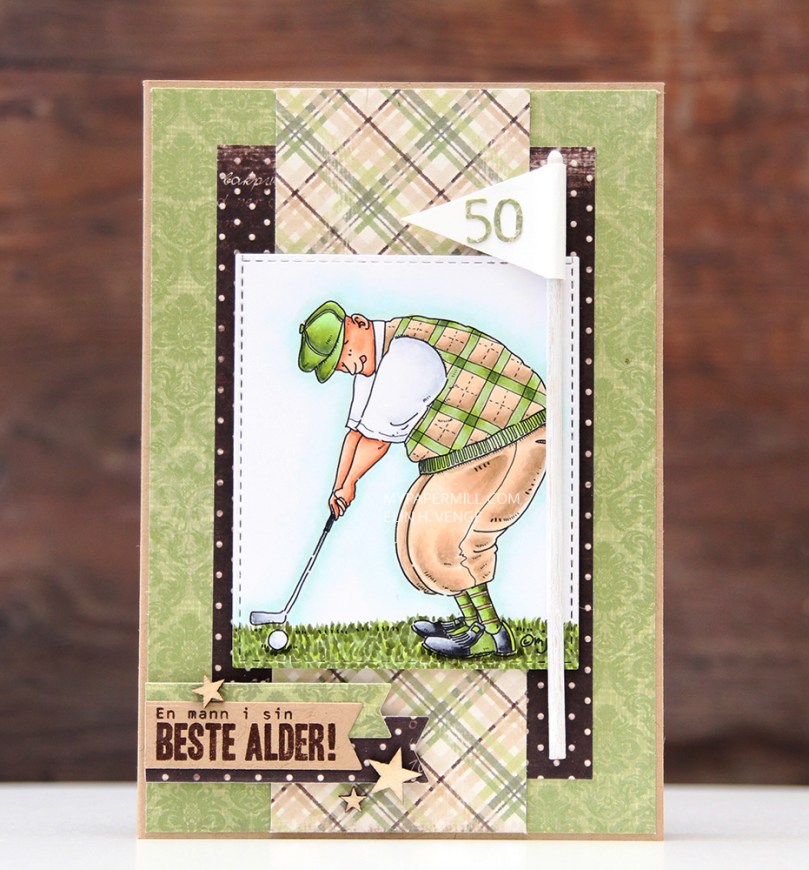
 I found some scraps of mostly green patterned paper from Maja Design. I had no idea that the club he plays at is named Green Joy, so that was pure luck. I added his age on a flag, thought it was fitting. Not that there’s 50 holes on a course (that much I know), but I’m guessing he gets it anyway.
 I colored up my golfer to fit my papers and added a bit of green below his feet and the ball. I love his tongue sticking out, he’s SO focused on making that put!
 I added a little cluster of banners in the lower left corner, with a sentiment on one of them. It says “a man at his best age” in Norwegian. I stamped it in Papertrey Ink Dark Chocolate ink and added a few veneer stars from Studio Calico as accents.
 The inside basically has the same design. I made a pocket for some cash on the left side, with a diecut sentiment and some more stars.
 The back is also pretty simple, the first line of a Norwegian birthday song stamped in the same dark brown color that I used for the sentiment on the front of the card. I scattered a few stars here, as well.