Wedding season is upon us. I made a card (on order) for a couple who got married yesterday. I usually have pretty free reign when I receive orders, which I love. People tend to tell me what color scheme they’d like, names, dates and other important stuff that they want included. A bit of a warning might be necessary right here; this is a very picture heavy post! 🙂
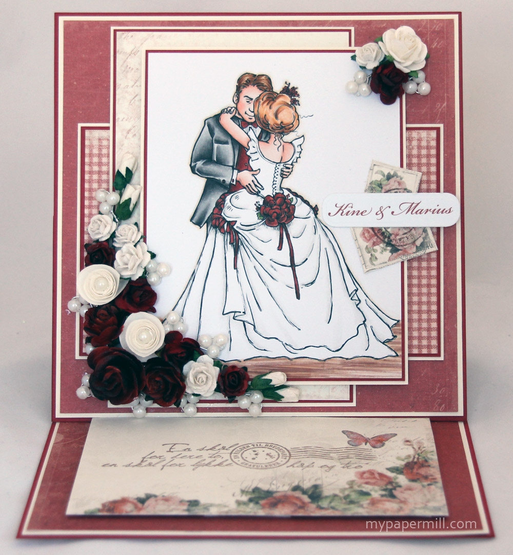
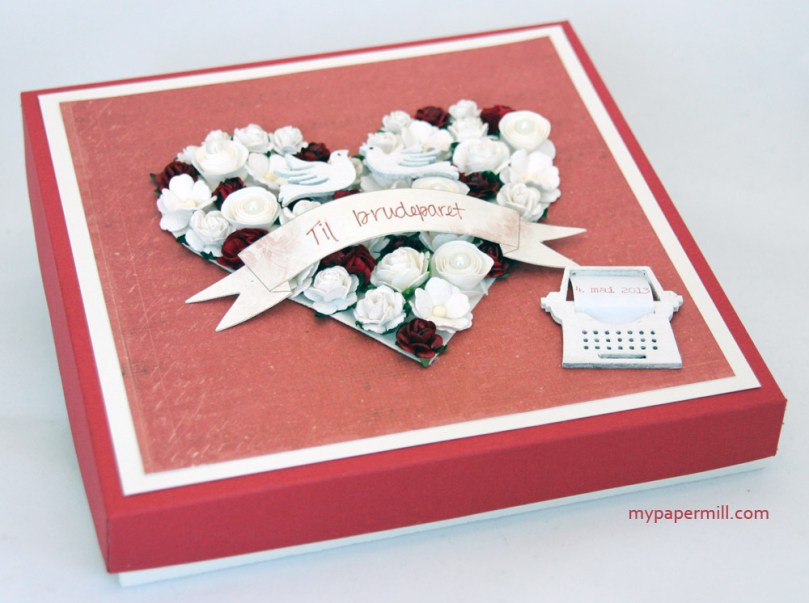 I made an easel card. The problem was that my flower arrangement made the card way too chunky to fit in an envelope, resulting in me making a nice box to put the card in. I’ve used Bazzill Maraschino, Natural and plenty of papers from Pion Design’s “From My Heart II” collection for this set, I like it when all the little details match!
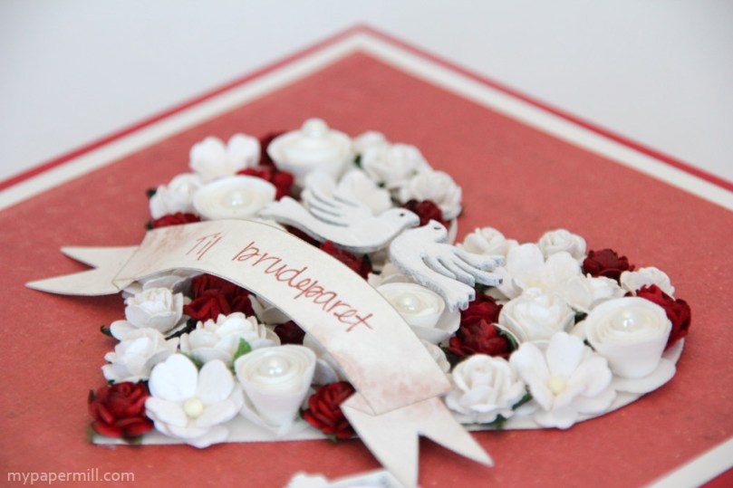 To make this flower arrangement I used a Spellbinders die to make a heart shape that I glued the flowers onto. I’ve airbrushed some of the flowers with E19 to make them match the patterned papers. The banner is cut from one of the Pion papers, and I have written “Til brudeparet” with a Distress Marker (Fired Brick). The little birds are wood veneers by Prima that I’ve painted with a white dabber.
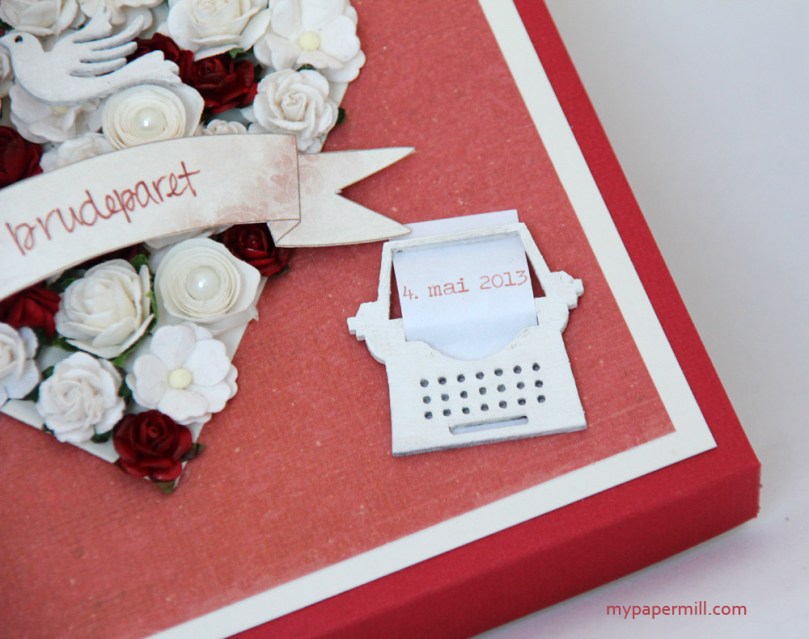 I bought a pack of Studio Calico wood veneers at the Geiranger luxury crop in the middle of April, and I figured that using one of the typewriters would be a perfect way to add the actual wedding date in print on my project. The typewriter I’ve also painted with a white dabber, the paper is just plain old copy paper with the date printed in E19, which happens to be the same color as the airbrushed flowers. Nothing is ever random with my projects 😉
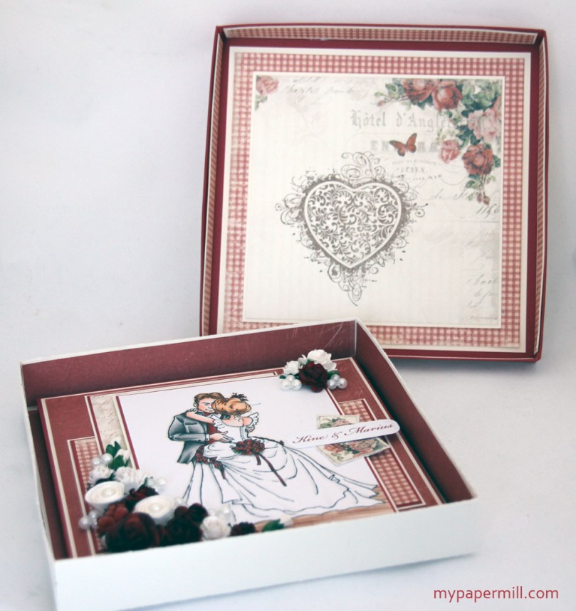 Open the lid of the box and this is what you’ll see: I’ve decorated the inside of the lid as well, and the inside of the box itself, where the card resides.
 I find easel cards more decorative than normal ones, they go well on a gift table and stand up on their own without any additional help.
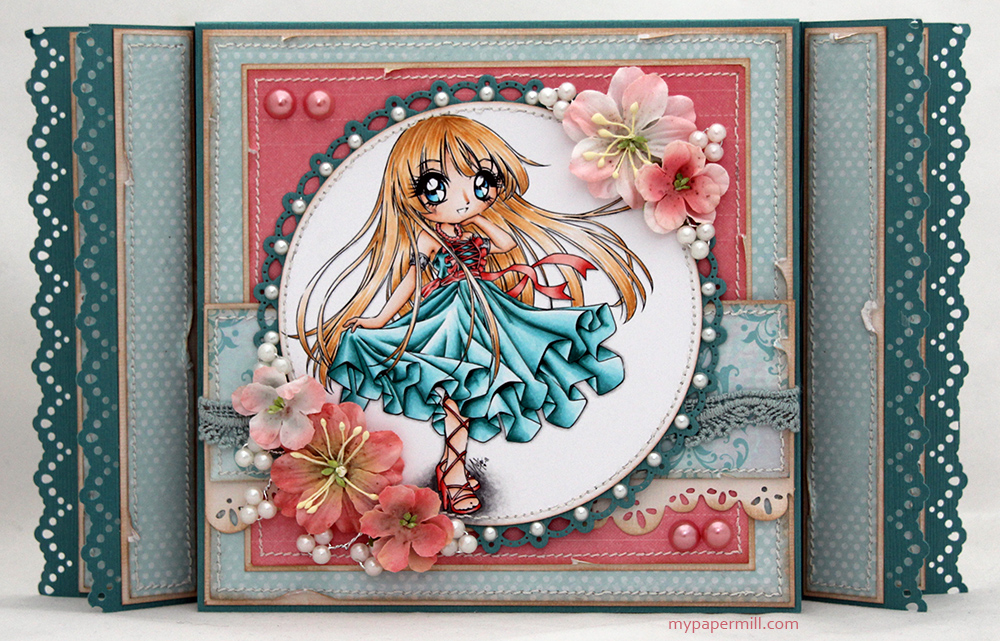
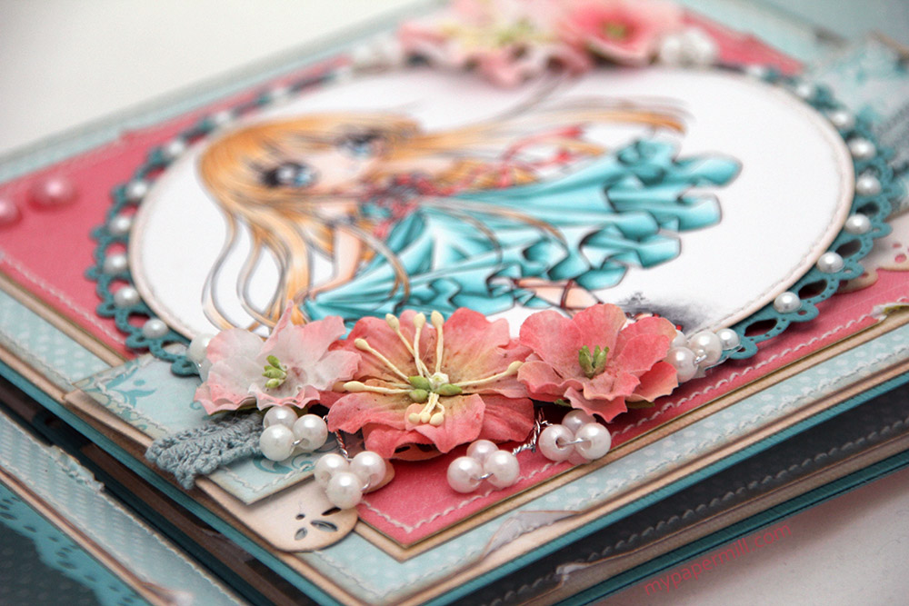
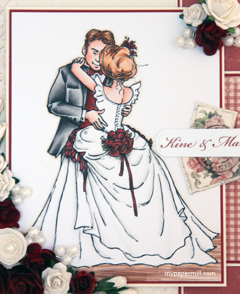
 I chose Mo Manning’s Bride and Groom image for the front of my easel. I love this image, I’ve used it several times in the past for wedding cards and it’s so easy to color! I’ve used my Copics for this one, the colors are at the bottom of the post.
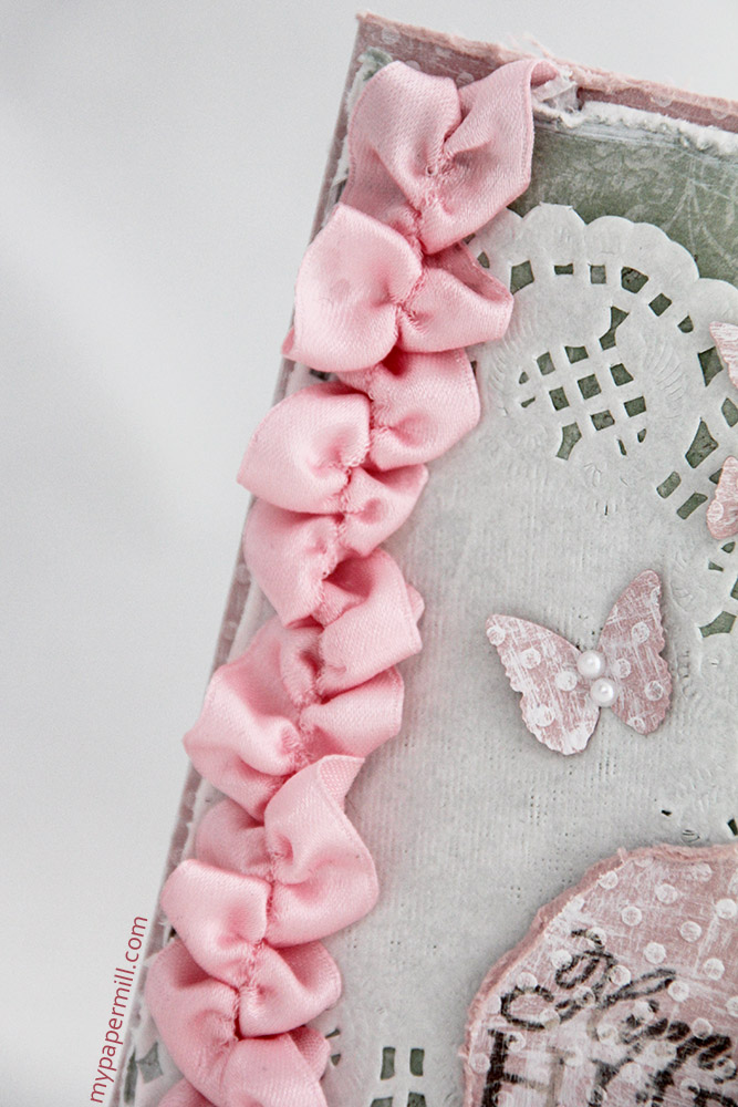
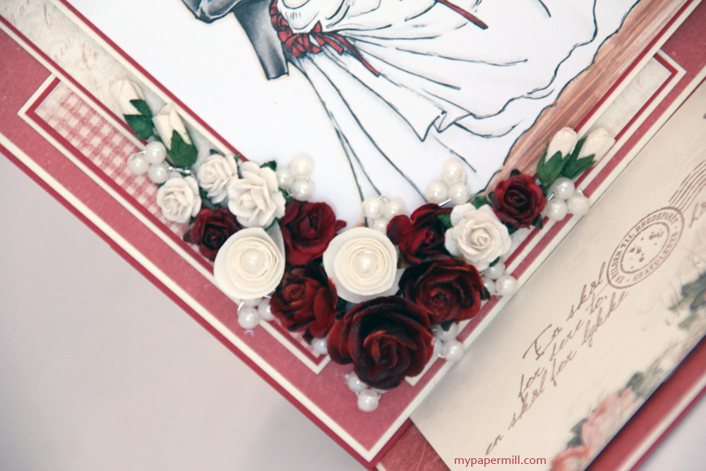
 I normally add plenty of flowers to my cards, this one is no exception. These ones are from Kort & Godt, Wild Orchid Crafts and Papirdesign. Some of them have been airbrushed with the same color I used for the flowers on the lid of the box. I’ve also added some pearl stamens by Kort & Godt and a couple of pearls in the center of two of my flowers.
 The whole set together. I like that the same elements are repeated from the box to the card (doble matting, the flowers, color and design paper).
 The “stopper panel”, as I like to call it. I’ve added stickles star dust and crackle accents to the butterfly (I added crackle accents to the butterfly on the inside of the lid as well). The stamp I’ve used is by Kort & Godt, inked with Memento Rich Cocoa.
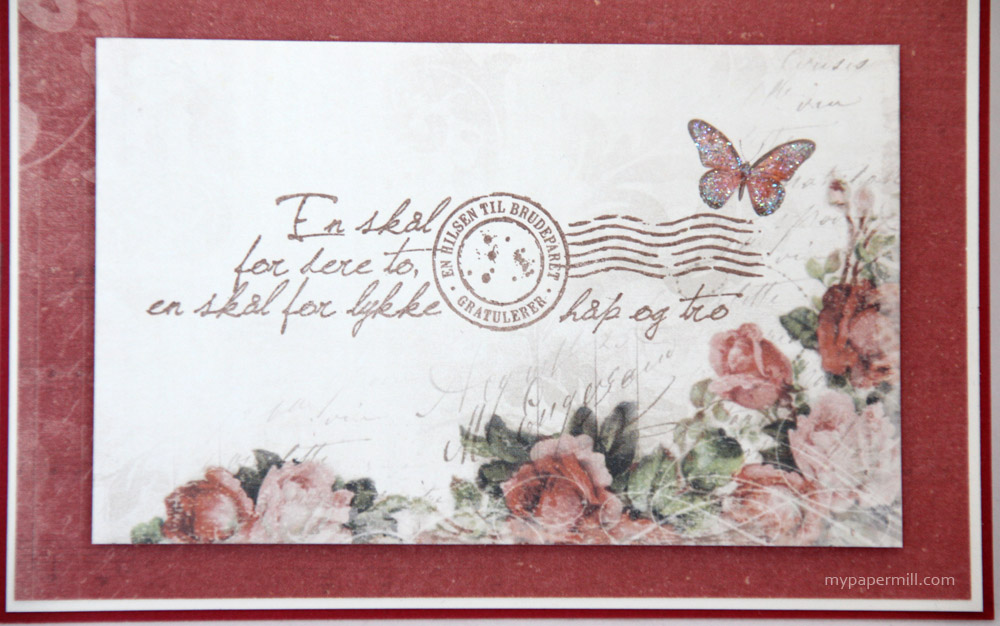
 The postage stamp images I’ve used are from the Cut Out sheet in the paper collection. I stamped a circular stamp (which is the same as the circle in the stamp on the stopper panel) on top of them in Memento Rich Cocoa, before I added the little strip with the names of the bride and groom, printed in the color E19 (I told you nothing is random with my cards). 🙂
I do, however, have one little bone to pick with easel cards: there’s no room for a personal greeting. In the above photo, there’s a little hint of a pocket for a tag on the inside of the card.
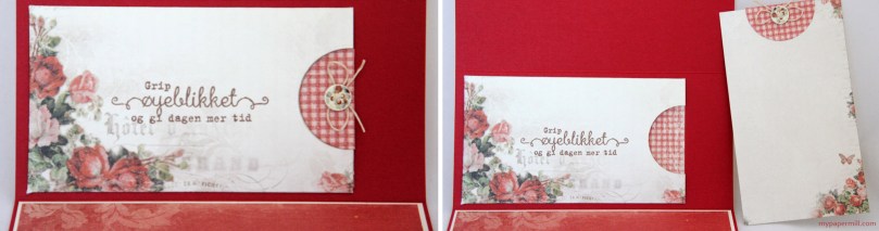 A tag pocket fixes my “no room for greeting” issue. I’ve tried to utilize the beautiful design papers to the fullest, only adding another Kort & Godt sentiment to the pocket. The button on the tag is by Melissa Frances. I have a jar full of beautiful white MF buttons, and in my opinion this one fits the card perfectly – it’s not completely white, and the colors of the print on the actual button are the same reds and greens as the design papers, it was just meant to be.
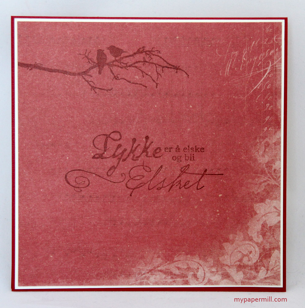
 No card of mine is complete without all the sides fully decorated. On this side, which is the bottom of the card, I’ve only added two stamps to the patterned paper, the two birds on the branch are by Kort & Godt, whereas the text (Happiness is to love and be loved) is by Stempelglede.
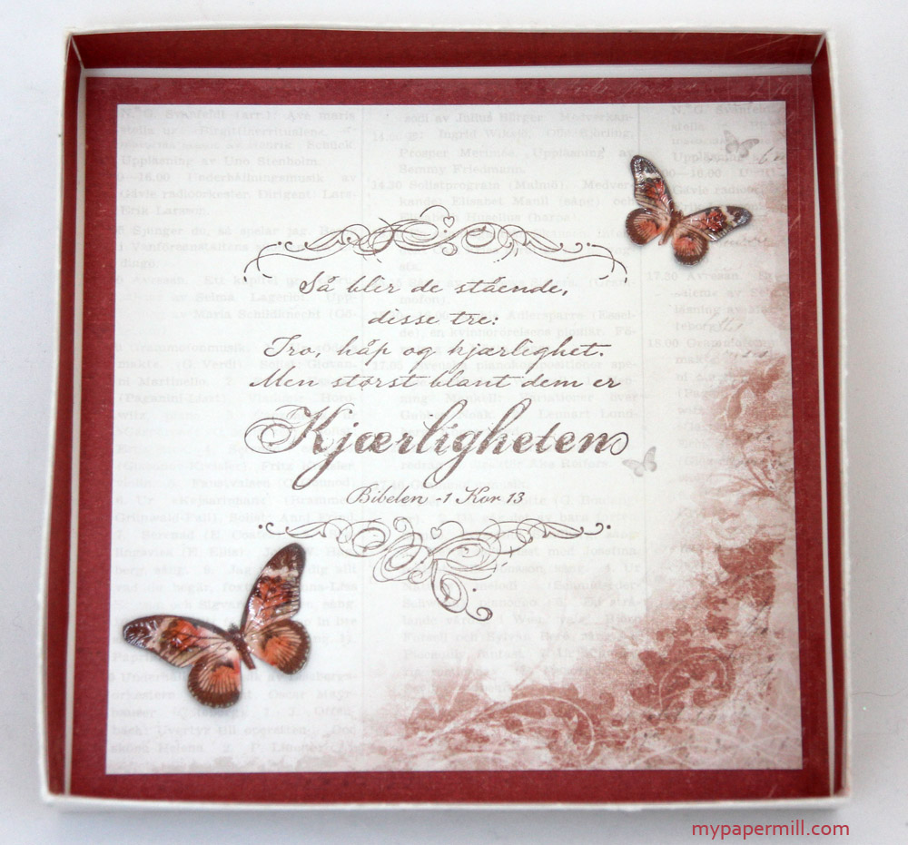
 And somehow, I’m still not completely done. This is the inside of the box that reveals itself when you take the card out. The text is another stamp by Stempelglede. The butterflies I’ve cut from the “Borders” sheet amongst the design papers. I added a thick coat of crackle accents to the butterflies before gluing them to the patterned paper in the box.
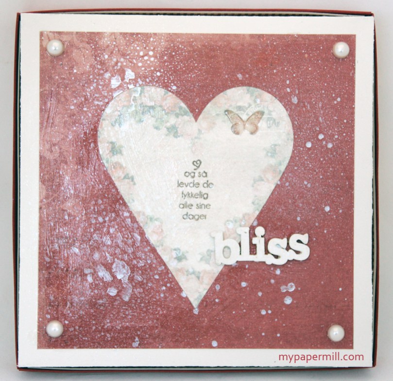 We’re getting close to the finish line now, I promise! 😉 I’ve done something different for the bottom of the box. Besides adding four Kort & Godt pearls for legs, I’ve rubbed goosebumps all over. I actually did that to cover up the fact that I’d managed to place the entire box in a puddle of glossy accents just as I was adding the pearls in the flower centers as the final touch to the lid. I couldn’t believe what I’d done (I’m usually pretty careful not to mess up things that are already finished), but the stain from the glossy accents was positioned in a way that made it impossible to cover up. I had nothing left of the patterned paper, so I couldn’t start over with the bottom of the box either, and this red paper was the only one I thought fit. The final step was a couple of sprays of Perfect Pearls mist. Underneath all this mist and the goosebumps spray (which won’t spray btw, how annoying!) I stamped a Kort & Godt text (and then they lived happily ever after) on a heart I cut out from the Pion Design Tags sheet. I added crackle accents to the butterfly on the heart, but that was waaaaay before I managed to place the box in the glossy accents puddle (also annoying!). It looked more dimensional and glossy before than it does now that it’s covered in a layer of goosebumps. Oh well… The word bliss is another Studio Calico wood veneer painted white with a dabber, at least I didn’t screw that up!! 🙂 I know I’m just being hard on myself, and that the bottom of the box doesn’t matter all that much, but I’m allowed to wish it hadn’t landed in that puddle, right? I’m happy with the overall result though, and I can just keep telling myself that the bottom of the box is the least important part!! 🙂
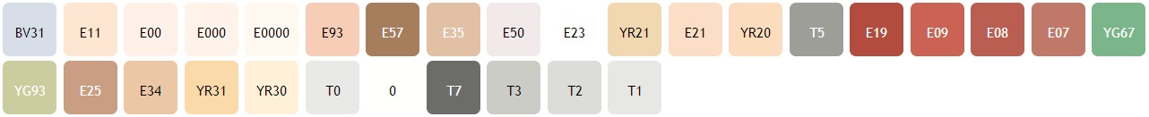
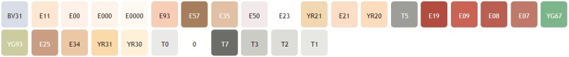 Last, but not least; the Copics I’ve used to color the beautiful Mo Manning image.
Challenges I would like to enter with this set:
Hjerteboden – Challenge #5: Wedding
* Bearly Mine Challenges – Challenge #84: Anything Goes
* Crafts and Me – Challenge #131: Floral Frenzy
* Die Cuttin’ Divas – Challenge #113: Anything Goes
Forever Friends – Challenge #17: Anything Goes
Fussy and Fancy – Challenge #88: Anything Goes
Our Creative Corner – Anything Goes
* Paper Crafting Journey – Anything Goes
* Party Time Tuesdays – Challenge #118: Anything Goes
* The Cutie Pie – Challenge #43: Lots of Layers
* The Sisterhood of Crafters – Free for all
Twisted Tuesday – Free for all
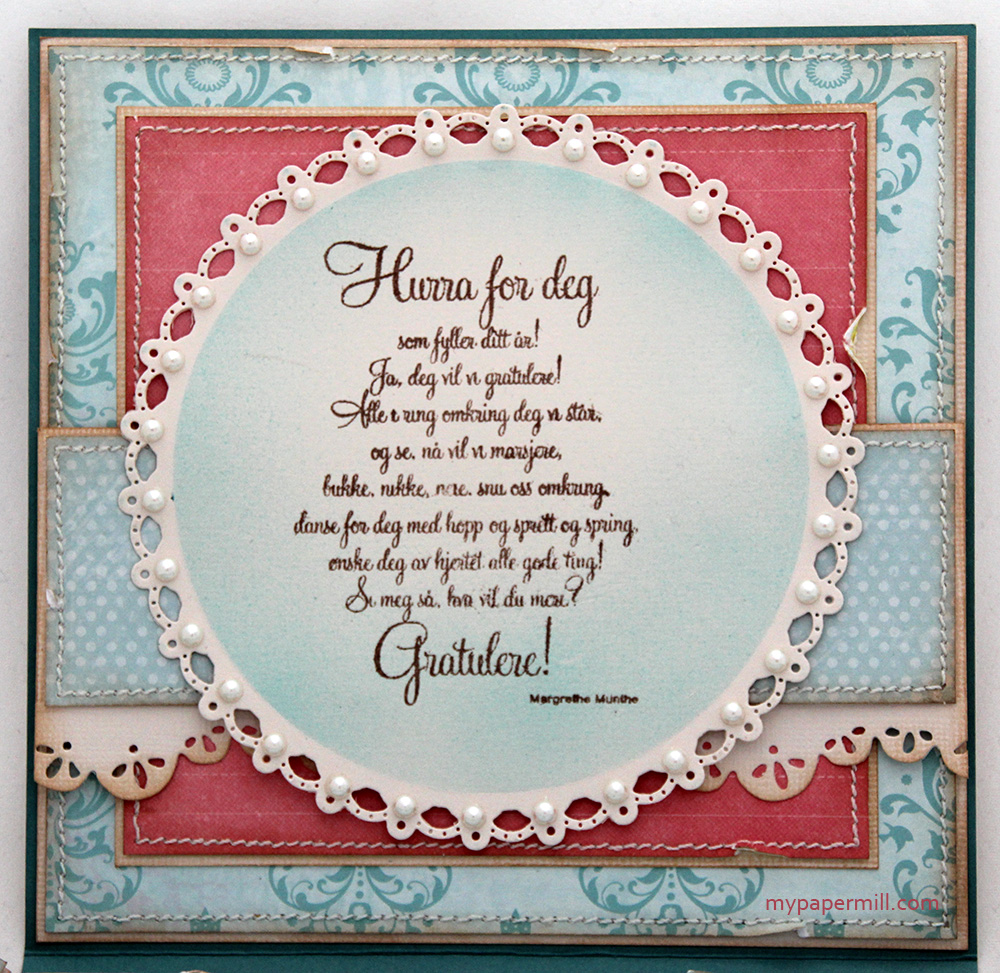
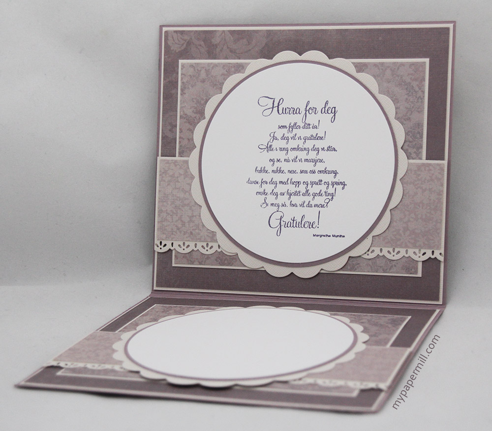
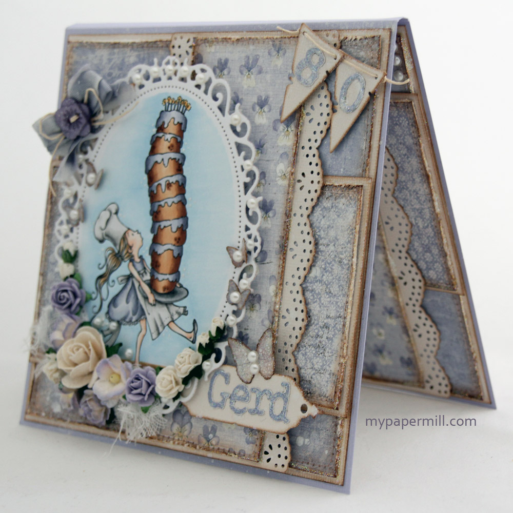
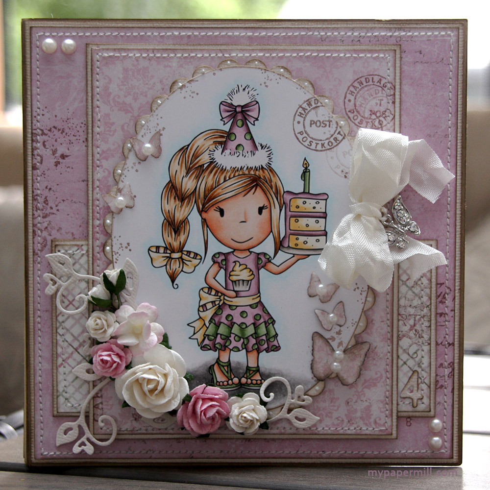 Min niese, Linnea, ble nylig fire år og som vanlig måtte jeg til pers og lage kort til henne. Hun er veldig rosa av seg, så de rosa arkene fra Maja Design sin Sofiero-kolleksjon passet perfekt for anledningen. Jeg har brukt arkene “a Romantic picnic in the Park”, “Enjoying the lovely fragrance” og “Royal Summer residence”. Inni har jeg også brukt arket 1912 fra Vintage Summer Basics-serien. Kortet er også mitt inspirasjonsbidrag til sommerutfordringen vår på CopicMarkerNorge. Lag et sommerlig kort og bli med, da vel.
 Bak motivet har jeg som vanlig gjemt en tag. Denne er stanset ut med Tilda Tag-dieen til Magnolia. Et tekststempel fra “Gratulerer med dagen”-platen til Stempelglede har blitt stemplet med Memento Rich Cocoa, og jeg har også stemplet et poststempel fra M-123-platen til Kort & Godt i kantene, også den med Rich Cocoa.
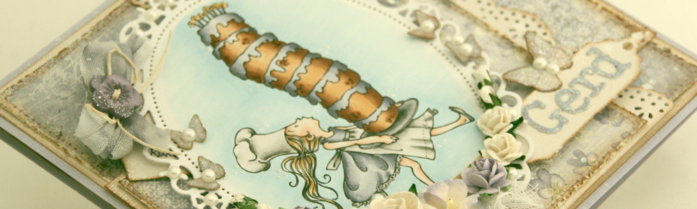
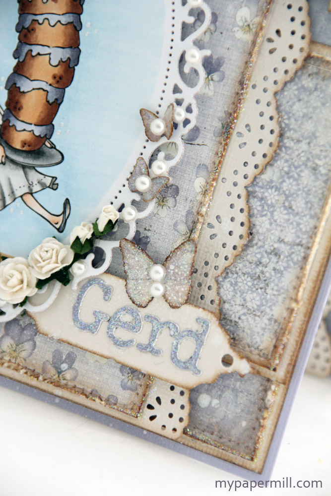
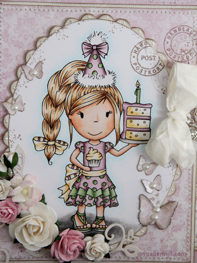 Motivet er ganske så spesielt. Det er et Paper Nest Dolls-motiv vi har fått spesiallaget til Copic Marker Norge. Hun er så søt der hun står med partyhatt og et digert kakestykke! Blomstene er fra Wild Orchid Crafts og hjertesnirkelen som ligger under er stanset ut med en Magnolia-die. Sommerfuglene er punchet ut med en sommerfuglpunch fra Martha Stewart, og jeg har sprayet Perfect Pearls på dem for å få litt skinn i dem. Jeg har også satt på perler fra Melissa Frances.
 Veldig enkle innsider. Hipp, hipp hurra-stempelet kommer fra North Star Stamps, og jeg hadde masse plass til å skrive på på høyresiden.
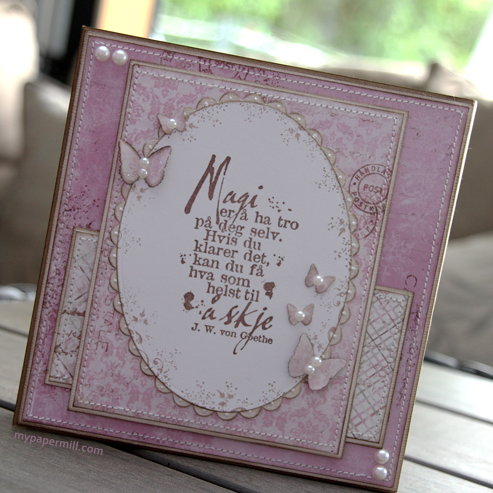 Baksiden er også enkel. Magi-stempelet fra Stempelglede gjør mesteparten av jobben.
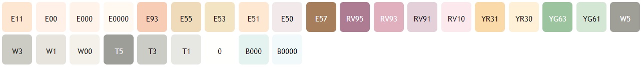 Til slutt: fargene jeg har brukt på motivet mitt.